What technical feedback would you like if any?
What artistic feedback would you like if any?
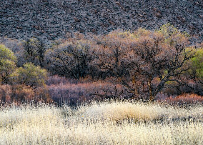
This is my first post ever in the NPN landscape section. I’ve been a past member in the old NPN under Avian for several years but just got into Landscape photography 4-5 years ago and rarely shoot birds anymore. So, my question is, Can this be more refined? I’m not even sure what I mean by that but is there too much contrast, color, are there white balance issues? Could this be made better as it is one of my favorite images that I took early on about 3 years ago. Just looking for feedback as I’ve been watching now for over a year and I love the feedback that the members provide. I’m looking for that kind of feedback and I promise I’ll do my best to chime in on other posts but I’m not that technically savvy with Photoshop. I’m almost exclusively a Lightroom processor but I have been in photoshop before, it’s just a year or two. Looking forward to be more of a participant rather than a lookie-loo. Pretty intimidating! 
Pertinent technical details or techniques: This was shot just north of Bishop alongside the road heading towards Mammoth Mountain early in the morning. 1/5 sec @ F/16, 240mm, ISO 80, D810, 80-400mm. Single image
(If this is a composite, etc. please be honest with your techniques to help others learn)
If you would like your image to be eligible for a feature on the NPN Instagram (@NaturePhotoNet), add the tag ‘ig’ and leave your Instagram username below.
Interesting scene. I think all of the colors work well together. I have attached an image suggesting maybe playing with the crop a little. I like the grass at the bottom and the texture at the top but I feel it could be cut down some. On my screen, the highlights in the grass seem a tad high so I dropped those as well and added a tad bit of contrast overall with a vignette… Just my two cents though. Nice photo.
This is quite a lovely study of this environment. The colors and texture within this scene are absolutely wonderful. Excellent work to see this, you did a good job of extracting key elements form the landscape. All of my comments were addressed in the rework by @Bobby_Burton, I really like how his rework adds more pop and impact to the image.
I think that this is really nice and I actually like how bright the grasses are. The mix of colours in the the mid-ground is also really nice.
This is the type of scene that Guy Tal presents with such sensitivity. Take a look at his gallery to see what I mean. I agree with the work on grasses by Bobby, although I think I can tolerate a bit more of the BG hillside.
A couple more thoughts on this intriguing image. This images shows depth of scene, with the grass in front of the trees, but the depth is equal on left, center and right. To some degree, the layers act as visual hurdles. So the result is a bit static. I recognize this because I am frequently do this, and have been coached otherwise. Try walking into the scene so that the objects on left or right channel the viewer into the scene.
With your LR brush, you might be able to introduce some mottled warm light onto the hillside, giving it interest and texture that it lacks.
Oh, this is lovely! Those cottonwoods and grasses on the east side are always beautiful. What strikes me is the same as mentioned by others. Those foreground grasses are quite striking, but I don’t think they are the main subject, yet they dominate the scene. The line of highest contrast is between the top of the grasses and the dark trees, so our eyes go there preferentially. My feeling is that if the overall exposure were “evened out” a bit across the frame, while using some selected dodging to bring out those beautiful trees, the grasses would not be so dominating. I took a crack at some edits to illustrate what I mean (hope you don’t mind). I darkened the grasses, lightened the central panel of trees (including bringing up the shadows), and desaturated that very green bush on the far right. The idea was to draw the viewer into the frame (as Dick was saying). I did all the edits in Camera Raw, not PS. Anyway, this is really beautiful no matter what.
Lovely photo. Very well done. Here is my take on some subjective changes: added some warmth to the grass and darkened it, added some blue hue to the top greyish rock/soil, and cropped a bit off the top and bottom.
2 Likes
Wow guys! This is exactly the kind of feedback I wanted on this shot. There was something just not quite right with it and I think the foreground grass is just too bright and reduces the impact of the layers behind it. I really appreciate everyone that made adjustments and shared those with me. It’s interesting to find 3 totally different ideas presented here on the redos. I like something about all of them. Thanks so much. This being my first ever post here makes this so worthwhile. I’ll be sharing more images in hope that I will get better and I will do my best to offer my own insight into other works as well. Thanks again for your thoughts.
Here’s another option for ideas David. You would likely get as many versions of this as there are photographers on NPN, but I too worked on the background and foreground to allow that central layer to star. In addition, whether it is real or not, it felt a little rotated to me and I kicked it a couple degrees clockwise.
The grass in front need some darkening.
![]()


