(If this is a composite, etc. please be honest with your techniques to help others learn)
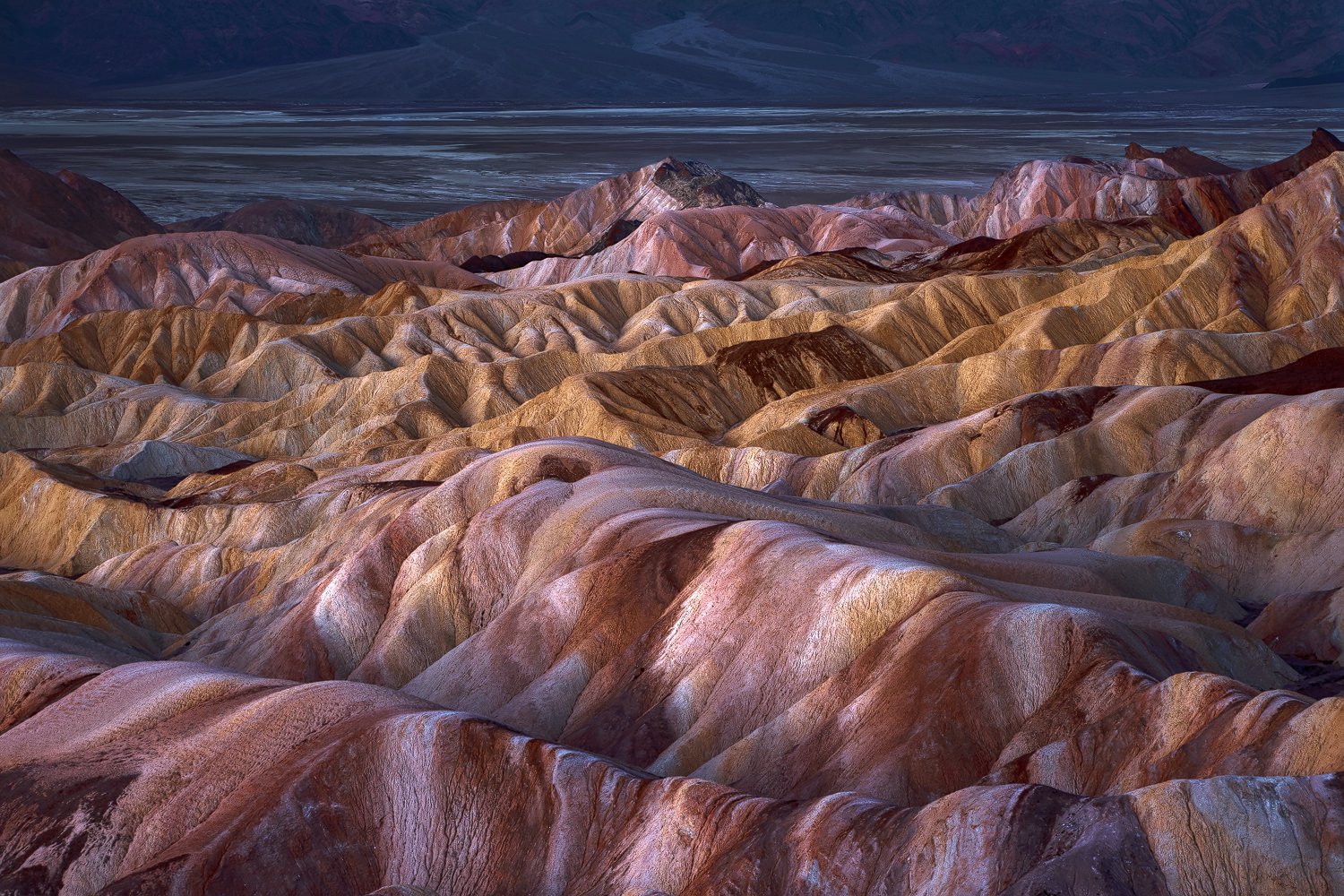
Single shot at sunrise. Cropped back from a larger shot that included the mountains in the background.
If you would like your image to be eligible for a feature on the NPN Instagram (@NaturePhotoNet), add the tag ‘ig’ and leave your Instagram username below.
You may only download this image to demonstrate post-processing techniques.
Excellent. I love the light and the band of yellow/orange dirt running between the red. I think the top of the image could possibly use a little warming, or maybe even just a little desaturation of the blue tone. To me the blue seems to work against the beautifully lit oranges and reds. Nice image!
Greg: Marvelous processing on this to bring out all the color and texture. My only suggestion would be to crop from the top to eliminate the BG hills and keep a strip of the flats. >=))>
Greg - nice image albeit one that’s very common. The challenge at these iconic places is to create something unique…to see what thousands of others haven’t. I’ve spent many hours on the same exact comp…my only suggestion is to experiment with different, much tighter crops fully eliminating Badwater and the Panamints in the background. Either way to have this one in the bag is nice - especially with such nice light.
I like the fact that you sought a different view and excluding Manly Beacon. The patterns, colors and just the geology are uniquely Death Valley and I think you’ve represented it well.
Colors are a little strong, given that many of us have stood there, but your processing is well within our creative, personal preferences. I think this is wonderful.
My only suggestion is a slight crop off the right to eliminate the dark, pointy rock towards the top. I like the inclusion of the background up top, although certainly a more abstract alternate is there without the top as suggested by Bill.
Greg, I’m going to go against the grain here and say that I like your composition without any cropping, and that I prefer seeing the valley and the Panamints, I think it adds a sense of depth and scale. I also think your arrangement of the badland formations is very balanced and pleasing.
I’m okay with the colors here, as @Lon_Overacker points out you have made a personal, creative choice to add some emphasis. I don’t find your colors to be over-saturated. As matter of personal taste, I might consider a second interpretation reducing magenta, which I think creates some better color separation, which still maintaining vibrant color. Something like this…
Nice image Greg, I think the composition works very well and I much prefer to see a hint of the Panamints in the background. I personally think the colors and contrast are a bit overdone for my taste. This is the direction I would take it myself. If you’re interested I can share the Photoshop file with the adjustment layers and a little description of what I did.
Looks great over at site as well ; o ). Yeah the colors are strong but I find that they work very well. Composition as framed and processing look good to me, except, that I would pull back on the blue saturation at the top of the frame.
Thanks @Dave_Dillemuth, @David_Kingham, @Preston_Birdwell, @Ed_McGuirk, @Lon_Overacker, @George_Kalantzes, @Bill_Fach, @Cameron_Miller for your input. My thinking on this comp was to have something from a different angle and Manly Bacon was taken out of the equation immediately, because it offset the balance of the shot. Zabriskie area was shot with and without it and I preferred this because of the balance. I took out the majority of the mountains because lack of detail, color etc… It is an early sunrise shot and was not the shot anyway. I left what I did because I like to have a “frame” effect to cap off the shot. If I had cropped down to the salt flats then it leaves all that white which to me is distracting. With just the salt flats the whites kept pulling my eye up and out of the shot. Which then left me with the cropped mountain and then trying to take care of the distracting white. Short of cloning, I came up with what you see. I do agree with multiple people on a little to much blue, but I preferred this to the white and overshot it. And will probably also pull back just a touch on the magenta throughout. Thanks everyone for the input.
@Greg_Stokesbury, No worries. Harley pretty much summed it up. Basically, many things like color, saturation, exposure/luminosity, etc., etc., are completely subjective. We each interpret things differently - from what we “think” we observed at the scene vs. what we think we remember. And so there is no right or wrong, only our personal perception and desires of how we want things to look.
If we’re purely “documentary” then colors/sat, etc. should be pretty close to reality and very believable. Once we consider ourselves artists, with free license to interpret how we see fit - then there should be no limits. Personally, I often push the edge of what’s believable, but always try and keep it real.
@Greg_Stokesbury I think Lon has done a great job of summarizing the “unspoken philosophy” underlying NPN critiques. Most experienced NPN members making comments understand that photography is very subjective, and we respect the artist’s right to push boundaries for creative effect. “Pushing the the edge of what’s believable, but keeping it real” is a common theme in the landscape critique forum, and appropriate for a Nature Photography website.
Many photographers post images here for critique because they recognize that photography is subjective, and they value the opinions of a wide range of viewers. Both in taking our images, and in processing them, it is easy to sometimes get too close to our work, and thus other’s perspectives can have a lot of value.
When post-processing color and saturation, in particular, it is very easy to incrementally make changes that look good, then our eyes become accustomed to these changes, then we do it a little more, and so on. When commenting on newer members like yourself, whose work I am not yet very familiar with, I have to decide if I think the color/saturation was successfully pushed for creative effect, or if the poster could benefit from my subjective opinion that there is too strong a color cast, or too high a saturation level. When you see a number of experienced NPN members making the same comment, that at least tells you something.
But in the end it is your work and your vision, and you should do what pleases you the most.