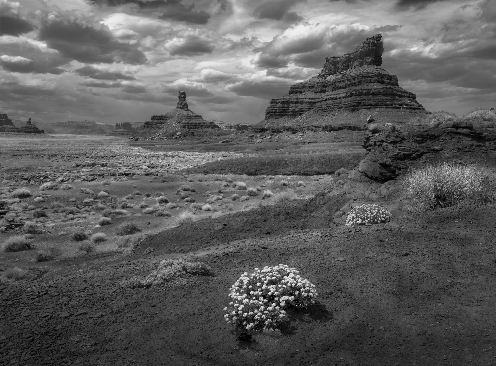
This image is I think of Rooster and Franklin Buttes. Overall color was a pretty blah orange, with wonderful clouds. So BW seemed to be the best choice. I worked to accentuate the contours of the plain on the left, and the foreground slopes.
The flowering buckwheat was important to me; hopefully not a distraction.
Beautiful photo! For me, the flower in the bottom foreground is a distraction. But you should know I am a complete purist when it comes to foregrounds. One of my most common comments is that the foreground is a distraction, often creating two photos, one on top of another.
I like seeing the flowers in this harsh-looking landscape and might even have done an extra step towards them. I also like how there is a second bush. The background is fascinating and spectacular without doubt.
This is such a wonderful image. It is a part of the world that is simply magical and you have captured that magic. But I find myself agreeing with @Tony_Siciliano - that it feels like two different photographs competing with one another. I find it interesting that when I scroll-crop the mesas out of the picture altogether, I see the makings of a very interesting image, namely the two bright patches of flowers, the grass on the far right and all the patches of grass running out like a river into the distance. Now, I know that isn’t the picture you intended and, really, it’s not entirely there in any case - just the hint of its possibility. The second picture is of those amazing mesas, the dynamic sky and that “river bed” running out to the distant horizon. That is a gorgeous picture, especially in black and white (although I might be tempted to pull up the mid tone contrast a touch - but not the sky). I think it might be worth a try to either crop out the leading flower patch or, I think probably better, crop a bit off the bottom and clone away the rest. I think the problem arises because that patch of flowers is so distinct from everything else in the picture. It doesn’t, for example, mirror the mesas in either shape or tone. As it is, the leading patch of blooms stops my eye and won’t let go, when where I want to be is roaming around down in that plain.
Kerry, and @Tony_Siciliano Thanks for the explanation of why to douse the flower. I like the success of David Muench and others when they exploit a strong foreground element, but I frequently overdo it, or do it in ways that don’t settle well with viewers. Just wondering, since I had gone to great pains to pop the flower, what if I bring it back down. That does not mirror the mesas in shape (although the shape is repeated elewhere), but perhaps it does not clash in tone so much and keep a death grip on the viewer’s eye. See also with the flower pulled out.
I think it works much better with it toned down than eliminating altogether. I would bring down the other one and the grass beside it as well. You’ll want to experiment but I suspect it will work best if the foreground plants are tonally aligned with the ones on the plain. I think you could still have more texture/clarity in the foreground as long as there’s tonal alignment moving out to the mid ground and background.
The toned down version does work better, but I still think it doesn’t enhance the photo; for the same reasons, although less so. Regarding the version with the flower pulled out, I would crop away a lot of the foreground, basically everything below the small scraggly bush to the left of center. The plain dirt is just not interesting and IMO also detracts from the photo.
It’s funny you mention David Muench. I took a workshop with him fifteen years ago or so, and we wandered around Zion looking for snaggly fallen trees to incorporate as foregrounds. He certainly popularized the snaggly tree in the foreground look! I remember reading an article in Outdoor Photography over ten years ago that said unless you had a really interesting foreground you couldn’t have a great landscape photo. But I think it has become a meme in photography that is now way overdone, an 11th commandment: “Thou shalt put an object, any object, in the bottom of your photo”. For me, for a foreground to work there has to be harmony with the middleground and background, and the foreground subject should draw the eye into the middleground, not block the transition. It’s not enough that it is interesting.
Really nice scene. Funny, I was going to suggest toning down the foreground flowers and your repost beat me to it. I prefer it of the three options. You got a great sky to go with a dynamic scene.
I think OP needs an article by @Tony_Siciliano and @Kerry_Gordon on foreground elements. Maybe even a comments or sidebar fm Muench. You have articulated compositional principles and examples that are worthy of a wide audience. I am happy they have been lavished on me. A NPN Learning Article to start? Cc @Harley_Goldman
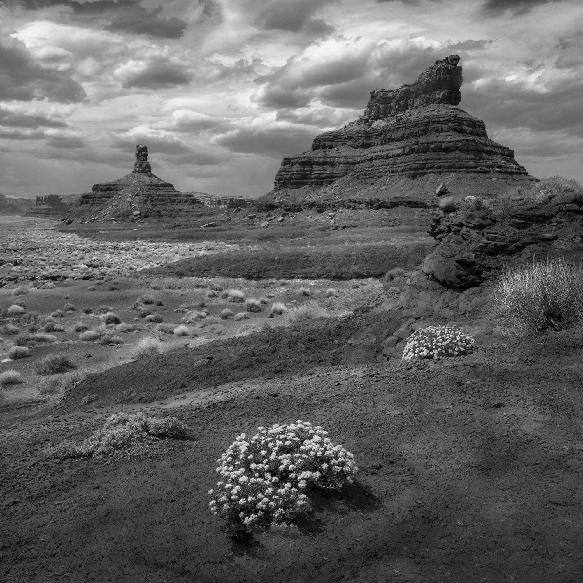
I’m with everyone on the bright flowers - your rework with them dialed back is definitely more appealing to me. It still feels like two photos, though, with the flowers vs. the mesa. I thought that perhaps a crop to emphasize more relationship between the flowers and the mesa might be interesting. So, here is my idea to make the flowers and mesa more complementary. I cropped to 4x5, increased the contrast on the mesa, further reduced the contrast of the flowers, and reduced the contrast and brightened the sky, so that it wouldn’t be so prominent. The latter has the effect of making the mesas more distinct, I believe. I did all the above with curves (just because it was easy to do it that way). I cropped off the left to emphasize more of a vertical feel in the photo, so the eye would move up and down between the flowers and mesa.
Interesting, in this vein of looking at foreground vs. background, Alister Benn just put out a video this morning discussing that very topic.
I find his discussion interesting and relevant to my work and my “eye”. For years, I tried to do near/far images and they were almost always awful. It took time for me to realize that I just don’t see that way and nor do I find inspiration from that in the field. I can relate to the stress Alister talked about when I was trying to pull off a “David Muench” scene when it just did not resonate with me.
I hear ya’, @Harley_Goldman! Same thing for me. I much prefer getting down in the weeds (figuratively and literally) and see the details in things, not so much the big picture.
Dick, I really like what Bonnie did. I think the image without the flower is missing something. The flower does something for me even though I am thinking that there is a little bit of a disconnect (not in theme but rather in visual flow) between the flower as a foreground element and the entire background. I am not sure what I will do if I were you in the field though. It looks like a tough problem but I think I will gravitate towards similar composition.
@Bonnie_Lampley thanks for the video, Bonnie! Gonna watch it!
I’m coming in late here, but it certainly has been an interesting discussion. I read the first few comments by @Tony_Siciliano and @Kerry_Gordon about the foreground flowers, and what to do with them to avoid the dreaded “two images / it’s a distraction” comments.
As presented originally, I would agree with the general comments received in this regard. My initial reaction was that what is incongruous about the original image is that we have a "vertical’ relationship between the flowers and the buttes. And then we graft that vertical relationship onto what is otherwise a strong horizontal composition depicting the vastness of the desert and the big sky.
The empty space to the left and right of the flowers makes it feel even more out of place with the top half of the image. I thought this composition needs to be tweaked to reinforce the relationship of the flowers to the buttes, rather than seeing the flowers as a distraction. Then I saw @Bonnie_Lampley rework and said this is a major step in the right direction.
Where I differ slightly from Bonnie is the following. Once you recompose this to emphasize a vertical relationship, you end up with a strong inverted triangle shape. And I think the three vertices of the triangle should carry equal visual weight. Thus, I would not “tone down” the flowers, I think they need to keep the stronger contrast of the original presentation. Here is a rework where I simply cropped the original post, retaining the contrast of the flowers.
Dick,
I am a little late to the party, but I have to say that this is a very interesting discussion with lots of great ideas. The winner for me is @Ed_McGuirk’s rework making this more of a vertical presentation. If you had several clumps of FG flowers I would stay with the horizontal presentation. With the vertical you do have a strong triangle; as @Ed_McGuirk already mentioned; with the clump of flowers and the two buttes. Of course the final decision is up to you and what your vision is. BTW, great B&W conversion!
Wow! I fully agree with @Ed_Lowe about this fascinating, informative discussion with well articulated ideas. It is amazing that the square crop of @Ed_McGuirk gives the greatest visual movement. I have used square crops for “mug shots” to depict something static. By removing the lhs, it implies that the first bush is there to say hello and pass you to the next (right) then to Rooster Butte via the grass, the to Franklin Butte, and then back to the start via the wavy ancient shoreline.
As @Bonnie_Lampley suggested, I lightened the clouds, hoping to let the buttes jump out more. I also burned the grass on the rhs to avoid it taking one out of the frame.
Learned a lot from the comments of @Kerry_Gordon (and Sam Abell) @Adhika_Lie@Harley_Goldman@Tony_Siciliano and @Ron_Jansen as well as @Alister_Benn (the video cited by Bonnie)
Will be a pleasure to cite all the co-creators when I show the print to my photo club.
I was surprised by Ed’s suggestion of a square crop as well. And yet, it clearly works. This is an excellent rework that really holds together. Well done.
Wow, why haven’t I seen this before! Great image, Dick. My eyes are shot tonight, so no suggestions from me, and I’m sure I couldn’t offer anything that hasn’t already been offered anyway. I’ll have to check this out tomorrow when my eyes are not so tired and can focus better.