Hi Everyone,
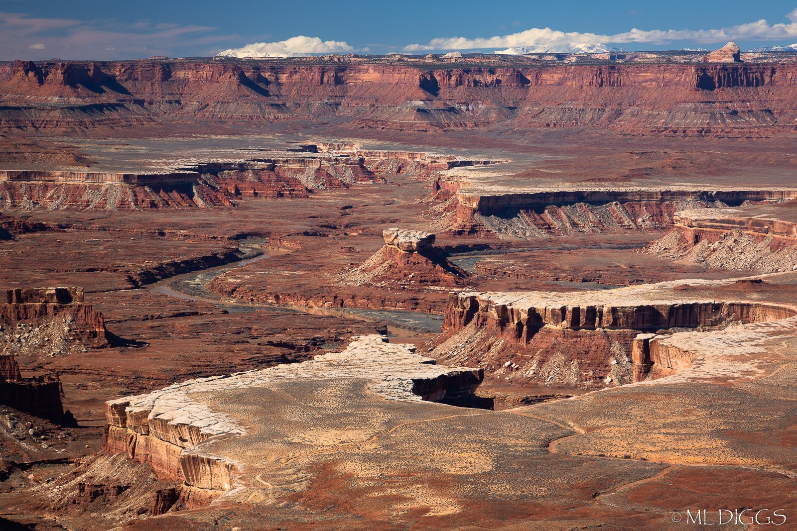
This is the fourth of maybe 5 or 6 images from my recent trip to the Moab Area. This one is in many ways the most lacking in a clear subject, but it’s just abstract enough, I think it might work.
What technical feedback would you like if any?
What do you think of the processing: too much contrast? saturation? I boosted both modestly, but it didn’t take much to make it punchy.
What artistic feedback would you like if any?
Do the lines and shapes in this mesa perspective of the canyon hold enough interest? (I believe it is the Green River overlook near Willow Flat CG in Canyonlands).
Pertinent technical details or techniques:
Single image minimally processed in LR
If you would like your image to be eligible for a feature on the NPN Instagram (@NaturePhotoNet), add the tag ‘ig’ and leave your Instagram username below.
You may only download this image to demonstrate post-processing techniques.
Marylynne, to me the most interesting “subject” is the small butte dead center in the image. But it is pretty small in the frame, and I feel like it gets dominated visually by the larger, brighter formations in the foreground. I also feel like the crop on the sky feel a little tight. Maybe a strong vignette could help focus the eye on the center. But since the subject is not very dominant here, a more abstract interpretation of the scene might be more effective.
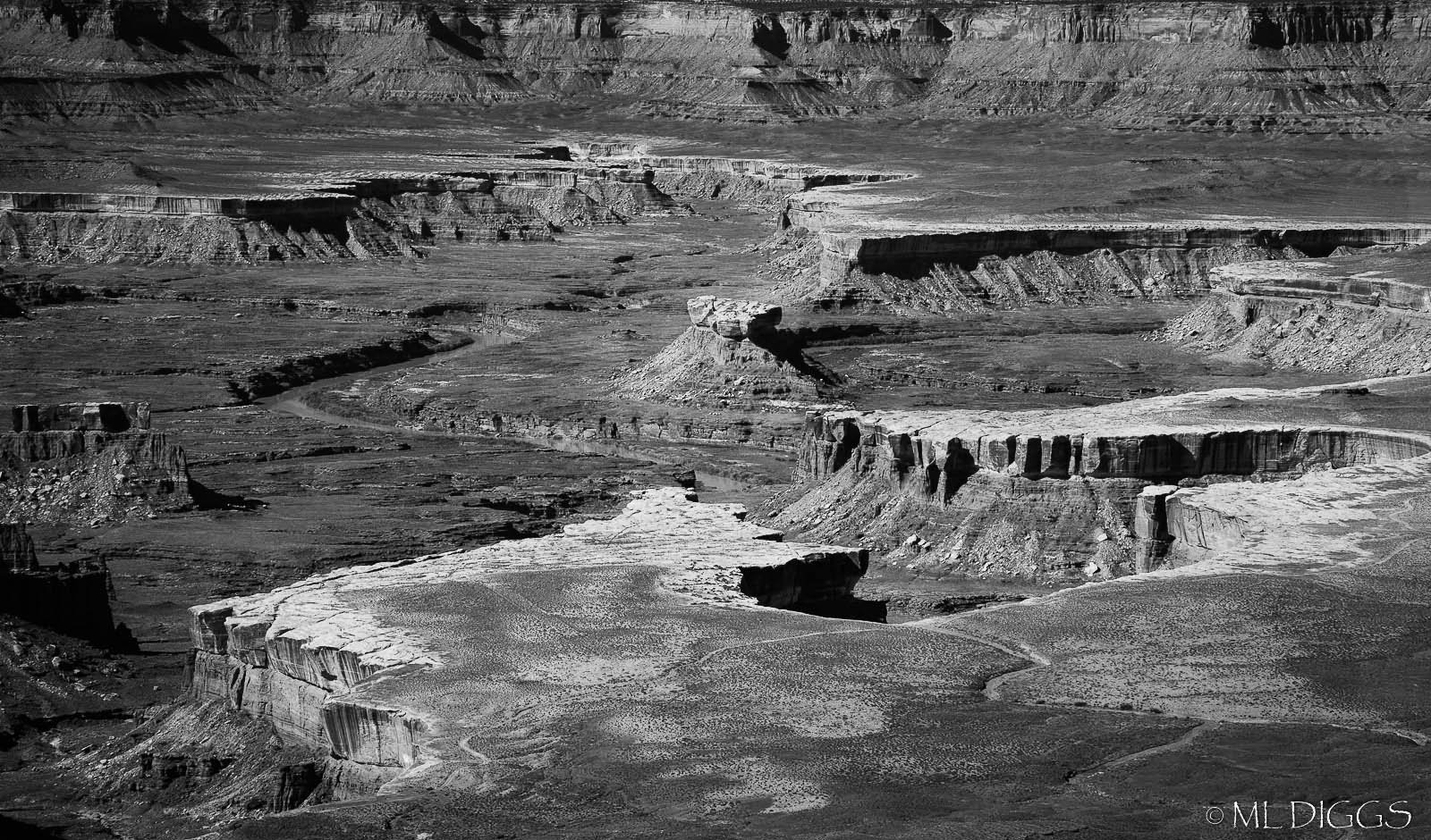
To go more abstract I would suggest cropping the sky away, but leaving as much of the background butte as you can. Another way to enhance abstraction in this scene would be to convert it to B&W, which would emphasize the shapes and textures. And B&W might be more suited for the high contrast light you have here.
Well done! I like the processing here and the mid day light. Personally, I would crop the sky out. It tends to draw the eye out of the interesting formations in the valley below. There are nice leading lines and formations in the rocks. I think there are a few compositions in this one. Maybe a panorama eliminating some off the top and bottom. Either way it is a nice image as is.
1 Like
Thanks, @Ed_McGuirk and @Hermann_Philips for the suggestions. This area is so vast and I found it so fascinating, yet so difficult to compose photographically. I completely agree with your thoughts on the sky. It’s gone now  . I tried both black and white and color with a slight vignette, and I’m thinking color is still the ticket here, despite the harsh light. The mid-tones dominate in the black and white, so it feels really muddy in monochrome, but I’ll share it below as well, just in case.
Thanks for making suggestions. This is the stage where I really struggled (my 4th or 5th image from a location, probably wishing it were stronger and searching for guidance on whether it’s a keeper).
I am always open to a second round of suggestions, so have at it everyone if you see other possibilities.
ML
Here is my effort at a second round for B&W with more contrast (though I think color works too once you ditch the sky in your rework). Subjectively I prefer leaving some of the back butte in my crop as a framing element.
Marylynne,
Kudos to you for continuing to challenge the “thou shalt not photograph in harsh mid-day light…” dogma. Ok, so I may subscribe to that theory in general, but clearly you are showing that viable, meaningful and great photography can be had. Good for you, and thanks for reminding us.
A couple thoughts. I happen to like the inclusion of the sky and like your original as presented. The one thing the sky/clouds do however, is make this simply about a grand view, the grand landscape. And for which you’ve captured, processed and presented beautifully.
The crops and suggestions offered I think take this to a more intimate and certainly abstract nature for a landscape. And that’s good too. I like your color crop and would consider Ed’s suggestion of keeping more of the buttes, just without the sky.
For me, even with increased contrast, the b&w is not better, I don’t think. Despite the hard light, the color, hues and varying tones of color are helping to define the landscape. Where as with the b&w, it’s just about contrast and I think the story of the landscape is lost.
Just my .02.
Small nit - I’d clone out the bright rock along the bottom edge.
Lon
Thanks everyone. I was undecided about the distant mesa wall (or legs?) but I’m convinced now. I think I will stick with the more abstract, but color, approach. The black and white versions feel less coherent to me–too much mid-tone even in a higher contrast treatment. I’ve been doing more bw the last few years, but for my taste (or my emerging bw style?), some degree of smoothness is critical in bw abstract, and this is just too textured and rocky for that.
So here it is: color, butte, 12x20 rather than 10x20 to eliminate those darkest buttes on the left edge.
And for @Lon_Overacker, I had to do a good bit of mid-day photography in Moab. Traveling with a spouse puts a damper on sunrise for sure! I do have a few sunrise/sunset from DHP, and those will be my final images shared from the trip. I generally like shooting for golden hour or at least some interesting light, but our days here were either very sunny or very cloudy, and not much in between. Arches was much easier --shooting right from the campsite at morning was wonderful. These mesas and sprawling canyons are tricky for sure. I’m not sure I will go back to do more at Canyonlands or DHP. I prefer more immersive places like Jumbo Rocks in Joshua Tree, Arches, Sand Dunes. I like to feel like I’m really in it, not just surveying it. That said, I’ll share elsewhere on NPN our Thelma and Louise Point adventure by Jeep. It got dicey, but we lived to tell the tale.
2 Likes
I like your latest color repost done in color, darkening the redder tones has placed more emphasis on the yellow highlights at the top of the buttes, kind of similar to what the various B&W versions were doing with tonality too. This punchier color version works for me.
Marylynne, I like the strong sense of depth that your original post has. To me, the contrast and saturation look good. The cropped version shows off the formations well, creating a very different feeling.
1 Like
Thanks Mark. Sometimes I think every image I take has another inside it.
ML