Hi Folks,
As promised, I’m sharing another (still maybe the next to last) image from the Moab/Deadhorse Point area.
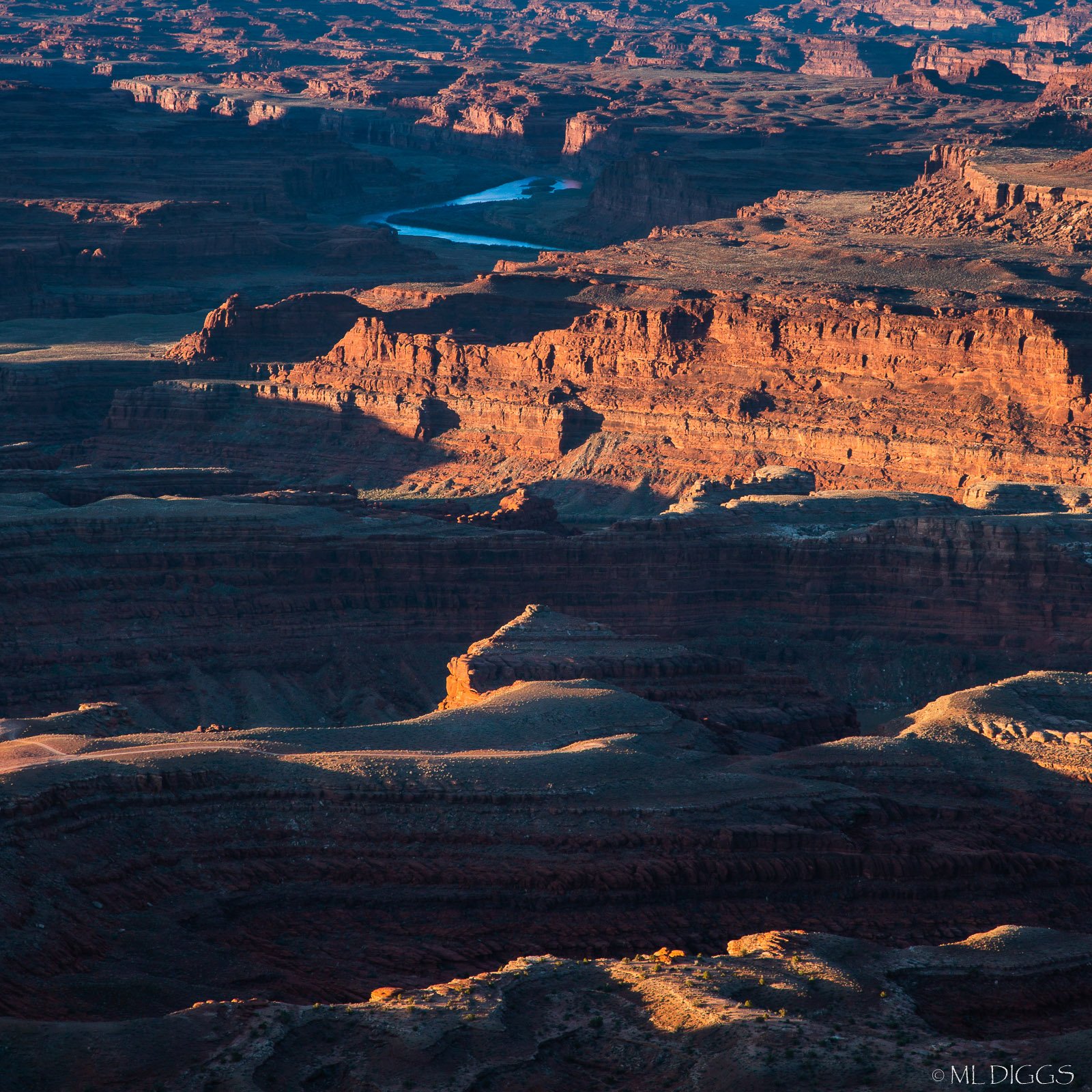
This one was planned as B&W, but I didn’t feel like the sliver of river worked (silver in b/w v. blue in red landscape). I have tried several comps: one with sky (hazy blue), one vertical like this, and one square. All have been processed a little differently too, so I’ll share square based on this processing if folks think the contrast and color look good. I’m out of my element again working in color after being into b&w for most of the last couple of years.
What technical feedback would you like if any?
Do the color and contrast work for you? Is the sharpening appropriate? I’m not sure my export sharpen process is stable (got a few comments on that, which is new for me).
What artistic feedback would you like if any?
Do the structures, complexity, and near to far with blue element work? My goal was to show the intricacy of these canyons and the force that carved them over time.
Pertinent technical details or techniques:
(If this is a composite, etc. please be honest with your techniques to help others learn)
Single image file, processed in LR
If you would like your image to be eligible for a feature on the NPN Instagram (@NaturePhotoNet), add the tag ‘ig’ and leave your Instagram username below.
You may only download this image to demonstrate post-processing techniques.
I like the touch of blue against the golden light Marylynne. My only nit is that I wish there was a touch more light and detail in the darkest foreground area, Wonderful warm light on the cliffs.
Marylynne, this works beautifully as a color image, the color and contrast look great to me, you have nothing to worry about here. I like the deep, rich shadows, and the alternating layers of shadows and highlights from top to bottom. Cropping out the sky was a good call. I think excluding the sky allows the color contrast of the blue river and warm red-rock to be even stronger. If you included the sky, it might make the river look less important than it does here. I love the warm light hitting the two foreground ridges, that light is gorgeous. I think this image as presented does a great job of telling the story that you wanted. Sharpness looks fine to me.
I think you have some other alternate square crops here too, one that excludes the bottom ridge-line, and another that excludes the river. I think the light, color, and shapes here are strong enough that many alternate crops would work well.
Marylynne,
Great job using the long lens to isolate this comp. I really like the layering of the ridges with the light striking all those various layers. Like Ed, I thought that there is an option to crop out the bottom ridge/layer - but only as an alternative. Losing one of those layers bottom to top also diminishes the impact of the scene, somewhat.
There’s just enough of the water to make it a positive element in the scene. I also like the hint of the expansive canyonlands up top - and wish there was more; but understand and agree excluding the sky is a good call for this particular image.
Colors, contrast and processing in general look great.
Lon
Thanks for the encouragement on this one, everyone. I have attached two additional variations on this:
#2: Vertical but with less of the foreground and more of the distant Maze district–not sure that fade to blue (natural color shift) works as well as cropping to keep the colors in the top more consistent)
#3: Square, but cut from the same cloth as the vertical above (I have another square version, but I’ve realized I didn’t process it fully because it was not as sharp to begin with).