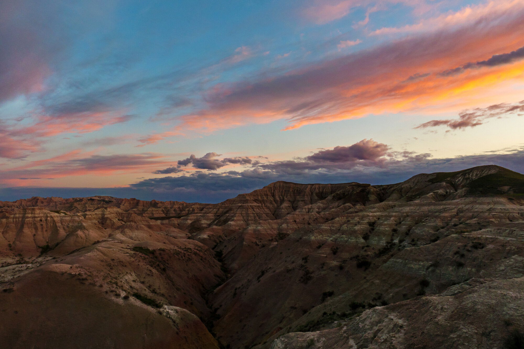
Another Badlands sunrise. This is about as much color as it produced, but I think it works. It was just before the sun broke the horizon line. I’m ok with the composition even if the LLC is kind of blank. It’s just how it was. I can include more down that way if you want, but I found the lighter rock that was closer to me to be too distracting so I cropped it out.
Specific Feedback Requested
What I’ve struggled with is the horizon line and the slight halo effect that our eyes naturally produce when we see a dark object and a light one this close together. I’ve actually processed this one twice, the second time burning the sky just above the darkest ridgeline in order to reduce this effect. Prior to that I used sky selections to work on the sky and those produced more of a halo effect even when I bled the selection down into the land. It was frustrating, so instead I switched to a linear gradient and backed it off the lowest portion of the sky. That, in combination with the burning, seems to have worked. What do you think?
Also how does the overall exposure look? I struggle with this kind of thing - the dynamic range involved is so great and the fact that your pupils constantly expand and contract as you look through a scene makes it tough to judge a 2D representation. There was no direct sun on the earth yet, so I wanted to keep that low key as it was.
Here is my first try with this shot just so you can see if I made the right choice to re-edit from scratch -
Lr for raw work - exposure boost, curves adjustment to smooth the tonalities, texture, clarity, sharpening & nr in small amounts. Transform to adjust the geometry slightly - to reduce the effect of the LLC. Sky selection and a touch of dehaze and saturation. Topaz Sharpen to bring up some detail. Ps to do some sculpting in the clouds and the lighter parts of the rock faces - used a variety of zone, luminosity and color masks with dodge and burn layers. Ran a vibrance mask to pull up saturation in the least saturated pixels in an effort to even out the overall saturation. Ran a clarity action and used a mid-tones mask to isolate it.
Hi Kris,
The pinks and oranges in those clouds are spectacular. There’s definitely less halo effect on your second edit, so I think that was the right choice. As for the exposure, I do want to bring it up a bit in the rocks. The colors and layers are so pretty but they’re hard to see clearly (at least to my old eyes). However, I suspect that by doing that it may exacerbate the halo effect? I wish I could give you more but this feels like one of those images I would edit and re-edit like ten times. It’s a great composition and worth the effort, though, imho.
Thanks @David_Mullin - I’m glad I got the clouds right and that the halo effect is reduced. It can be a tough call - editing can be like the story of the boiled frog; you start out having a nice bath and end up soup. I left the hills alone kinda because in the second shot which was my first edit, I think I lightened them too much, especially on the right side which had its back to the sun so to speak. Hm. I could dive back in. As @Diane_Miller often says - with digital photography, the paint never dries.
The gorgeous sky is such a wonderful complement to the rugged hills! The LL is a bit empty – I wonder if there is more contrast or subtle detail to be found there, but not a big deal. I think the distortion correction was a good one. I’m with @David_Mullin, though, on wanting the rocks to be a bit lighter or more contrasty. You wouldn’t need to use a hard-edged selection that fit the horizon. The selection could feather out before reaching the top of the rocks.
Hi Kristin, I actually prefer the first image, even with the halos. I think it feels a bit more natural.
I’ve found that Clarity, Highlights, Shadows, and Contrast can all create halos like these. You can use gradient masks to adjust the sky using curves and that would help the halos. Also, someone, I can’t remember who, posted these instructions on one of my images:
Fix Halos in Photoshop
Create a new (top) layer.
Select the clone tool.
Not up top but to the right in the layers panel where it typically says “normal”, switch that to “Darker Color” (in other words you’re not changing the action of the tool but the action of the layer itself).
Set the clone stamp opacity to somewhere between 70 and 100%.
Set the clone stamp fairly small and max feather and have the stamp follow from just off the edge of, in this case, the rocks.
Because you’ve set the layer to “Darker Color” you won’t alter anything of the rock itself, you will only fill in the pixel gap with the sky color just beyond.
Thanks for that, @David_Bostock - I’m going to bookmark it so I can go back to it on any other shot like this.
The face of the slope in the LLC is unfortunately pretty blank, @Diane_Miller. I just messed with the uncropped shot to see if I liked it with a bit of lighter rock in front of it, but it’s too distracting with just a triangle visible of that nearest ridgeline.
So I put another shot in the OP - I lifted the mid-tones a bit and I think that’s what might have been missing. I’m a bit of a mid-tones fetishist so I don’t know why I left them so muddy, but check out version number 3.
I did a select sky and inverted and looked at the histogram of just the hills. All the info is in the left third, which for my taste could be raised even more. I wonder if a subtle HDR could have yielded a realistic-looking result with more info in the darks. You were dealing with a big tonal range.
Hm…I hadn’t thought of trying that, but shouldn’t it be that way given the dimness overall and the fact that a lot of it was in shade/shadow? I know a normal histogram with a properly exposed scene should stretch wider, but if there are no light tones to represent in the histogram, how else can it register? I’m really not trying to be argumentative, lol.
Thanks @Dan_Kearl - it was a good workshop overall and I’m glad we got some color in the sky in the morning since we hardly got any in the evening. Lifting shadows is very easy to do these days and I try not to be a nut about it, but sometimes it’s how we expect things to look. I’m not saying resist all the time, but I have to be true to my recollection.
I’m just using that idea to visualize the limited tonal range in the land, and wondering if it would stand up to a little stretching, but of course the right answer is how you visualize the scene. Not arguing with that, just thinking about a way to see how separated in tones the two areas are. In the whole image histogram you don’t really see that separation.