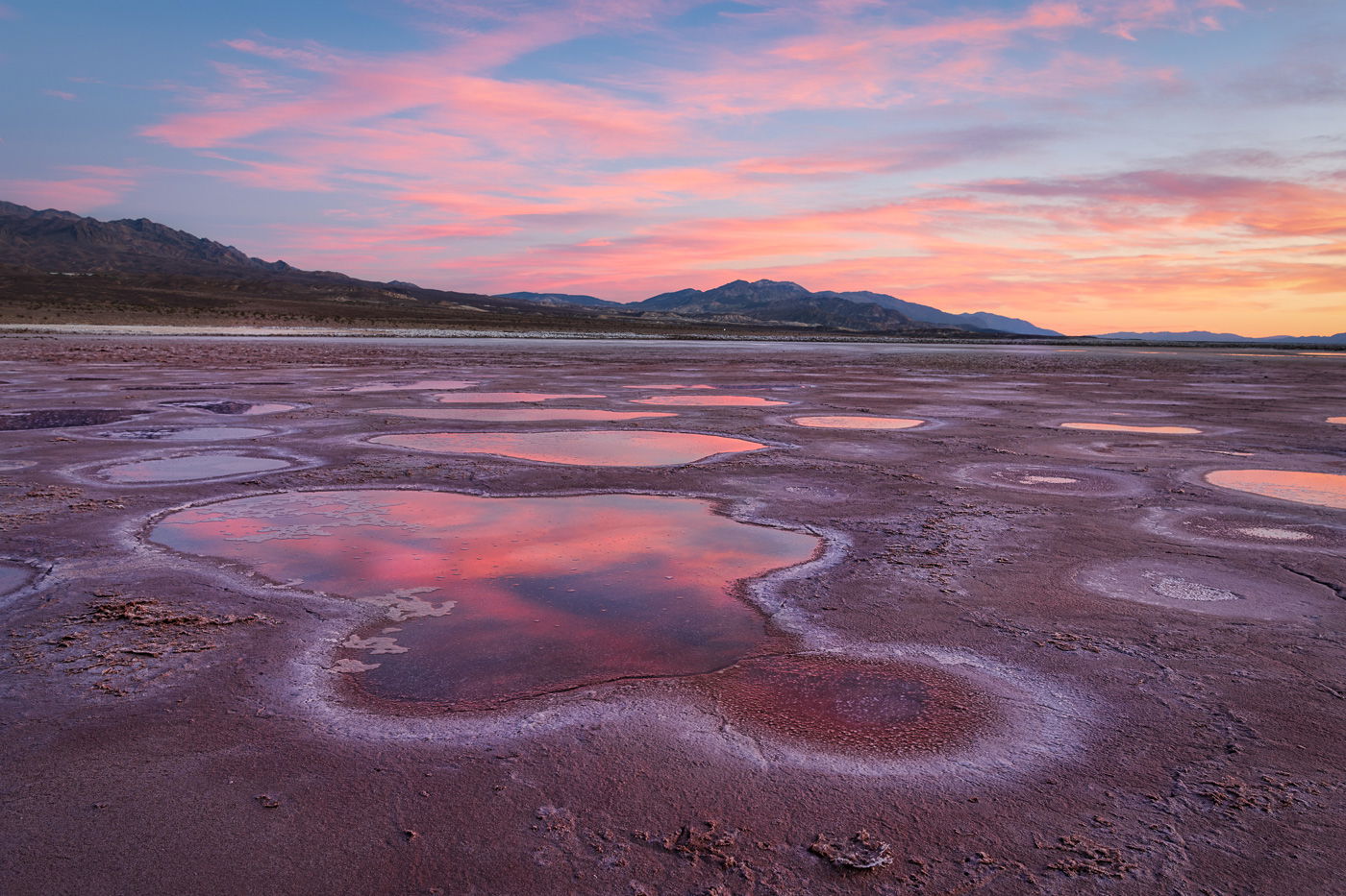
This was on a workshop with David Kingham a few days back - great experience, learnt a lot. Real processing is relatively new to me, since I am mainly a wildlife guy, trying to extend my territory !
What technical feedback would you like if any?
I am having monitor calibration issues which I think I have corrected to a large extent
Is the WB reasonable ?
Anything constructive is to be appreciated
What artistic feedback would you like if any?
Bottom center - are those 2 little mounds distracting ?
(If this is a composite, etc. please be honest with your techniques to help others learn)
1/3 sec ISO 100, F/8
If you would like your image to be eligible for a feature on the NPN Instagram (@NaturePhotoNet), add the tag ‘ig’ and leave your Instagram username below.
You may only download this image to demonstrate post-processing techniques.
Very nice photo. There are two changes I think should be made, but that’s just my way of thinking: first, the horizon appears to need some counter clockwise correction; second, the “mounds” you mention are distracting. I don’t think cropping them out would work. Removal would be better retaining the bottom space as presented.
This is a very nice image Karl, I love the repetition of the graphic shapes in the pools. The luminosity of the landscape looks fine, you kept the reflections in the water darker than the sky, yet maintained detail in the rest of the landscape. Yes, I do think the 2 little mounds are a distraction to be cloned away, they pull the viewers eye away from the pool. It’s minor, but I think the smaller of the two cutoff pools along the right edge is a distraction too. The large cutoff pool looks like a deliberate cropping decision, but the little one does not, so I would clone it away.
The WB and colors in an image are more of a creative processing choice, and not a function of your monitor calibration (all you need there is a reasonably accurate starting point). Color and saturation become a personal choice, and can be used to create a mood, or enhance the color contrast in an image for visual effect. In terms of saturation, many of us here at NPN would espouse the philosophy of process for impact, but keep it believably realistic. But there can also be personal latitude as to what is realistic.
This image was shot in twilight, which would naturally add a cool cast to the image. And the landscape has reflected light from the clouds, giving it a magenta cast. While these color casts are there in real life, in processing for creative effect you don’t necessarily need to limit your choices to replicating what you saw, as long as your processing looks believable. To my eye this image looks too magenta, and bit too cool. Here is a rework reflecting my personal taste, where in PS I used a Color Balance Adjustment layer to add green (opposite of magenta), and add red (opposite of cyan). I think this creates more color contrast in the landscape, especially note how the white salt rings around the pool look, they stand out more in the rework. Cloning of elements is included too.
A beautiful landscape from Death Valley. Love that sky and the foreground layout of reflecting pools is a beautiful compliment to the sky. You’ve captured and presented quite the glorious scene.
I love the colors as presented - the sky with these pre-sunrise clouds are beautiful and quite believable to me - We’ve all seen these skies and this looks true to me.
Ed’s edits are subtle, but his rendition works beautifully as well.
The only two minor nits/suggestions would be the horizon slant and the small piece of water on the right edge (Ed cloned out and looks good.)
I’m not bothered by the “stuff” along the bottom - it’s just a larger version of what’s repeated throughout the frame .