The photographer is looking for thoughtful feedback on the image as a whole, especially around the areas noted below.
Feedback Focus: Artistic + Technical
About This Image
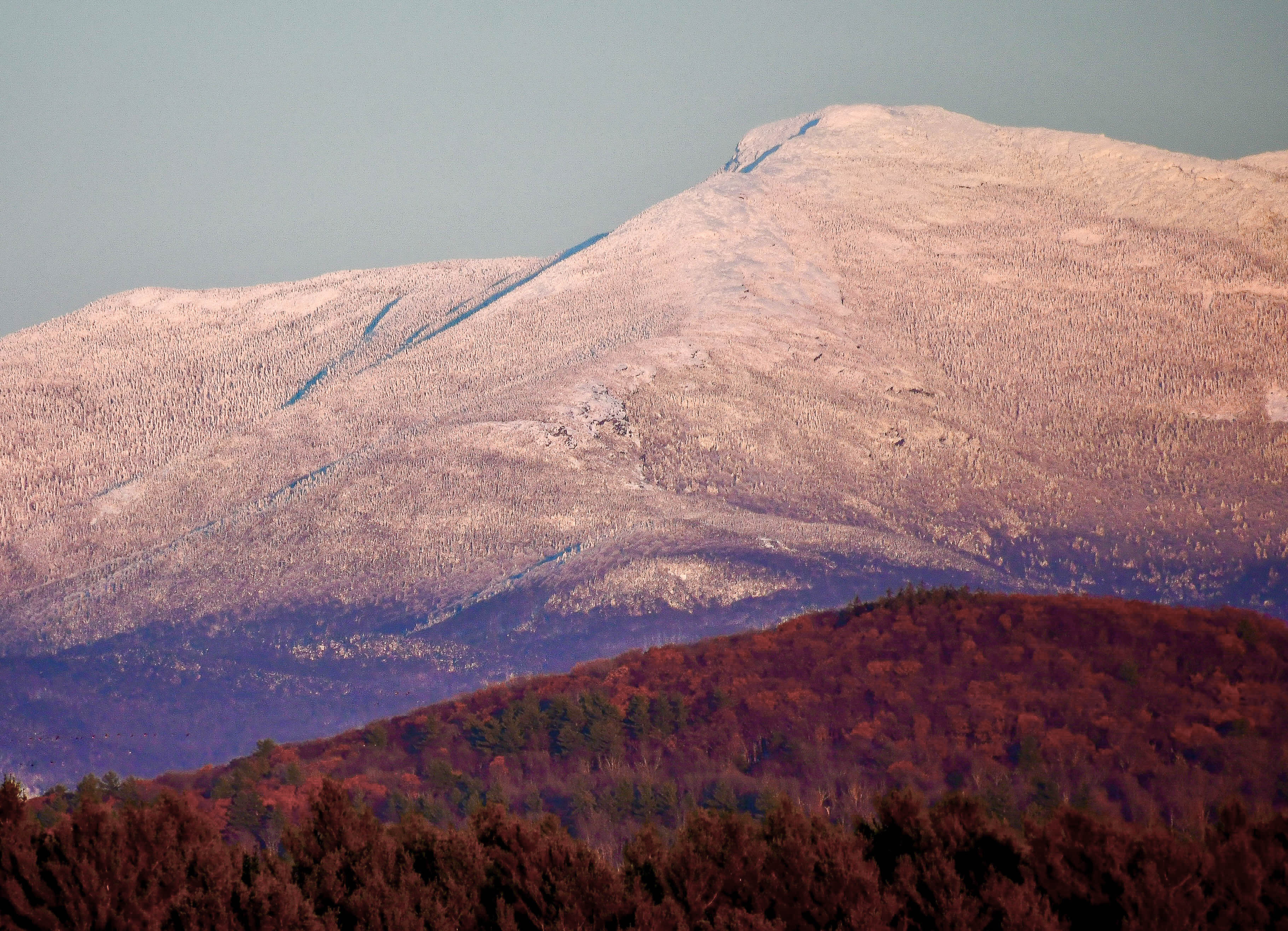
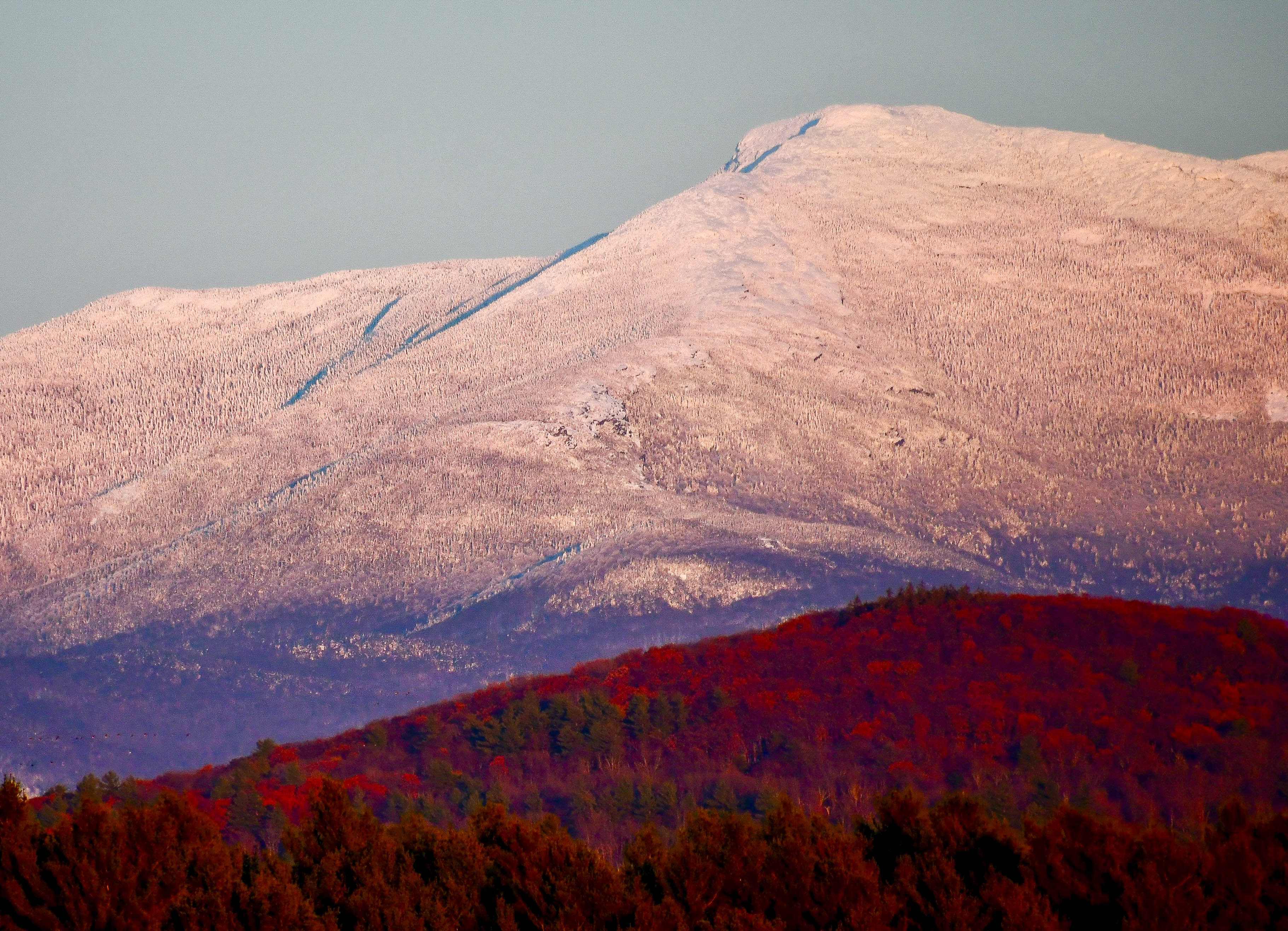
I dug into the archives for this one, to where I once lived near the base of Vermont’s Mount Mansfield. The early snow late in the day with the maple-colored hillside caught my attention.
Elizabeth: A pretty marvelous scene and I especially like your comp and the proportions of FG, middle ground and sky. I would like to see the FG opened up just a bit as some of the darkest areas look blocked a bit. I suspect your original is considerably better but when you post such a large image with lots of fine details the site does some fairly nasty compression. I would venture that if you sized this at 2000 pixels on the long side the result we’re seeing on our screens will match more closely what you see on yours. I’m speculating but I think this view is worthy of tweaking. >=))>
Very nice Elizabeth. Like Bill, I think the foreground having more detail would add. Since your depth is not coming from a focal point (or points), but from the difference between the foreground and background I believe this would help. Bill has a very good point on the sizing. I myself would process the foreground separately and then PS it in. But that is just a suggestion.
Elizabeth, the blocks of color work very well at separating the different portions of this great view. I especially like the quiet subtlety of the sky and the snowy mountain. I am thinking the the reds are over saturated and that toning them down would visually fit the rest of the view better. I do like the difference in red between the trees along the bottom and those of the first peak. It is a spectacular scene.
An amazing concentration of super saturated red in the forest, Elizabeth. It may be what you saw, but I do think backing off a touch would help the image. The composition with the masses of color works very nicely.