The photographer is looking for generalized feedback about the aesthetic and technical qualities of their image.
Description
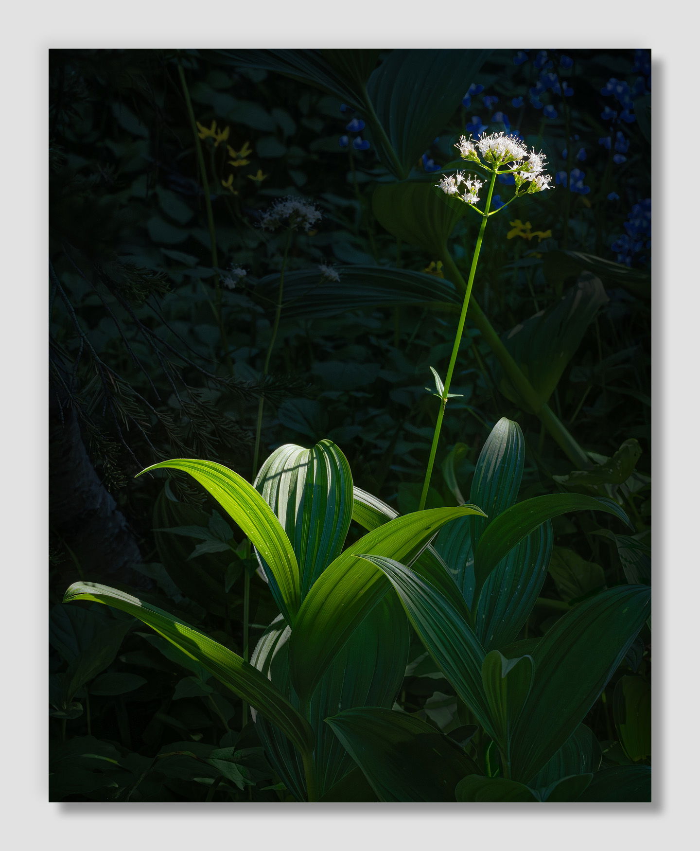
I was able to get away for a couple of nights to shoot the Milky Way last month, and while I was exploring views around Sunrise on Mt. Rainier I found this splash of light at the trails edge. (I’m not a member of Nature Second, so I stick to the trails up there.) The light was changing rapidly, but I was drawn to the way it was splashing on this little scene.
Specific Feedback
Shadow development is tricky. (Interestingly, my browser shows it slightly darker here than how it looks in Photoshop.) The jpg the camera shot is near black where the sun isn’t shining. How does it look on your end? Too much? To little?
All thoughts and comments welcome. It’s often answers to questions I don’t know/think to ask are super helpful.
Technical Details
NIKON Z 7II
NIKKOR Z 24-200 f/4-6.3 VR at 105 mm
1/800 sec. at f/16 and ISO 800
Handheld because I was using my tripod to briefly hold a branch out of the scene.
Critique Template
Use of the template is optional, but it can help spark ideas.
The shadows are perfect for me, just enough detail to set the environment but not enough to cause a distraction from the main subject. And you handled the light on it just perfectly. A very elegant photo indeed.
John, my review and thoughts are very much as @Youssef_Ismail has stated. The only item of change might be in the shadow cast. Is the blue more from the floral BG color or shadow blue? Just a thought for another look see there maybe…
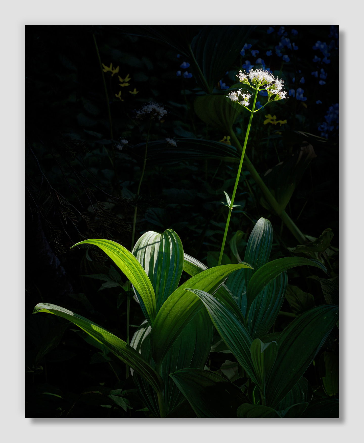
John, just a thought on the shadow area. I just selected the BG shadow area and brought down the Cyan -5 and boosted the Black +10.
This is quite beautiful, John. The long stem of the flower makes it look like it’s reaching out to catch the sun. This is just my personal preference and nothing else, but I would prefer even darker BG/shadows.
Hi John,
That’s what I call serendipity. The wildflower appears as though it is reaching out trying to bask itself in the sunlight. I had to chuckle when I read the part about the secondary use of the tripod. I often put my brother to use and he me when we encounter that pesky branch that is trying to ruin the image. I suspect you will get a lot of differing opinions on the shadows. For my tastes I could see them just a touch darker, but that is subjective and not a nit. Beautifully done. BTW, great job on holding detail in the whites of the flower.
A strong image that grabs your attention John.
Quite a lot of shadow detail on my screen adding context but not diminishing the overall impact.
(i often use my tripod to push down stinging nettles)
A very nice and although the shadows are strong, they are essential with details and patterns essential to the comp. The flower on the RH edge is the icing on the cake. I might fiddle with reducing the brightness of the highlights, but find the image fine as presented…Jim
It’s amazing what you can do with just light. Here it just outlines shapes. It just gives a hint of shape. The darks are really negative space and you just need a hint of information. I wouldn’t raise them any further or else they don’t fulfill their purpose. I’m going to go against popular opinion and say the flower and stalk aren’t necessary. The simpler the better.
Really great catch, John. I think the comp is great and the flower leaning toward the edge of the frame works quite well to balance the plant on the left. Nicely done.
John, this is a fine use of spotlighting. The white flower and its large flowing leaves are elegant, while the chorus is clearly there, but in the background. I too wouldn’t dodge the darks any further, in fact I wonder about a slight burning-in (or maybe desat) of the background flowers and stems only.
First of all, my apologies for not replying sooner! Last Sunday my wife started feeling off, and fully sick by Monday morning. When I got to work, I found that three of our regular doctors and two of our relief doctors were either out or recovering from COVID. I called my wife, who thought she had just a cold, and told her “Maybe you should test.” Sure enough, she was a strong positive too. Wonder of wonders I didn’t come down with it myself. I have no idea how I escaped, because I was surely exposed. Since I felt fine, that meant that I had to pick up a lot more work at the hospital, including a couple days I would normally have been off. Fortunately things are returning to normal, and I’m able to take a few days off and catch up.
Thanks for taking the time to do an edit, and your thoughts on the color. I’ll play with that. (I wonder how warming the midtones a little too would look?)
Man, I wish my brother lived closer! Thanks for noticing the flowers; I specifically worked on that.
I hate those things! Fortunately they are not common around here.
I was actually looking for something like you describe when I came across this. Unfortunately, the patches I could photograph from the trail were pretty eaten up and didn’t look good.
Interesting thought Mark. I’ll take a look at that.
John, very sorry to hear about the Covid attack. Apparently there is a later version called “Stratus” out now. I can totally feel the pain having had it 3 times even with the barrage of shots.
Be safe and help those who need the support…nasty stuff for sure.