The photographer has shared comprehensive information about their intent and creative vision for this image. Please examine the details and offer feedback on how they can most effectively realize their vision.
Self Critique
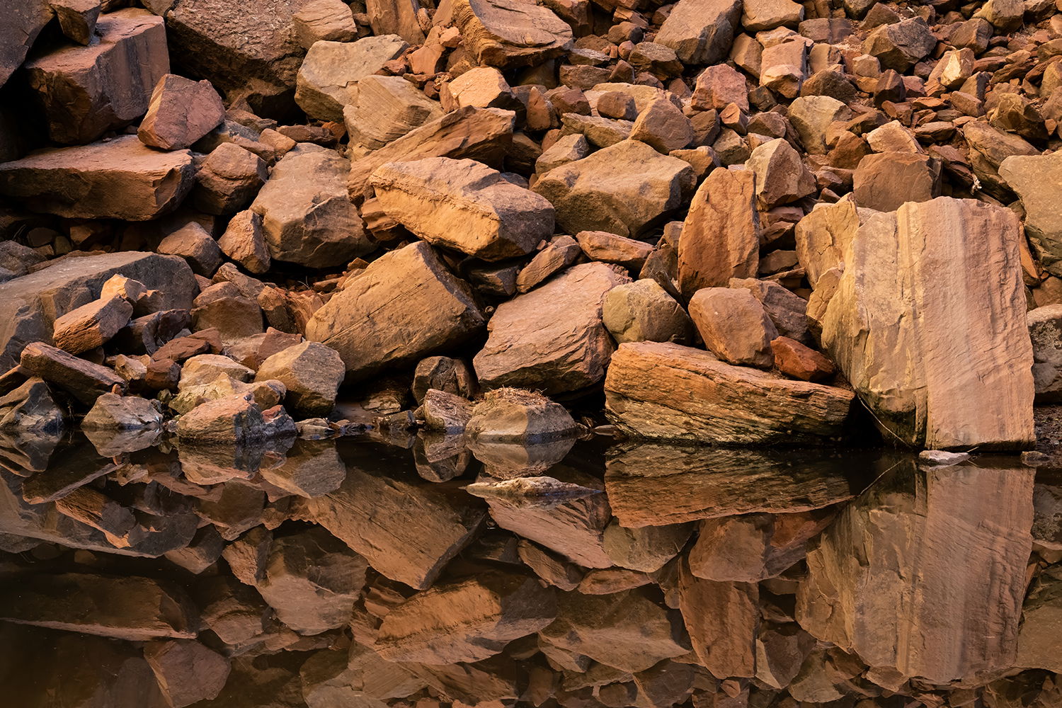
The location afforded a beautiful reflection of the boulders. I feel these were captured well. However, it feels a little unbalanced. Meaning that I think it would be more interesting to see more of the reflection than the boulders above. Thoughts? This is the full frame shot so don’t know how I would crop it.
Creative direction
My creative vision was to capture the reflection of the boulders having a symmetric POV.
Specific Feedback
Aesthetic: Feedback on the overall visual appeal, including color, lighting, cropping, and composition
Photographed in 2024 at Zion National Park. Captured after hiking up to the “Emerald Pools”. Small water feature that was very still. That combined with nice lighting provided for the right elements to capture the photograph.
Critique Template
Use of the template is optional, but it can help spark ideas.
Vision and Purpose:
Conceptual:
Emotional Impact and Mood:
Composition:
Balance and Visual Weight:
Depth and Dimension:
Color:
Lighting:
Processing:
Technical:
This is a alluring photograph. The lighting is very nice indeed and works very well for this subject. Its sharp and has loads of detail and a nice big print will be a great way to enjoy all that detail. The reflection is dead still and perfect. With regards to the imbalance you are referring to, what about a crop from the top so that you get a panoramic perfect mirroring and create a sort of abstract. It will be “balanced” top and bottom physically anyway.
I’m with the guys above. I like the idea of making it a perfect 50/50 split. I think, though I could be wrong, it might need a tiny counter clockwise rotation. Maybe a tish more texture for a bit of pop, but the color all feels right to me.
ML
I’ll throw in my 2 cents. I’ve been to this pool and it’s a beauty. You did a marvelous job representing that beauty in this image. The reflection is so nice! I do feel it is imbalanced and as Youssef suggested, a crop from the top that splits this 50/50 at the water line makes a pretty big difference. Outside of that, it’s processed perfectly and I wouldn’t change a thing.
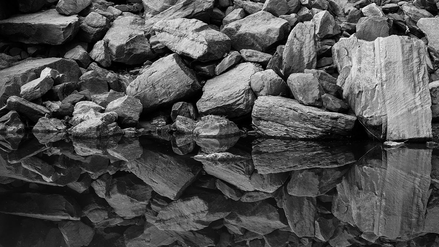
Thank you, @Youssef_Ismail, @Preston_Birdwell, @Marylynne_Diggs, and @Bret_Edge, for the compliments and feedback. I like the photograph overall, but it still felt a bit unbalanced. I converted it to a 16:9 crop, which was nearly a 50/50 split, and then made a small adjustment to include a bit more of the top reflected in the image. Here are the updated color and black-and-white versions.
Wow, this image really caught my eye. I love the colors and the amazing reflections. I agree with the above comments about cropping to achieve a 50-50 split. I like your 16:9 crop better than the original, but still would try to put the waterline exactly in the middle if it were mine. You might want to try a free crop to see if you can get it to feel more balanced that way. Like Marylynne, I also see it as a wee bit tilted. Your black and white version is also nice, but not as compelling to me as the color version.
I think @Youssef_Ismail’s crop suggestion was a good one, and the new version works very well.
My first thought on viewing this was “I wonder what this looks like in black and white?” I’m glad you added that version! Comparing the two, my preference is the BW.
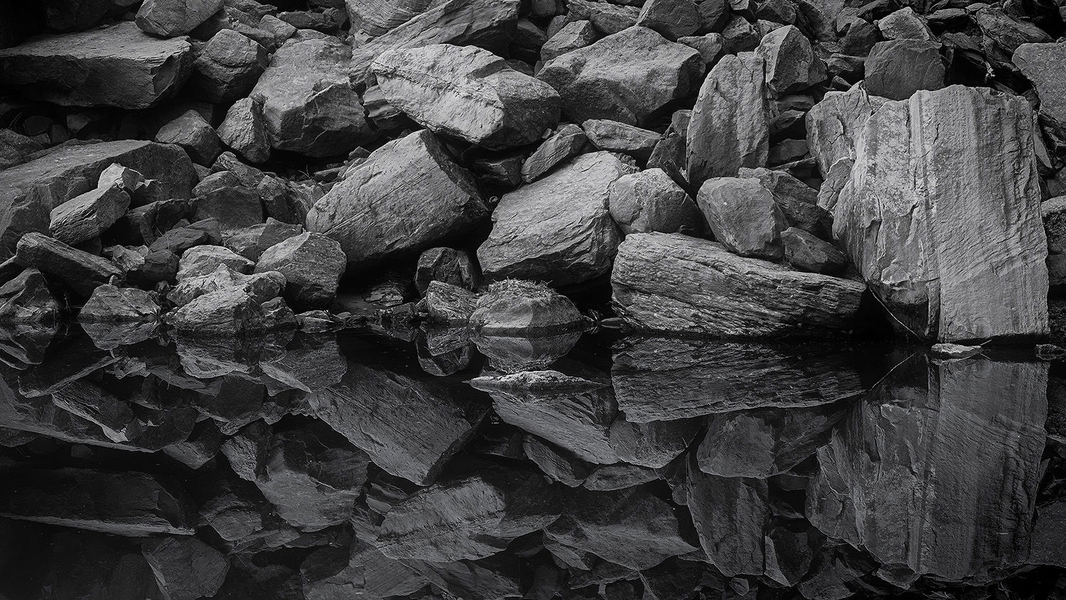
I was curious what a couple of tweaks to the black and white would look like (sharpening the reflection a little more than the rocks themselves, adding a bit of a vignette to the right side, dropping the brightest areas a bit to try and get a touch more detail, etc.). Not sure if any of it adds, but here’s what I came up with:
Thank you, @Cathy_Proenza and @John_Williams, for your compliments and thoughtful feedback. I enjoy the photograph in both color and black & white—the color version feels especially unique and reflective of Zion’s geology. The hike was early in the morning, and as the trail opened up to the Emerald Pools, the reflection was right in front of me. There wasn’t much water or many people, which gave me the space to take several shots.
I agree—the crop suggestion is exactly what I was looking for to create better balance. John, I really like your adjustments, especially lowering the brightest areas. Great catch on adding the vignette to the right side as well—it balances the left side nicely. The silver toning works beautifully too.
Thanks again to everyone who contributed feedback. Have a great holiday!
My first impression was I really like it but could have been made a little better with a 50/50 crop and a B&W conversion. So i’m really liking @John_Williams second rework with the silver effect.
Hi Stephen,
I am a little late to this conversation, but I have to say that I quite like the tweaks in the B&W rework from @John_Williams. I think they have elevated an already outstanding image another notch. Very nicely done.