Swimmin' Upstream +Edit

Reworked:

Original:

Critique Style Requested: Standard

The photographer is looking for generalized feedback about the aesthetic and technical qualities of their image.

Description

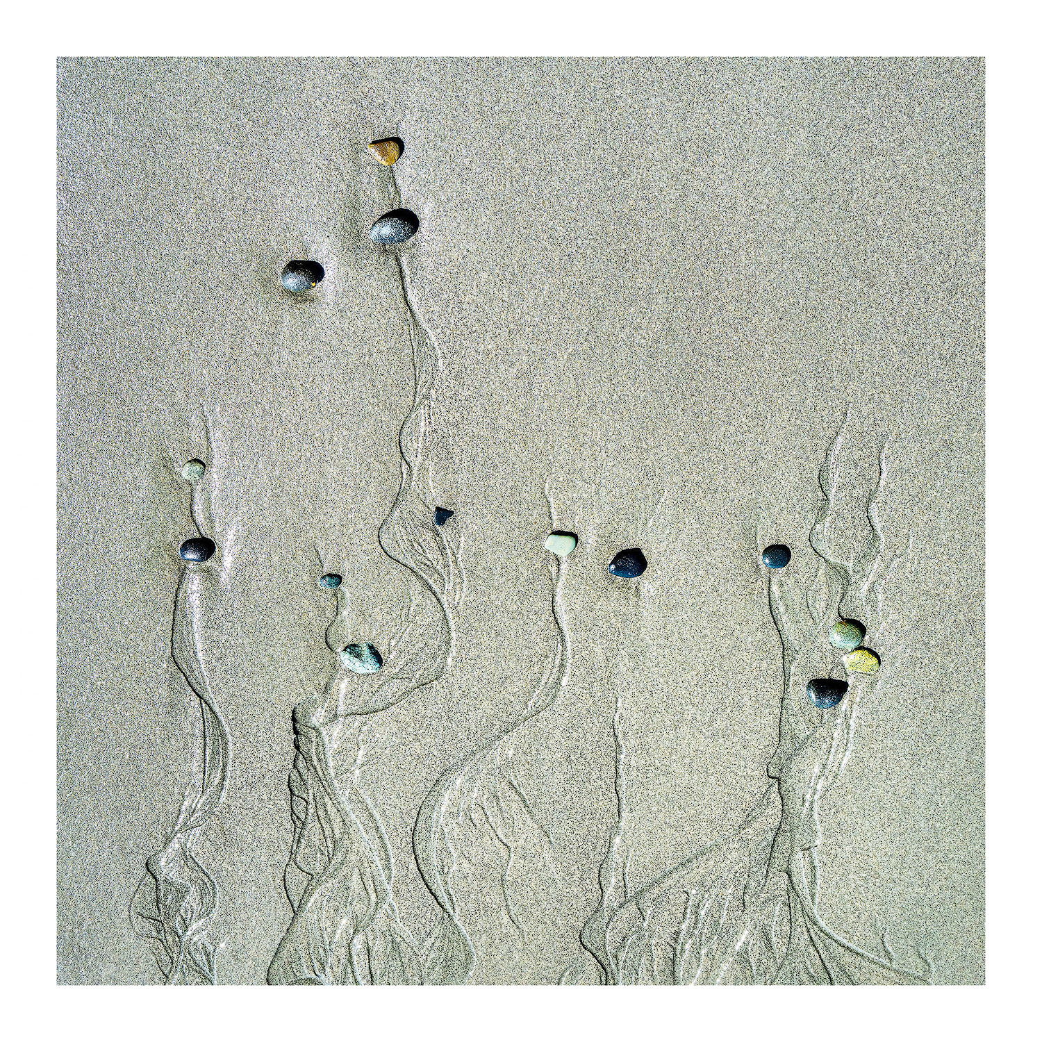
This was captured on a beach on the west coast of Vancouver Island last fall on a vacation to Victoria, BC. A fantastic vacation, although not a photo trip per se… but I managed to get in a few.
Most of the beaches we visited had little to no sand, mostly pebbles, stones and rock. Certainly a beautiful place that I hope to return to one day.

Specific Feedback

I’m curious to learn if anyone has the same reaction as my title suggests. If not, what do you see?

There was also an optical illusion for me that I can’t get back… just one of those things, once you see the reality, the illusion goes away for good. What I saw for a while while processing was that all the little polished stones were beneath the surface and revealed by the outgoing surf. I can’t really explain how or what my impression was, but no matter, the reality is as presented, polished stones on top of the sand with the trailing patterns from the receeding water. Do you see the illusion?

I attempted just about all possible rotations; the original full frame was a rotation 90deg ccw. Do you see a crop or rotation that works better for your eye?

Of course all comments and suggestions welcome!

Technical Details

Nikon Z7ii, 24-200mm @44mm. f/13 1/250th, iso250. handheld.
Cropped to square. Some dodging/burning, ACR, PS and Topaz Denoise


Critique Template

Use of the template is optional, but it can help spark ideas.

  • Vision and Purpose:
  • Conceptual:
  • Emotional Impact and Mood:
  • Composition:
  • Balance and Visual Weight:
  • Depth and Dimension:
  • Color:
  • Lighting:
  • Processing:
  • Technical:
2 Likes

Lon, nature provides us with so MANY opportunities such as this but it takes a good observer to find them. Many would walk by and never even look down. I’m guilty unless the normal landscape views are just not there at the time.
I can’t say I find a different look of crops and or rotations working for me personally as much as what you are presenting here. At first glance I thought it was a B&W presentation. After zooming in on the larger version and seeing the colorful highly polished stones it became apparent it was a color take.
No thoughts at this moment beyond a really neat find and enjoying the wonderful looking wispy trails behind each colorful stone.
BTW: any thought on trying the NIK polarizer on the scene in post processing? Just a thought here.

Lon: Since you asked and since I’ve made the same comment on other images, flipping this horizontally suits my western cultural bias for left to right movement across a page. However, I do find your orientation very pleasing and I think it does indeed imply your title. With that said my other first irreverent impression was, “sperm cells” :roll_eyes:. All kidding aside this is the result of attentive observation and compositional awareness and vision. A simple scene perhaps but a marvelous final result. >=))>

2 Likes

@Bill_Fach’s first impression was also mine, and now that is all I see. Your title reinforces my first impression. Great find and presentation.

There’s a NIK Polarizer tool? In which application? Or is it its own thing? I have only used Silver Efex recently, but I think I get the full suite “for life” or until they change that program ;-).
ML

Maryllynne, Filter>NIK Collection>Color Efex Pro 4>Polarization

1 Like

I totally see the “swimming upstream” theme. This is very cool! I also see the optical illusion where the pebbles look concave, not convex.

It’s just me, but I could see this being brighter, while holding the dark trails. Also, I could see them swimming upward:

Exactly, especially looking at the thumbnail.

2 Likes

I like how Bonnie raised the exposure but still kept the darks as they were.

Hi Lon,
This is so cool and the title is perfect as that was my first thought as well. There is a certain grace and elegance in this scene with the etchings in the sand as they trail out behind the stones. It definitely pays to look down once in a while. I could see the sand just a touch lighter, but that is minor stuff and more of a nit. The different colored stones are a wonderful find as well. Beautifully done!

I always love sand patterns. These are great, especially with the little multi colored rocks. I think I agree with Bonnie about having the line come up from the bottom. Just feels right to me. I also think brightening it a bit would be good, but maybe not as much as Bonnie’s example. All in all, I love this image.

I’m always on the hunt for scenes like this while strolling the beaches in Oregon and have yet to find anything even close to this good. It was interesting scrolling through the comments because as much as I like the original, I then saw Bill’s version and was more drawn to it and then I saw Bonnie’s version, which really hit home for me. Both the orientation and the brighter presentation sucked me in. All three versions are fantastic, though. Thanks for the inspiration!

Lon, this is a very intriguing view. The smaller version looks like you’ve placed various jewels near the beginnings of the water runs, since the stones are so shiny. The largest view shows me that they are stones. I like the horizontal view and how much branching there is on the right. It’s an amazing scene, well presented.

Thank you @Paul_Breitkreuz , @Bill_Fach , @Jim_Gavin , @Bonnie_Lampley , @Igor_Doncov , @Ed_Lowe , @Chris_Baird , @Bret_Edge and @Mark_Seaver !!!

Thanks for the comments and suggestions. I’ve posted a reworked version. Looks like the orientation can work with several different variations. I added a vertical rotation, but with the extended tails to the right instead of the left. More on this on Bill’s comments. I also agree with Bonnie and others about increasing the exposure a bit.

Thanks for the comments Paul. I gave up on NIK some time ago as I had been unable to keep it working (licensing.) I might just pursue it again for the use of a polarizing filter in the app. I’m quite certain I had a CPL on the lens, but for these scenes, I also remember NOT taking the time to rotate for effect. But certainly a good call.

This to me is fascinating. I know we’ve had discussions on NPN in the past on this topic, so I won’t belabor this too much. I too am a believer in the “western culture bias” (actually, not sure it’s a cultural thing, but more just simple written language,) where we in the West read from left to right and top to bottom. So I do think there is a bias we grew up with simply because of that left to right learning. Having said that, it still seems that within our western culture, we individually can see things in the opposite, while still calling out the left to right “culture.” For me, I much prefer an image to be open on the left, allowing the eye to flow “in” to the image from left to right. Conversely, you, and I’m sure many others, like the main subject to be seen first on the left… There is no right or wrong here. I find it fascinating how we each individually see things.

Thank you Bonnie! “concave/convex” - the words I was looking for! Glad you saw that too. It’s just weird, I can look at this and see the concave view, then turn away, look back and now it’s convex.
Also, thank you for the brightening suggestion. Good call. I brightened the rework, just not as much as your rendition; which looks great btw.

I appreciate all the views on orientation as well. I think this just might be one of those images that can work in just about any orientation.

Thank you again everyone!

2 Likes

Whew, thank god, I’m not going crazy. lol When I looked at the thumbnail a day ago it was horizontal and I saw the one now and it’s flipped. But I see you posted a rework. This is gonna sound weird but I think the title better suits the horizontal, cause that’s how we usually view a stream. But I do like the vertical lightened image better. Great eye to find and envision this image.

1 Like

Love this Lon! What a unique catch; well seen and captured. I definitely like the increased exposure, and interestingly am agnostic about the orientation; I think they all can work.

1 Like

I am so late here – great discussion and superb image!! I think the final version is beyond exceptional. The vertical orientation is perfect for me. It reminds me of sporophytes – the tiny spindly fruiting bodies of moss. But it is more otherworldly – maybe Martian moss. The trails toward the bottom keep me engaged for a long time. Any yes, I did the face/vase thing with the pebbles.

This is just SO cool! And congratulations on the well-deserved EP!

1 Like

Thank you @Michael_Lowe , @John_Williams and @Diane_Miller for your comments. And thank you for the EP! Wow, cool!

1 Like