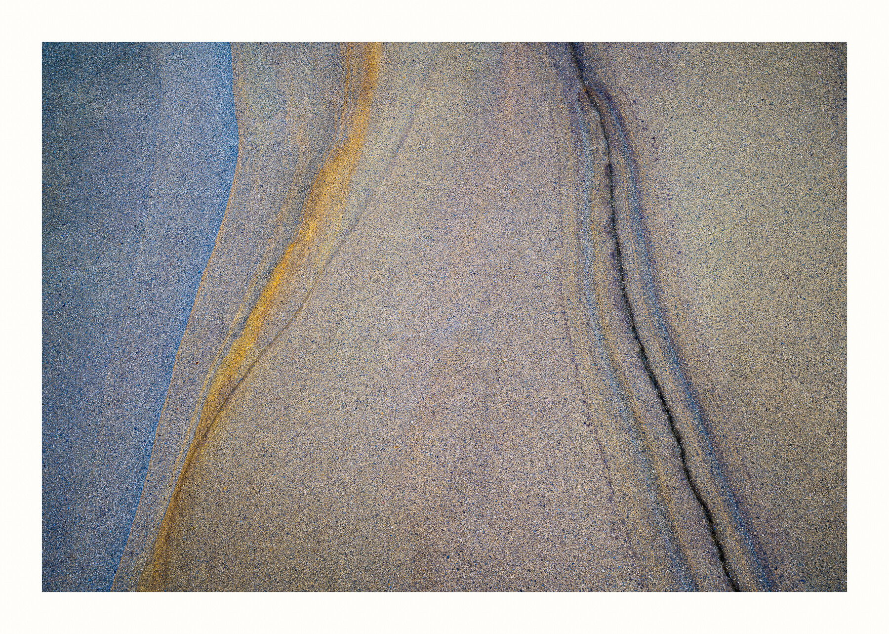
For fun I added another image in landscape mode. I actually made 5 different images from this one location.
This is another image from my recent trip a couple weeks ago to La Jolla. I went there to actually photograph small scenes, intimate scenes, abstracts and the like because I heard and have seen some really cool images from this area. I discovered that there are indeed lots of images to be had here and almost anywhere if you’re looking for them. I have shot this section of coast numerous times and never “saw” these types of images until I went looking for them. So I named this image discovery because I actually discovered that there really are images to be just about anywhere but you have to be open to seeing them.
Anyway, this is a very small section of coastal sandstone that’s about 2 feet on the long end.
Specific Feedback Requested
Is the upper left corner too dark?
Any and all comments and suggestions are greatly appreciated.
Technical Details
Is this a composite: No
This is a photo stack for depth of field using 6 images. Z711, ISO 125, 1/50 sec @f/10, 47mm, 24-70mm lens
This is beautiful David. Love it.
I sure love the simplicity in the vertical image (my favorite) as well the color balance.
The horizontal image sure works for me but , for me, lack the precision (booth aesthetically and as statement) from the, I believe, your main image.
I have no trouble picking out your work, David. Always carefully considered and composed around texture, colour and line. Of the two you’ve posted here I much prefer the first, the vertical in portrait mode. For me it is a much stronger statement because it does more with less. The second in landscape mode adds another element and while it is a very good image, it lacks the clarity and simple elegance of the first. I think, @joaoquintela makes a similar point.
Beautiful and elegant abstract, David. I much prefer the vertical. The horizontal strikes me as two distinct vertical images, the left and right. The lines, colors and textures in this one are gorgeous. Excellent work!
David, both of these look great. The vertical is simpler and has more of a sense of movement, while the extra contrast of the “line” on the right adds more drama and complexity. In comparing the two carefully, it looks like the first post is a vertical crop from the horizontal image.
Excellent David. I also prefer the first for its composition. The lines are all working together there while in the other they seem to work against each other. I am curious how you get that blue sandstone. Is that due to part being in the shade? There is no side lighting so that seems unlikely.
Both are very nice in their own way. The first is soothing with respect to form and colour by its simplicity. The S-curve divides it in two parts with luminosity contrast and colour contrast. The second image is symmetric with respect to form but not at all with respect to colour which gives a visual tension. But in a really pleasant way because of colour harmony.
David,
Both of these images are outstanding IMO. I went back and forth several times trying to decide which I like better and I am leaning toward the vertical because of it’s simplicity. You have nothing extra in the scene to detract from those lovely graceful bands of color. Beautifully done!
Superb image, David. I haven’t visited NPN for a while, but I had a free moment this morning so I popped in, and am glad I did so. My favorite is the vertical image - It immediately drew me in and once there, allowed me to search the scene over and sated my appetite completely. It has everything necessary (great colors, lines, textures, flow, and composition) but nothing extra or unneeded which could distract. In my eyes, this is a complete success, a masterful effort.
The landscape format doesn’t work nearly as well IMHO, as the dark opposing diagonal line completely overwhelms the scene and completely changes the entire feel of the image.
As for the upper left hand corner being too dark - not at all too dark for me. The gradation of tones appear normal to me and perhaps even adds to the scene. At worst, it certainly doesn’t distract from the scene in my eyes.
I don’t know if you offer your prints for sale, but I think it would be a very successful image in the marketplace matted and framed properly.
Wow, thanks very much Bill. Super excited that you really enjoyed this one. It’s very simplistic for sure and I’m glad that the upper left corner doesn’t bother you. I love the framing that you did to this. Is this a program that you use?
I do not sell my work but you certainly have enticed me into thinking about framing for a few of my images. It looks like an art unto itself.
Thanks for taking the time to show me the possibilities Bill. That was very kind of you.
No program, just added a combination of strokes and canvas additions in different colors. I usually play around doing this in order to get an idea about how I want to mat and frame my images.
I’m late here but have to add how much I love the images! The first is an absolute classic, and @Bill_Chambers’ framing is such a wonderful touch! The second may not be as elegant, but I think it stands up well as a composition because the darker shape on the right is fascinating in its own right and is beginning to converge with the lines on the left.