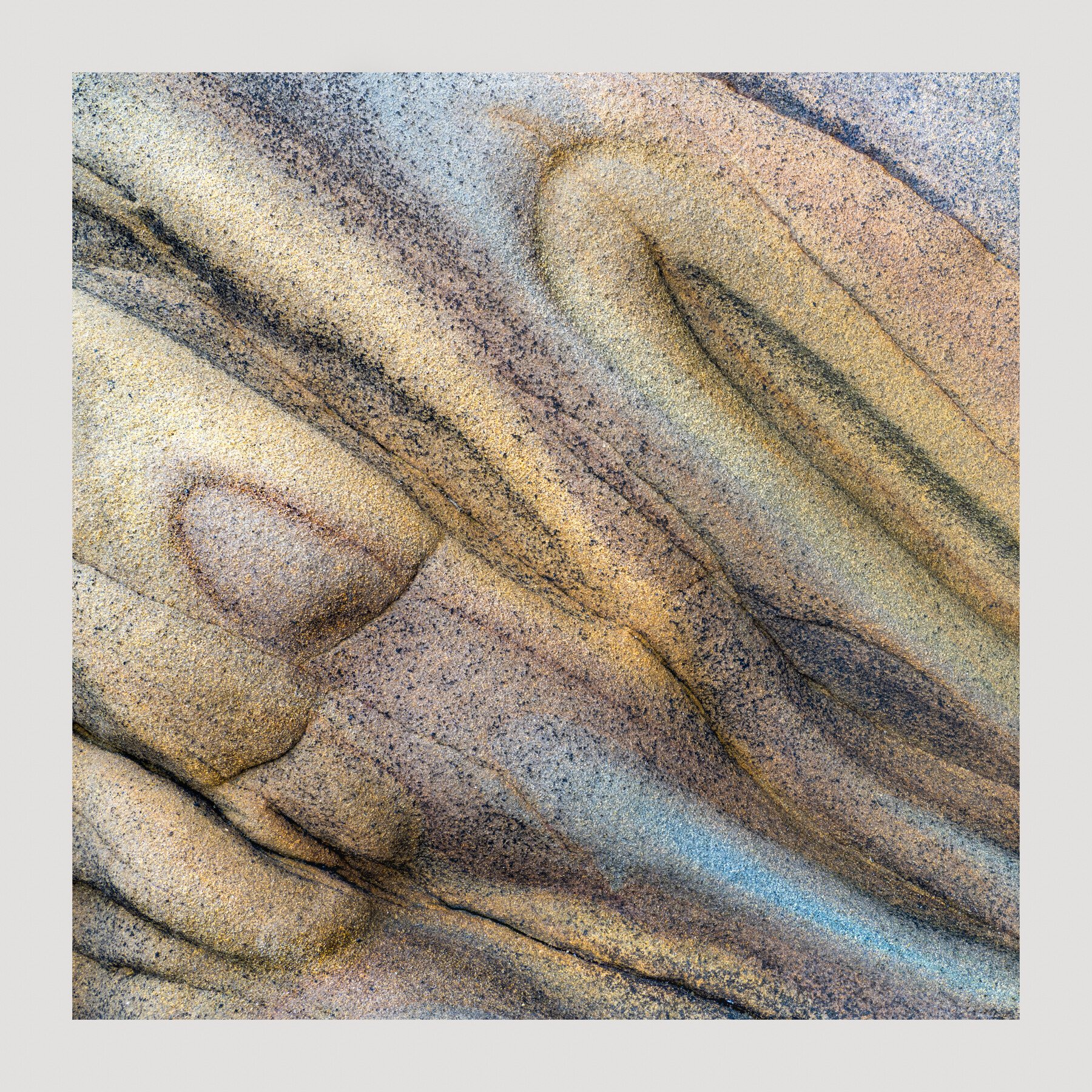
This image was taken at a beach near where I shot my last tafoni image in central California. I stacked 5 images because I was very close while shooting this and it was by no means a flat surface. I had good soft light since there were the typical clouds along the coast which made for even lighting. This sandstone grabbed my attention because of the various textures, colors, lines and curves. This was cropped to square because I didn’t like y original composition when I saw it on the computer. I did quite a bit of dodging and burning to bring out more contrast as well as a bit of color.
Specific Feedback Requested
This is not necessarily a cohesive image. As I stated above, I didn’t like my original composition so I cropped to square. Is this balanced enough with the varying elements?
Do the colors look ok?
Technical Details
Z7ii, 24-70mm lens @ 29mm, ISO 160, f/14, 1/6 second, shot in manual mode, 5 images focus stacked for depth of field
This photograph is very alluring. The soft color pallet is wonderful and is a great counter to the rough texture of the sand stone. You had perfect lighting for this subject and you capitalized on it.
Hi David,
I think I know what you mean about the image not seeming very cohesive. For me, the upper right feels like a different image from the lower left. The top is very fluid and rounded and the lower left has two things that kind of throw it off kilter: one is the resemblance of a face with bulging eyes and a mouth, and the other is the linear blue swath of stone. If you can find a way to eliminate the shapes that “look like something,” I think the image will coalesce better as an abstract.
I don’t know to what extent you cropped this, or how much more cropping can happen, but one of the creative aspects of abstraction is the ability to invert, flip horizontally and vertically, and even crop pretty severely to achieve different effects. If that sounds good to you, I would play with flipping first to see if it minimizes the impression of a face, and then also play with crops, potentially cropping off the entire left edge to the point where you retain some of the blues, but lose the “eyes, mouth and nose.”
Something like this, perhaps (just q quickie in Windows picture editor):
Oooh, what great texture. And I love the way the colors grade into each other. It does feel a bit unbalanced, though. I think that might be because of the distribution of shapes (longer-narrower vs. wider) and light vs. dark areas. I thought maybe rotating, also. Here are my ideas - lightened shadows (in what was your LRC) then adjusted clarity to get the texture back; lowered exposure in what was the ULC and at the same time brought up lights to make it more contrasty to match what was the LLC. Then rotated, because it felt more uplifting, in a way. Hope you don’t mind.
This is superb David. You really have a gift for this sort of image. The blue may be a bit strong in that area. I like the presence of blue but on my viewer it’s just a tad strong at its most intense areas. Maybe it’s just my monitor. Or maybe it’s me.
@Marylynne_Diggs , I like what you are thinking here. It’s definitely worth playing with. I appreciate the time and effort that you put into reworking this. You’ve got me thinking for sure. I don’t see the face or the eyes that you are seeing and that may be a good thing because that would become all I’d see but we all see things differently.
@Bonnie_Lampley , this is so well done. I hope you don’t mind but I posted your version up top. I really, really like the flip on this and I think it solves the balance issue that I had with it. Thanks so much.
@Igor_Doncov , Yep there is too much blue. I noticed it after I posted it but I thought I would see if anyone objects to it. It is meant to be more of a gray/blue rather than just blue. Good catch. How is Alaska?
@David_Haynes , I missed this post earlier. The sandstone is quite eye-catching! I like how you focused in on these patterns. And I do like Bonnie’s rotation for the “uplifting” lines and curves. Great job paying attention to all that was around you.
Challenging. It’s just too big. I can’t get my hands around what it is I want to photograph. There are no well known subjects and places to go to like the tafoni bluffs in central California. People come here to photograph wildlife or postcard scenic landscapes. However, I came here for the good light and there is plenty of that.
PS. I did manage to catch some decent sized graylings.
@Mark_Muller what do you mean by “Uplifting” ? Is it because you are “reading” the image from left to right the way we read text? Or are you referring to the sense of heaviness of the shapes and colors? In the original, the oval-ish shapes of the stone are up higher and as you move down and to the right, the lines appear to get thinner, while in Bonnie’s simple rotation the heavier shapes are on the bottom and get thinner as we move up and to the right in the image. Just wondering.
Yes, for me the heavier shapes at the bottom makes it seem more “grounded”, allowing the thinner shapes/lines to rise upwards. I guess I’m reflecting a bias to the natural order of things, and maybe gravity!
Wow, this is outstanding! One of those images that could be sliced, diced, rotated, etc. - there are many options here.
Been mentioned in one comment or another, but I too LOVE the colors and combined with the rough sandstone texture and details, just makes for a perfect marriage. (don’t think I’ve ever made that compartive comment before…)
I too see the “face feature” that Marylynne mentions. I’d go so far as to say I see a baby Bart Simpson… and sorry for those who now can’t unsee it…
And for that, I especially like Bonnie’s rotation. To me aside from any shapes or features, I do think the rotation did align and bring the image together better for presentation. Of course as I mentioned from the start, there’s plenty of viable options here - including Marylynne’s.
The only other feedback would be to also agree with comments about the long streak of blue. I think the core of that long piece could be brought more towards the other pastels in terms of tone and saturation. But that’s pretty minor.
Love this David! An awesome abstract, but we’ll take it here too!
Lon
Thank you @Tom_Nevesely, @Lon_Overacker for your comments.
I guess I’m not sure where to put these types of small, intimate landscapes anymore. Glad that this one could fit in either space. Thanks for that Lon.
The streak of blue is definitely an issue and I didn’t notice it until after I posted the image. It needs to be a gray blue with less saturation. Love the perfect mariage comment. You had me grinning. Oh, is the face in the LLC with a flat top head?
Thank you Tom. I’m glad you like the image. Always good to hear from you.