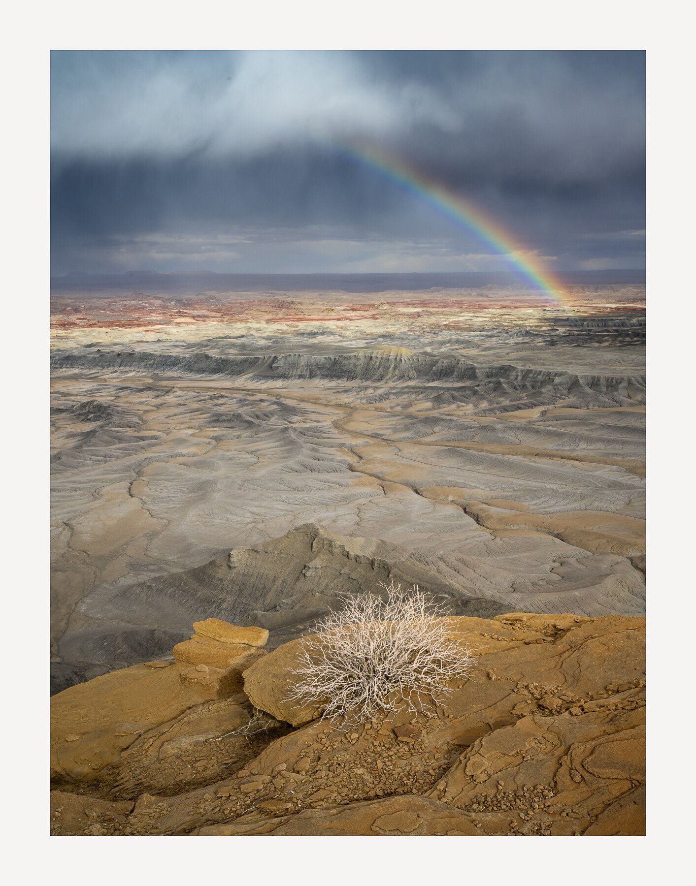
Yet another from my trip a few weeks ago. This was shot on the evening I arrived. I had about 2 hours of light after checking into my hotel room. The sky was really moody, it was raining in places but never where i was. So I made the short drive to a location that I thought would embrace the stormy conditions. On the way to the scene I saw a double rainbow. Thinking I would not have time to make it another 15 minutes to my set location I pulled the car over just to get a couple shots of the bow. They were right off the road and of nothing in particular and in the end were terrible shots. So I jumped back in the car, and drove as fast as I could on a rocky dirt road to try and get to my spot before it all faded away. Luckily it lasted until I arrived but faded out with about 2 minutes of my arrival. I know this location well so I ran to one of my favorite spots where there is this small, dead, desert bush, and the light came across the bush as I set up for my shot. This shot was when the double bow was fading and you can just make out the second bow to the right of the lit up bow. I actually love the simplicity of the single bow and the single focal point in the foreground but I’m posting a second image that was taken about 2 minutes prior to this shot with both bows lit in a landscape format.
Specific Feedback Requested
Which version do you prefer?
I had to clone my shadow out of the scene as the light was coming from behind near sunset. Can you see it or not?
Are the color tones ok?
Woops, I just saw the dust bunny in the portrait version.
Technical Details
Z7II, ISO 125, 24-70mm lens @ 32mm, f/16, 1/80th second, 2 exposures for depth of field.
Woah…what grandeur you got to witness. Very glad to have your skill on the spot, too. Both photos have their strengths. The simplicity and straightforward composition of the first is quite striking. There isn’t a lot to get lost in, but plenty to look over and absorb. The bush and rock nearest don’t compete with the rainbow or the far landscape in my opinion. It’s too pared down for that. I do wish the bush was off center though. Dust spot easy enough to get rid of. I hate it when I miss them, too. I did that just recently and had a dope slap.
The opposite is true of the larger landscape - there is a lot to get snagged on and I don’t find it as easy an image to get into because of that. But the staggering size of the scene is pretty jaw-dropping. You could try cloning out the green plant in the LLC if you wanted to maybe reduce the complexity of the foreground. That may help.
The colors look right to me - rich, but subdued and definitely in the earthy palette. Makes those rainbows really stand out nicely. I don’t see your shadow in either.
David, these are stunning images. With or without the rainbows they’re wonderful dynamic scenes on their own. I will always vote horizontal or landscape mode. However, this vertical or portraiture take is an exception to my longstanding default rule. I think here it’s the simple singular FG bush that works better for me overall.
Regardless, these are both wall hangers…
Two beautiful images! I have no real favourite, and I can more or less copy the opinion of @Kris_Smith .
The sky is a little darker in the larger landscape. If I would change anything, than I would darken the first image a bit. Something like the added image (cloned out the dust spot for you as well ).
No signs of your shadow. I suppose you didn’t bring a tripod, otherwise you could have walked a way a few steps and use the timer.
It is great to be in the right place at the right time with the right equipment and the good eye to see it. I think that you have two excellent images. I agree that a little border patrol, taking out the llc shrub helps the horizontal image.
Outstanding! What grand and dramatic landscapes - both of them. Well done!
Love the first one for it’s more simple and direct composition. Great use of the near/far composition. And how fortunate to have witnessed and experienced the storm and rainbow. I do like Han’s edit as the slight darkening, especially in the stormy clouds, is a little touch that makes the image even better.
The wider view is even more grand! The expansive view is even more impressive than the more intimate view. The colors and processing look great with this one too. My only suggestion would be to raise the darkness of the butte on the right edge and bring out a little more detail if possible.
I just picked up on this after looking at the large view - but at least to my eye, the foreground in the larger gives me the impression of a diorama. Does anyone see it? I mean, the only thing missing would be a cougar, mule dear or something in the foreground to complete the diorama. The quality of light on the foreground - and throughout this scene is exceptional. this belongs printed large and on display.
The landscape has it for me David. I like the way that the foreground leads us to the mid ground on the right hand side. I also think that Kristen has summed up the images very well.
I could happily view them without the rainbows…bit i have also done the crazy drive to get one in a shot!
A couple of great ones, David. Tough to go wrong with either, but I prefer the depth and grandeur conveyed in the landscape version. I took a couple of liberties and got rid of the green bushes. I also like Lon’s idea about the dark bluff, but very minor. Excellent conditions and take from this location!
Marvellous! I prefer the portrait version. Sure, this image would be wonderful even without the rainbow but the rainbow, a double to boot, is definitely there and for me, the star or, perhaps, the co-star of the show. The other star is that delightful round of brush, which truly grounds the image in all the depth and expanse. I guess I’m more attracted to the portrait because of its intimacy. To be honest, I care about the portrait version in a way that I don’t with the landscape version. In any case, excellent work.
David, these are both outstanding views. The vertical has a fine sense of a long view thanks to the foreground bush. The horizontal view shows off the details in the land spectacularly and feels more intimate due to the foreground ridge and vegetation swinging across the lower frame. The drainage pattern pulls my eyes to the left into the mid-ground, but then the rainbows pull them back and lead up to the clouds. The landscape view belongs on the wall.
I was all set to pick the portrait version because it was my favorite in the email you sent. It’s a classic David Muench image and you have composed it to perfection. But the landscape version, although not as strong a composition, gets my vote. It just holds more interest due to all the varied components. The white clouds are better separated and included. The splash of light is better because it surrounded by darkness which gives it a spiritual quality. The green bush is a good bonus. The edge of the promontory coming in from the right. The dark ominous bluff entering fro the right. All these add and make the landscape version richer and more interesting to explore.
Thank you for your input to the question, which do you prefer. Seems like an almost even split between the 2. That was my conundrum. I like each but for different reasons and they convey different emotions in me. So, in the end, I guess one is not necessarily better than the other, just different.
Kris…Love the idea of cloning out the green bush at the edge of the frame. See Harley’s redo. Thanks for your input. Hope you’re having a great trip in the badlands.
Paul,I think you hit on why I posted the Portrait version in the thumbnail. It’s the bush that I call, “The Watcher.” Thanks for your thoughts
Han…Yep, I processed the two images differently so they have a slightly different feel to them, particularly the sky. Did you just reduce the exposure globally? I like what you did. I actually did have a tripod and it was the tripod I had to clone out and not my actual shadow. It was in the lower left of the scene.
Don…Thanks Dan. I appreciate it.
Lon…As is typical from this view, there is generally so much going on that the scene feels like it can overwhelm the senses. Add in the double bows and my initial feeling was that it was too much compared to the much more simplistic portrait version and the little “Watchman” shrub, my favorite shrub at this location. Add in, that I didn’t have much time to frame this up as the bows were disappearing, so the foreground is a little bit cluttered with shrubs however, I really like what Harley did, particularly the left lower edge shrub. In the end, I guess it just depends how I feel when I’m looking at each of these as to which one I prefer. I do love them both. Oh, and I will go back and add a little bit of light to the right side butte. I didn’t even think of that. Thanks for your thoughts on these. And I do so a diorama. I’m thinking it just needs gumby and pokey out on the bluff with a little fire truck.
Ryan…I have many images without the rainbows and like them very much so I get your point. They certainly don’t make or break the scene. Thanks
Harley…Well done. I love the revision particularly the removal of the left edge bush. Not sure about the center green bush but it certainly has simplified the scene. Thanks for that Harley.
Kerry…I thought you might like the more intimate and emotional portrait Kerry. It’s the single bow and of course that bush all by itself overseeing the valley below. Thanks for taking a look Kerry.
Mark…I agree about the drainage pulling the eye and the bow pulling them right back into the frame. Thanks for your input Mark.
Igor…I completely agree about the composition being not as strong in the landscape version Igor. I also agree there is more to look at in that version and the light might be marginally better as well. Glad to hear your take on both of them. I always appreciate it.
No, I left the blackpoint and whitepoint unaltered, placed an adjustment point near the middle of the curve and pulled down the curve a little. This results in a darker sky with a bit more contrast, because the slope of the curve is steeper. The shrub stands out a bit more as well, because the light shrub is less affected than the darker rock.
But whatever version you prefer, all of what I have seen here in this discussion deserves a place on the wall. And it must have been great to witness this moment.
Hi @David_Haynes, what a fabulous image. It is absolutely gorgeous! I just love the vista of the landscape version. I can actually feel the vast expanse of space in which the whole scenery unfolds. The quality of light is superb throughout, but I particularly enjoy the warm light in the foreground where the level of detail is just superb (as it is throughout!). So much more to say, I wish I had the time to write a thousand words about this image! It is one of this images that captures the attention. One does not merely look at it and moves on. Nor does one forget it. It plays on the mind after seeing it, calling for one to return. And the story of the shot reminds me of Ansel Adams’ story about Moonrise in Hernandez… definitely one to print and frame and perhaps to submit to some top awards, it will win something guaranteed!
As for the vertical version, it is also beautiful but, to me, feels more isolated, colder, perhaps even a bit threatening. There is certainly no wrong choice here. Each image has outstanding qualities of its own.
The version with the green grasses cloned out removes “busy-ness” in the foreground where my eye tended to jump around a bit too much and focuses the attention on the unfolding landscape even more effectively. I’d never have imagined! It’s so interesting to read the suggestions: they’re all excellent! I’m amazed by the quality of the eyes looking… this community is definitely one of advanced photographers!
Wow! I really like everything about this scene, David. I like the grand landscape view the best, because it’s like steps going down and then leading back up again to the colorful rocks in the distance and like your going to be able to climb the steps up to the rainbows. I also really like what @Harley_Goldman did, by taking out the greenery it really adds to the sameness of the brown/grey rocky landscape and my eyes are led forward into the scene instead of stopping and noticing the foreground, which is neat too, but it seems to give it a cleaner look. Beautiful capture and I’m sure it was breathtaking to be there!
@Vanessa_Hill, @LauraEmerson, @Han_Schutten, @Lon_Overacker
Thanks very much for stopping by and letting me know what you think.
Lon…I’m glad you like that reference.
Han…Thanks for the information. I’ll give that a try for sure. I like what you did. Subtle but effective.
Laura…That’s the way to do this. Great comments and in depth evaluation. You’re going to fit right in here. Thanks so much for your feedback. The foreground greenery is one of the things that bothers me about the landscape version and oddly, I had never even thought about cloning them out like @Harley_Goldman did. I think almost everyone agrees that it improves the image quite a bit. I understand why you feel the way you do about the portrait version.
It’s funny, but I’ve never entered any photos in a competition before. Glad that you think this one would stand a chance though. Thanks for that. It might actually be fun but I’m not sure if it’s me. I’ll have to think about it.
Vanessa…I agree about removing the greenery. It unclutters the foreground and allows the eyes to wander in that crazy valley below. Thanks for your comment Vanessa.
WOWZER! Both images are exceptional; I like the more intimate feel of the vertical, but the landscape version gives the whole scene more breathing room, and I find my eye wandering longer in the latter. Brilliantly seen and photographed.
I think you composed this vertical scene quite beautifully, David. The way the desert brush points you up to the rainbow, which takes you to the mid-section of the storm before your eye is drawn back down to the center of the scene and the brush below it by the rain - though these individual aspects may not have been thought of in the moment, they certainly work well. And, as is often the case with landscape photography, I would not have guessed you to have rushed around so much prior to the capture of this photograph. For sure not my style of photography - there’s no way I could set up my large format camera as quick as you could your digital kit - but hey, it worked out well for you.
There is a sense of calm which I get from the piece, and, in a way, I am jealous of the desert bush, for I can only imagine all that it has born witness to over its lifetime while sitting on the edge there.
Regarding your specific questions:
The vertical is a much stronger composition. Just the fact the desert brush is isolated helps for the eye to go exactly where it should - as described above - and there is little chaos in the scene to cause distraction.
Had you not mentioned it, I would have never noticed your having cloned out the shadow; in fact, I still am unsure if I can pinpoint it, though I am not pixel-peeping or looking too closely at it.
As a b+w photographer, the color tones seem pretty natural. I would, perhaps, decrease the saturation of the yellows and increase the saturation of the blues; a bit of split-toning, so to speak.
Hope that all makes sense and is helpful, to some degree. Nonetheless, I love the photograph!