The photographer is looking for generalized feedback about the aesthetic and technical qualities of their image.
Description
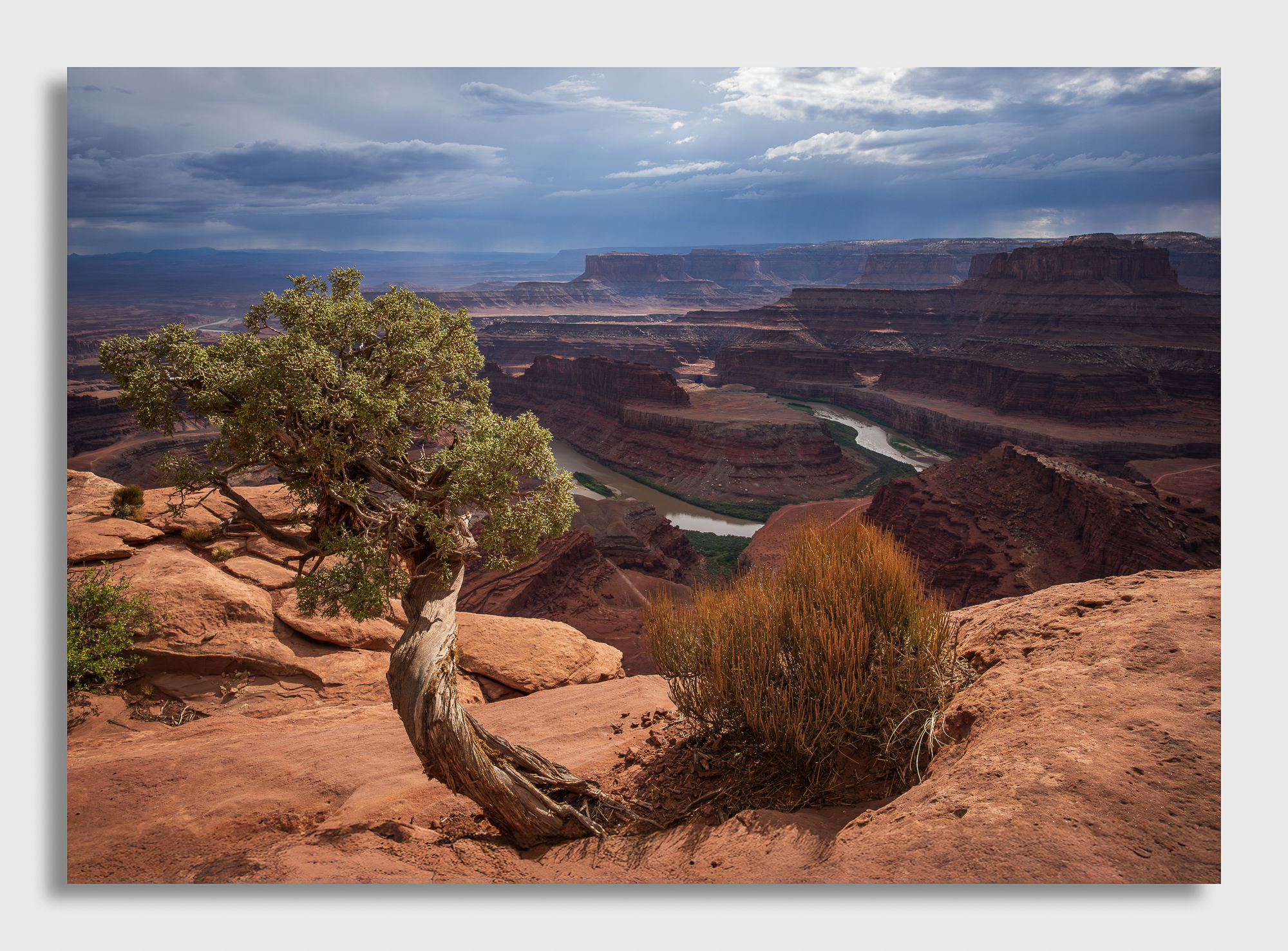
On my way to Yellowstone and the Tetons I had a couple of days before I was due to arrive at my campsite so I decided I would head over to Dead horse point since I had never been there before. I got pretty lucky with some storm clouds that had been following me the whole trip. I immediately avoided the look out point where all the tourists where gathered and went about my way trying to find a good composition. If you’ve even been there before, you know there are hundreds of small juniper trees scattered about that can be used for a foreground subject. I thought this twisted little fellow would do and he had a little shrub that kept him company on the cliffside. The storm that had followed me provided some nice mood to the sky while allowing enough light to shine through in a few locations. By the way, I think I might have been there around the same time when @Bret_Edge was there.
Specific Feedback
I’m not sure I like the little bit of shrub sneaking into the side of the imageBut when I moved to the left, the juniper began to cover up the bend in the river and when I moved to the right, the juniper and the shrub were too far to the left which left an open area on the right side of the frame. I didn’t want to clone out the shrub but I may end up doing that anyway. What are your thoughts on this.
The colors were pretty intense and I actually desaturated this ever so slightly. What are your thoughts about the saturation?
Anything else?
Technical Details
Z8, 24-120mm lens at 24mm, ISO 250, f/16, 1/500, Manual Exposure, tripod
Critique Template
Use of the template is optional, but it can help spark ideas.
Vision and Purpose:
Conceptual:
Emotional Impact and Mood:
Composition:
Balance and Visual Weight:
Depth and Dimension:
Color:
Lighting:
Processing:
Technical:
David, this is a great view. I agree that the colors look right. The stormy sky and the mix of sun and shadow work well for adding depth. The bush on the left doesn’t bother me at all, but I do wish that that great Juniper wasn’t touching the bottom of the frame.
Well done, David. I like the light, airy FG light against the foreboding dramatic dark sky. The shrub and the saturation are fine with me. The only small nit I have is the tree bottom cut off/ touching the edge.
I love this! The overall atmosphere with those stormy skies adds so much drama and yet, the image doesn’t feel too heavy or intense. To me, the colours look great and don’t mind the shrub sneaking in from the edge. If I could wish for anything it would be for a little bit more space from the bottom. Don’t get me wrong, this still looks pretty darn awesome though.
It’s interesting to read the comments and suggestions. All photographs are compromises. If you added space below the tree it seems to me the fg ledge would gain prominence and the canyon in back would lose some. That would change the feel of a tree in front of an abyss. So I think you made a good compromise.
What stood out for me is that parts of the brown bush merges in color and tonality with the canyon behind. In a perfect world it would stand out in the manner that the tree does. But this is splitting hairs, as is the bush on the left. I think you achieved really well what you were after.. These are the type of image that David Muench popularized 40 years ago and which I tried to emulate. Because I admired his work. Having a sunlit fg in front of a scenic canyon and stormy sky. What more could you ask for.
A very fine image, David. I’ve said this many times before but it is the bane of digital photography that it brings out the worst sort of perfectionism in photographers. Just because we can do something doesn’t mean we should. This photograph isn’t perfect not because of some failing of the photographer but because perfection isn’t possible and doesn’t exist in the natural world. The idea of perfection is a human construct and, as photographers, we really need to keep it in check (I know I do!). So, the bush in the lower left, where you’ve chosen as the cut-off point for the bottom, this is not what I’m looking at when I look at this photograph. What I get is a very strong sense of mood due to the light and colour. Through this image I have a sense of being there and the energy that you must have felt coursing through your body as this storm was brewing. This is a grand landscape in every sense of the word, and I envy your experience in having been there to make it.
Wow! As a desert fan, you’ve brought me back there, great shot, great light, great colors. I agree with you that the bush on the left is a bit of an eye drag. A thumb over it improves the image for me. I agree with Igor that the tonality of the bush on the right is unfortunately similar to the background, but perhaps some slight dodging could help with that? My only original comment is that the background mesas seem just a wee bit too clear – my feeling is that such vistas are usually a bit more hazy, but maybe it was the clearer air following the storm that dehazed it.
Ah, my backyard! This is lovely, David. I actually like the shrub as I feel it creates a sense of balance. You very obviously composed this in such a way to prevent the shrub from merging with the river, which would have been distracting. Beautiful light and sky, great composition, what else is there to say?
Hi David,
That is some impressive looking scenery. The warm light on the FG works quite well and contrasts very nicely with the blue tones in that stormy looking sky. I also love the shape of that twisted looking juniper tree; although I do find myself wishing it was not cropped where it is. The shrub along the left edge does not bother me as I feel that you have enough of it so that it doesn’t look like something that was missed. I don’t know if it is possible to dodge the brown shrub on the right to give it a little more separation from the rock in the canyon. The saturation is perfect for my tastes as it looks very natural. I hear you on avoiding the tourists. Very nicely done.
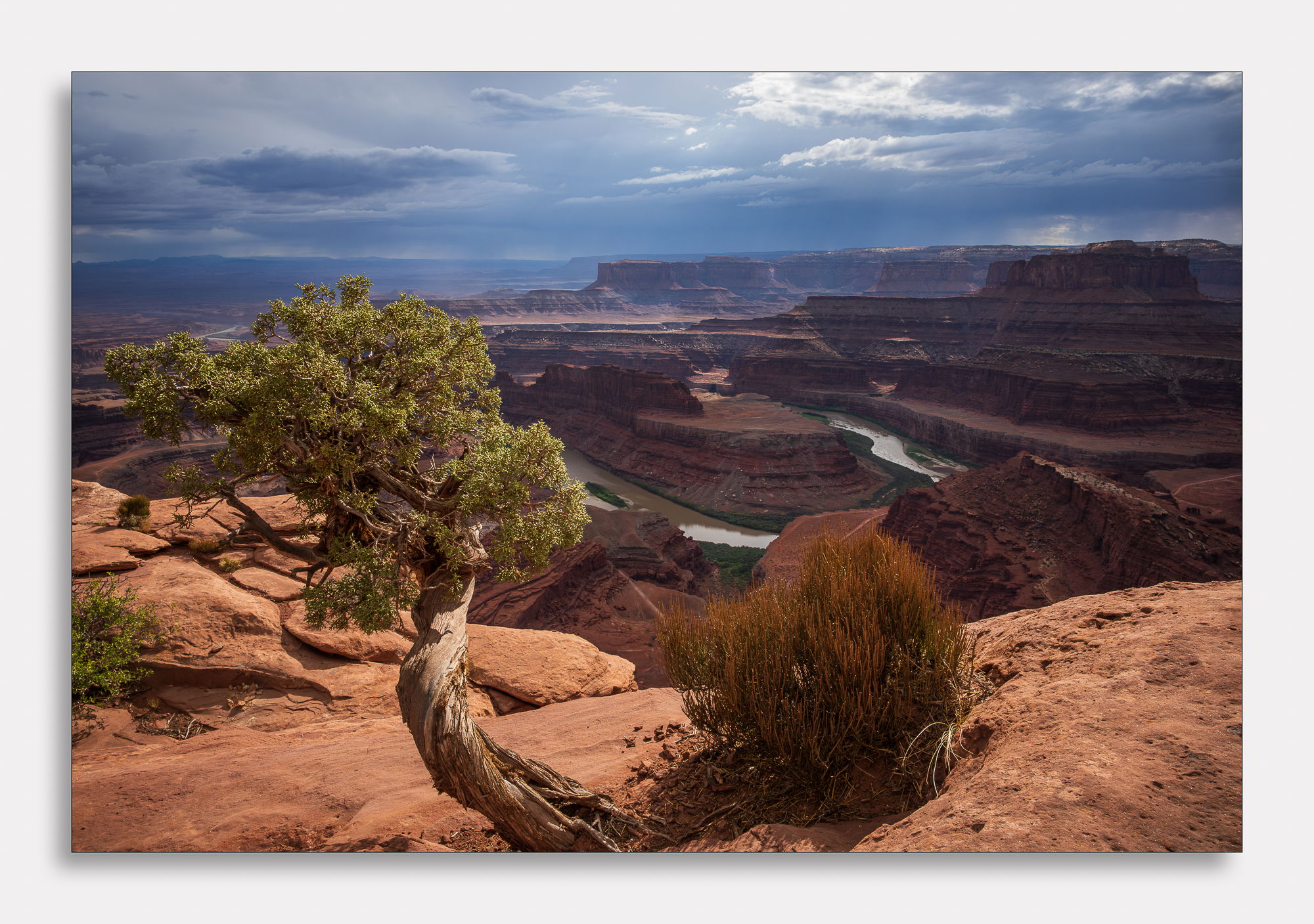
Nice work here, especially with the added canvas at the bottom.
I’ve only been to this area once, and I found it to be the hardest beautiful location to photograph. It’s one of those “make something with what you have” locations. It’s many factors: the inability to get the full river bend without illegal climbing and a fisheye lens, the people wandering in and out of your frame unless you are right at the edge, and of course parking.
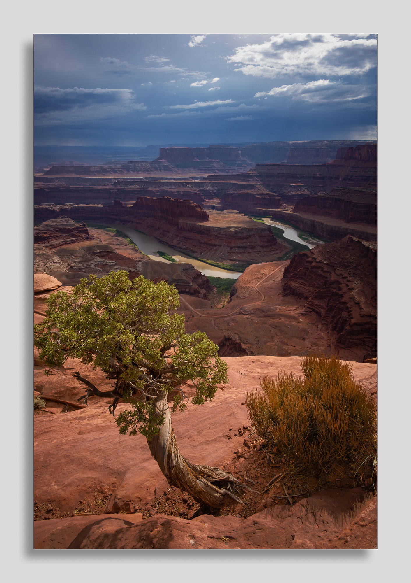
You did a fantastic job here with a wonderful sky and worthy foreground interest. FWIW, I think I like the portrait version best. It’s cleaner and pulls the eye deeper into the frame.
ML
I have to say I much prefer the portrait version. The foreground tree is clear of the canyons beyond, in the other versions it blocks the distant view behind the tree, which I thought was detrimental. It’s great you took shots both ways!