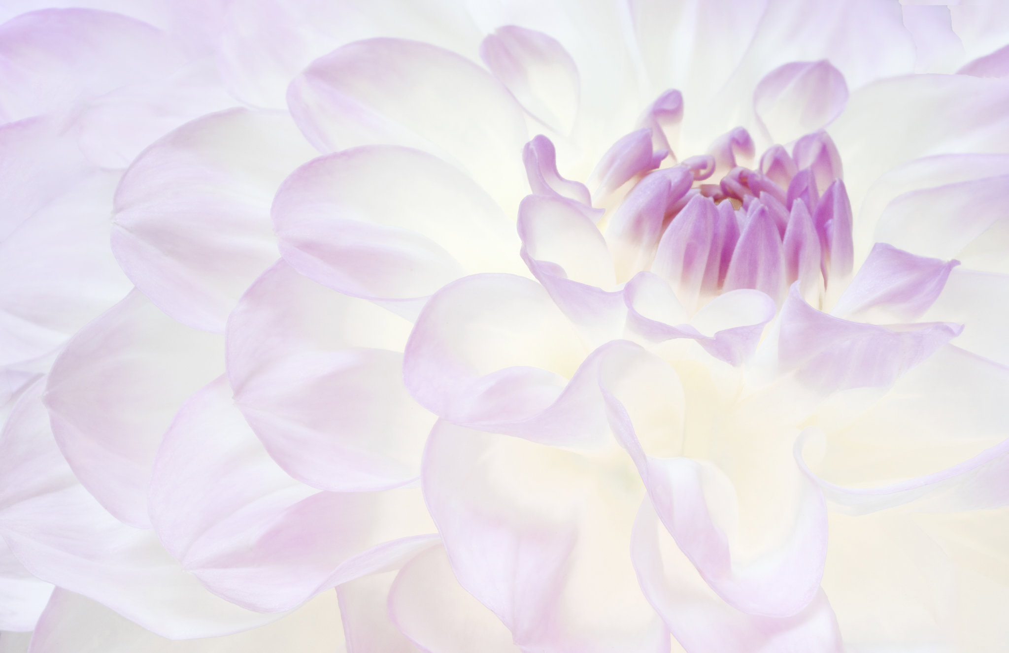
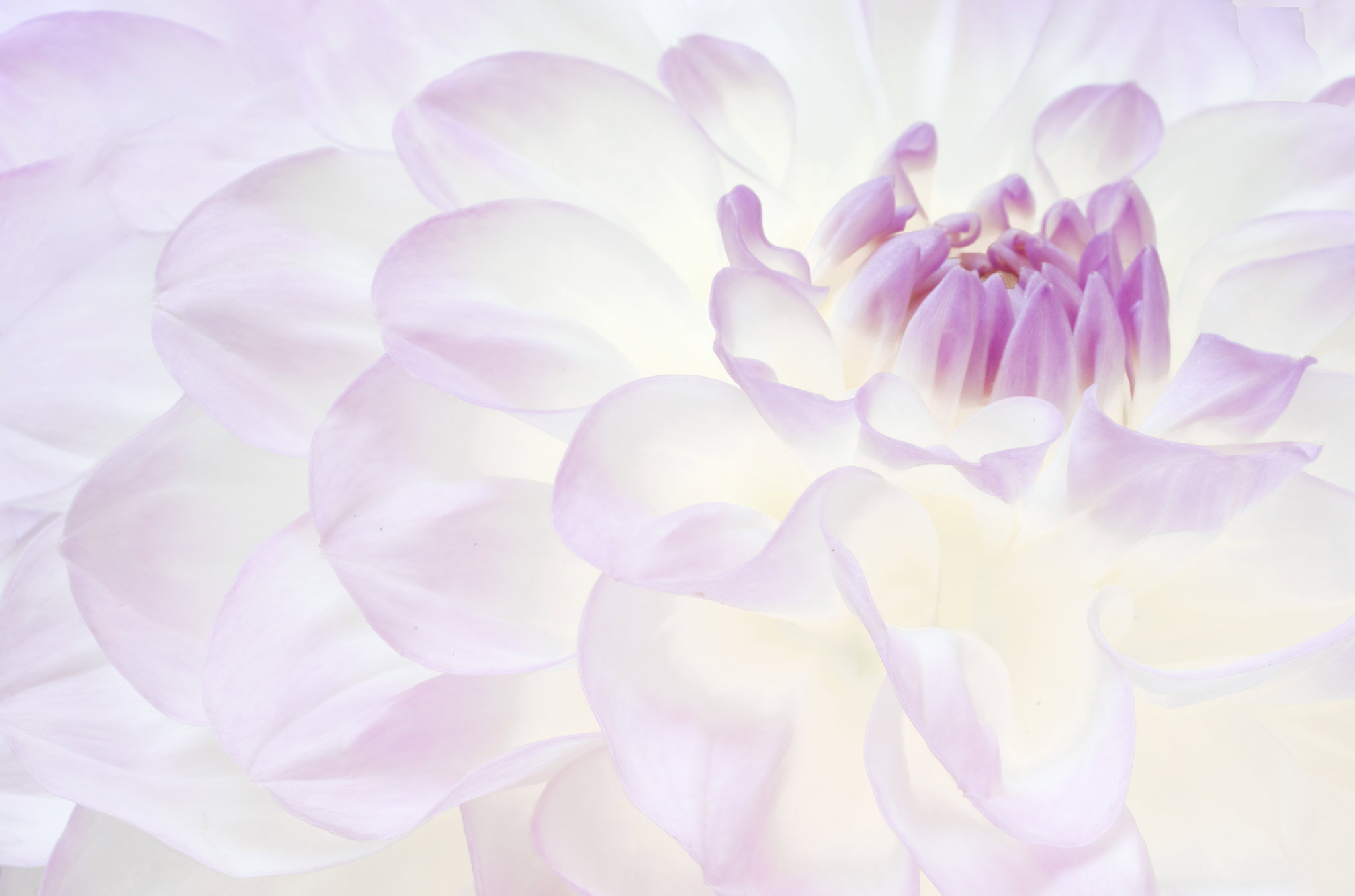
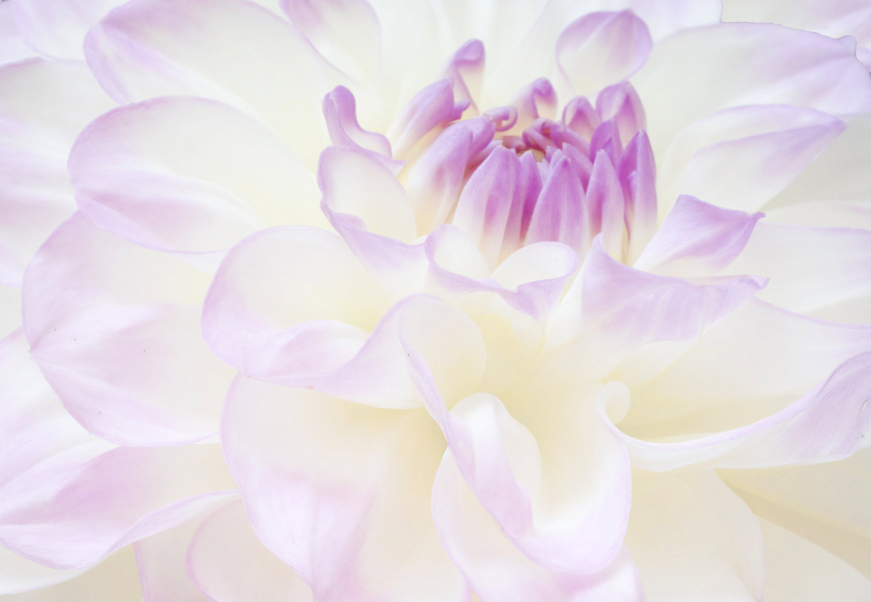
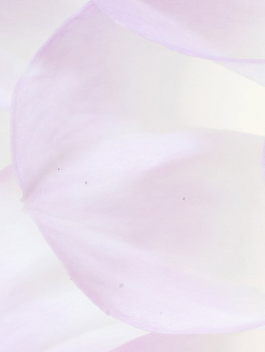
What changed: Since I wanted to add canvas on the top, I just started over with this one. Pretty much the same processing otherwise except getting rid of those dark spots and having to fill in more off the upper corners. As before, content-aware did a nice job on the upper left, but I had to use cloning in the upper right (content aware picked a petal facing the wrong way).
Added after receiving feedback from the community.
The photographer is looking for thoughtful feedback on the image as a whole, especially around the areas noted below.
Feedback Focus: Artistic + Technical
About This Image
This is the same flower as the previous Dahlia post, but taken the day before with the Sony half-macro 70-200. That meant that even with a crop I ended up with a bit of background in the two upper corners one of which content-aware fill worked pretty well in, the other of which was filled with old fashioned manual cloning (the background was gray foam core which didn’t fit the image at all well). Other than that I used similar processing to the first post, though the lighting left the lower part of the flower a bit darker, so I used a linear gradient to compensate.
Feedback Requested
I’m mostly curious about people’s reaction to the position of the core of the flower and whether it’s too high in the frame? Not much I can do about it in this image without radical surgery, but it would be nice to know for future attempts.
Technical Details
Camera: SONY ILCE-7RM5
Lens: FE 70-200mm F4 Macro G OSS II
Focal length: 200mm
Shutter speed: 1/13s
Aperture: f/22
ISO: 640
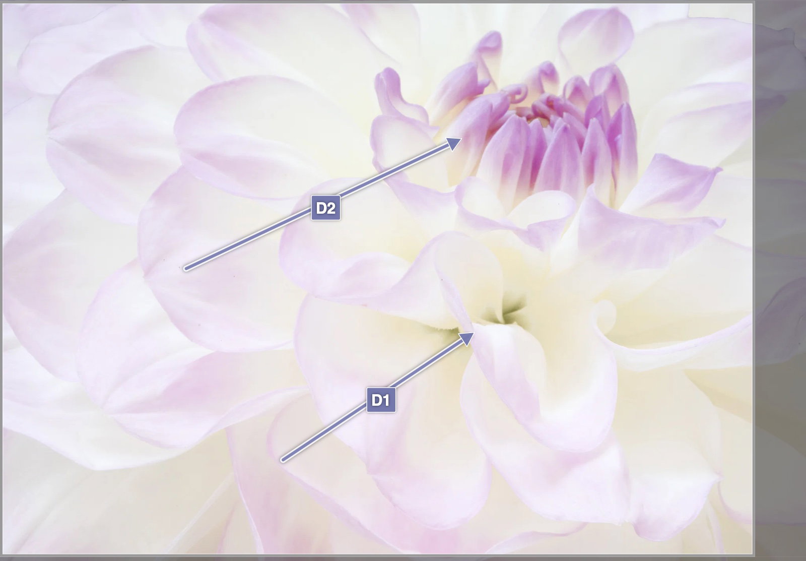
I thought the same as Huw about D1 - it could be made insignificant with a little cloning or color fill, as could the other small dark patch close to it, if you wanted. I don’t mind the original position of the petal clump. I like the diagonal flow very much, as well as the same cool colors you had in no. 1.
The lavender center of the dahlia is in the right spot for your comp. However, the center of the flower should be as sharp as the other petals. The linear gradients look fine to my eye. The dark shadowed wrinkle in the single petal is nice, but with only one, it tends to pull my eye away from the center. Well done for capturing this very challenging subject…Jim
Dennis, you’ve succeeded in getting another nicely dreamy look at this Dahlia. I do like the emphasis on the central petals. Removing the dark bits would add to the dreaminess, but they do add some extra context and interest.
Got to love this - so soothing - perhaps a little too off to the upper right ? I understand you do not have leeway, so i took the liberty of playing around a little - recropped, removed those 2 darker distractions , a slight vignette and a subtle boost in saturation - all personal
Dennis: I’m commenting on this one before looking at your previous post but my first immediate impression was that the flower center is a bit too high. The other small nits noted by the others really don’t bother me much. The color palette carries the day for me. Beautiful subject nicely presented. >=))>
And that was my comment before the revision! And so you most certainly elevated this one to another level! I love the dreamyness, the bright and cheerful mood and the colors/sat are just wonderful.
I didn’t mind the darker area in the original, but will say I much prefer the reworked version!
A couple of comments/suggestions to maybe take this another step up. First, I thought the original was a little tight up top. Just right on the edge of wishing for more room. There’s just enough space as presented, but even the notion that it feels like it needs more space, just raises the question, which actually is a distraction (for me) - if that makes sense. And so speaking of the space, you had less on the top and more on the right in the original - but now there’s more on the top and less on the right? In my view, if you had the equivalent space on the right as the top, it would “feel” more comfortable as far as positioning goes.
The last tidbit I wanted to mention, I really hate mentioning. Yeah, I’m that guy who pixel peeps and looks for specs of dirt and dust bunnies. I don’t mean to offend or waste time, but it’s just my nature. I go by a couple things: One, "Make the image the best it can be,’ and Two, I want my work to be “clean” and free of these things - for the reason of hypothetically having my image printed, framed and hanging in a gallery. That said, there are a number of tiny specs of dirt, or something scattered around. Most of these specs are found in the bigger petal left of center. Posting cropped for illustration.
When it comes to Critiques, there are a couple schools of thought. There are many who don’t want to hear technicals like color, white balance or there are dust bunnies… they want their image viewed on it’s artistic value, meaning, story, etc. etc. I completely get that. And I do my best to critique in that way, however, those little technical nitpicks I can’t ignore as it takes away from me spending more time on the artistry of the image. Hope that makes sense.
And I thought I’d been so careful at getting all those little specks. Don’t hesitate to mention them on my images. It depends on the image, but I usually try to remove that kind of thing. Revision II coming up soon.
I like your revision, Dennis, and the extra canvas helps. I like that you positioned the core of the flower off center and the softness of the image. Removing the darker areas below the core was a good idea to help enhance the dreamy effect.
That last revision is great Dennis. I am coming way late and just get to enjoy the evolution. I at least wanted to say that this, for me, is a very unique take on a flower shot. A work of art my friend. Good job.