The photographer is looking for generalized feedback about the aesthetic and technical qualities of their image.
Description
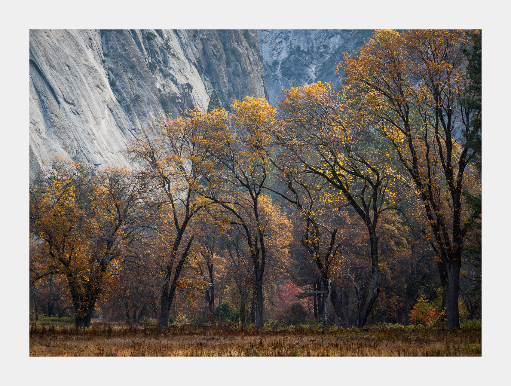
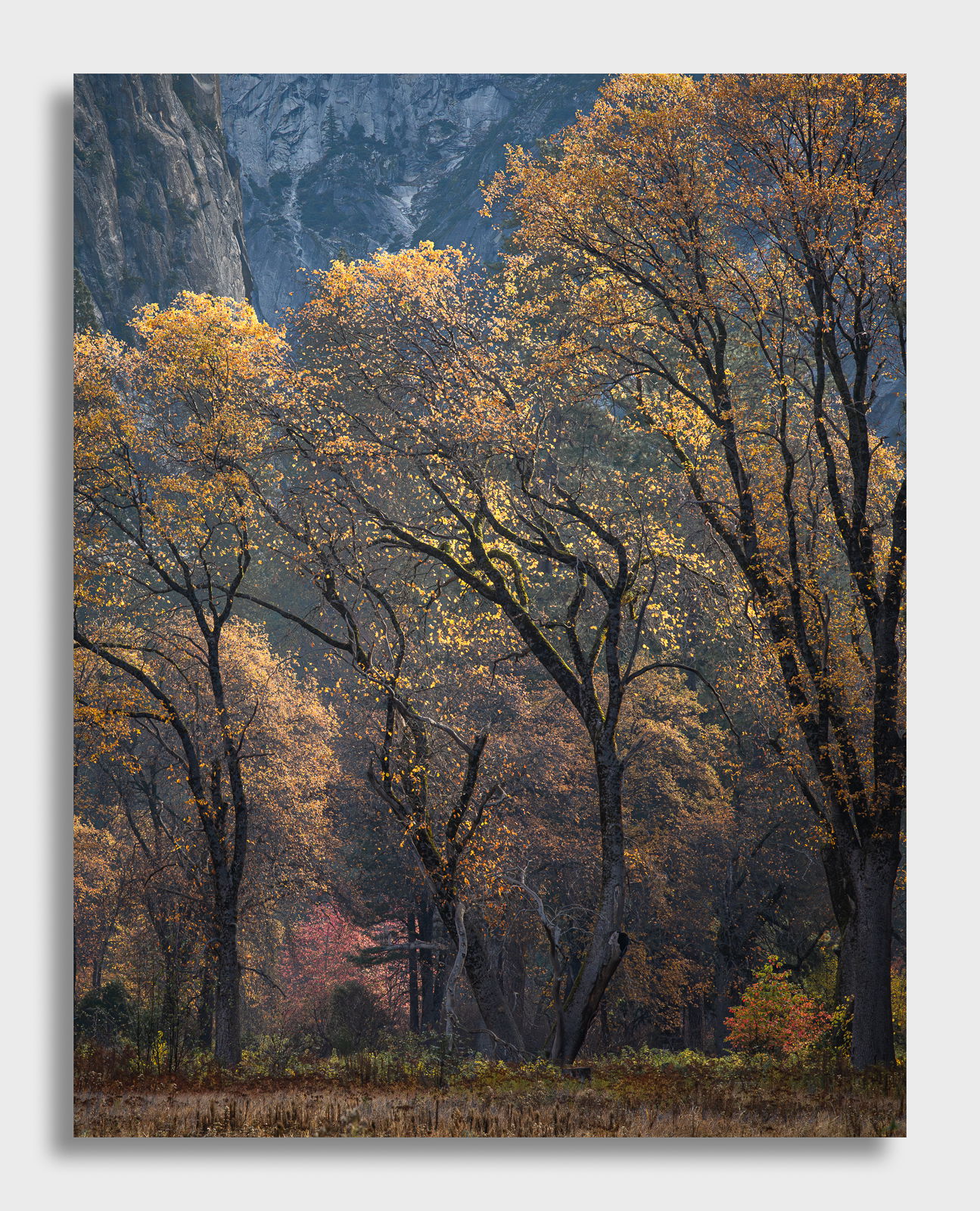
More Fall colors images from Yosemite a couple months ago. This scene was backlit in the early morning down on the valley floor. What intrigued me the most about this scene was the combination of Fall colors being backlit and the bending tree trunks which, at least to me, give this scene a little whimsical feel and look to it. A little bit like my last tree from Yosemite that looked like it was dancing. I get that same feel out these trees.
Specific Feedback
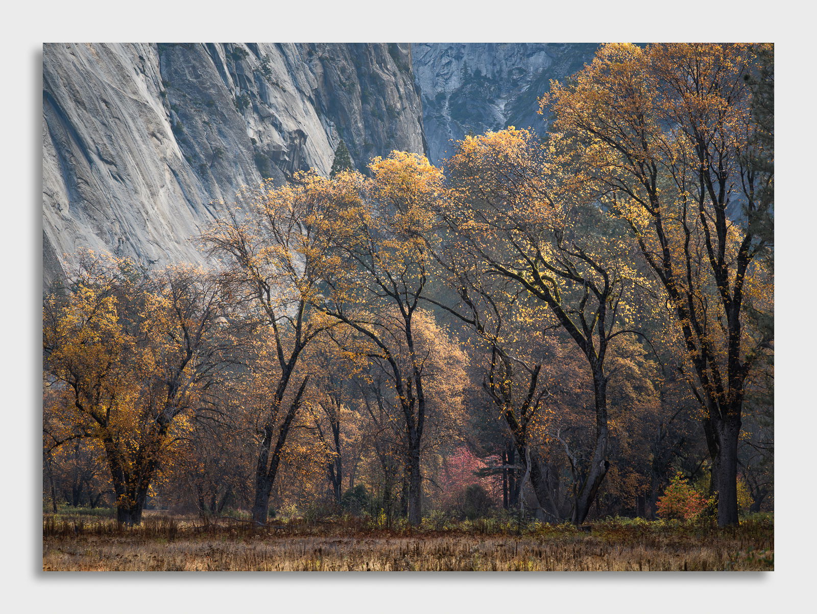
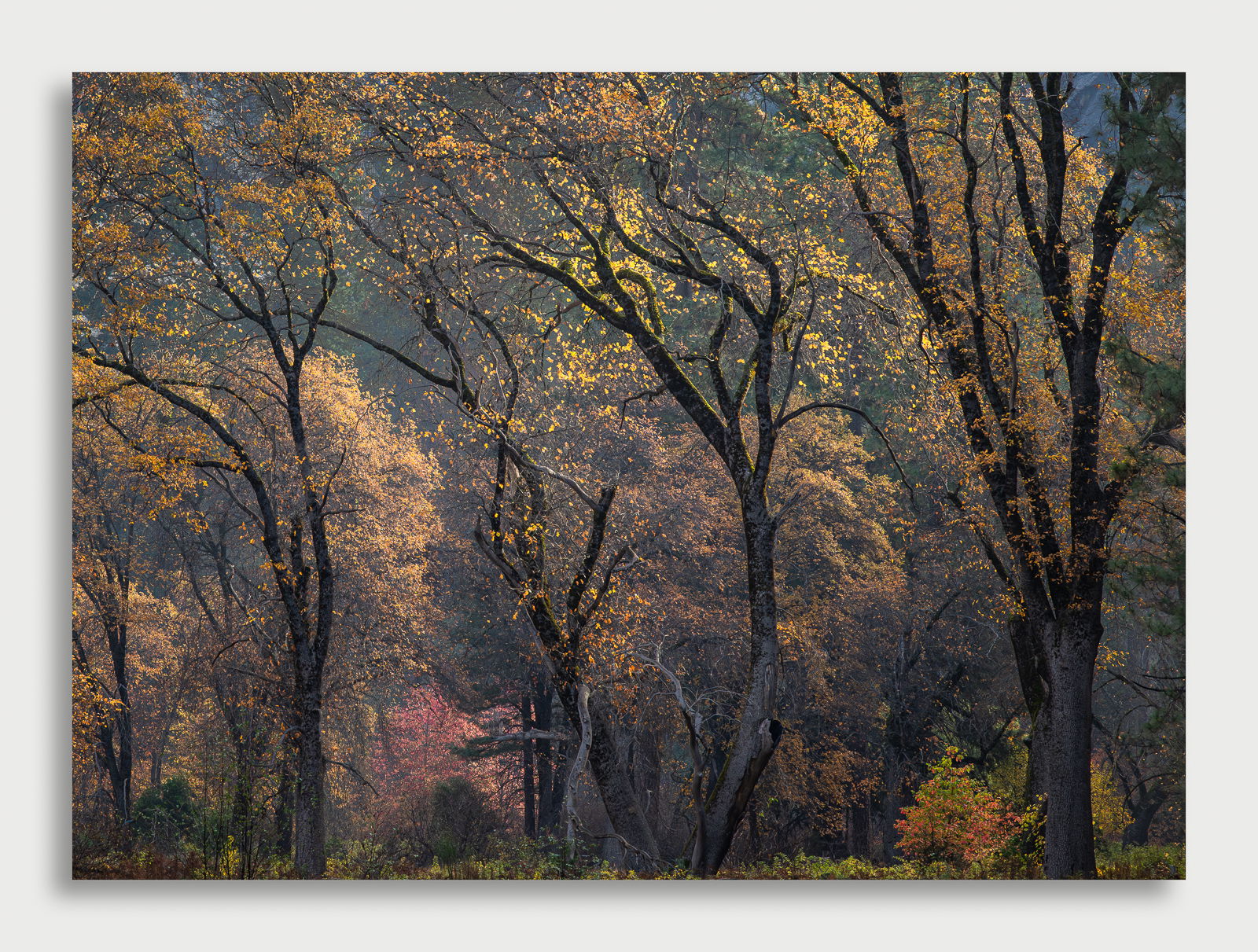
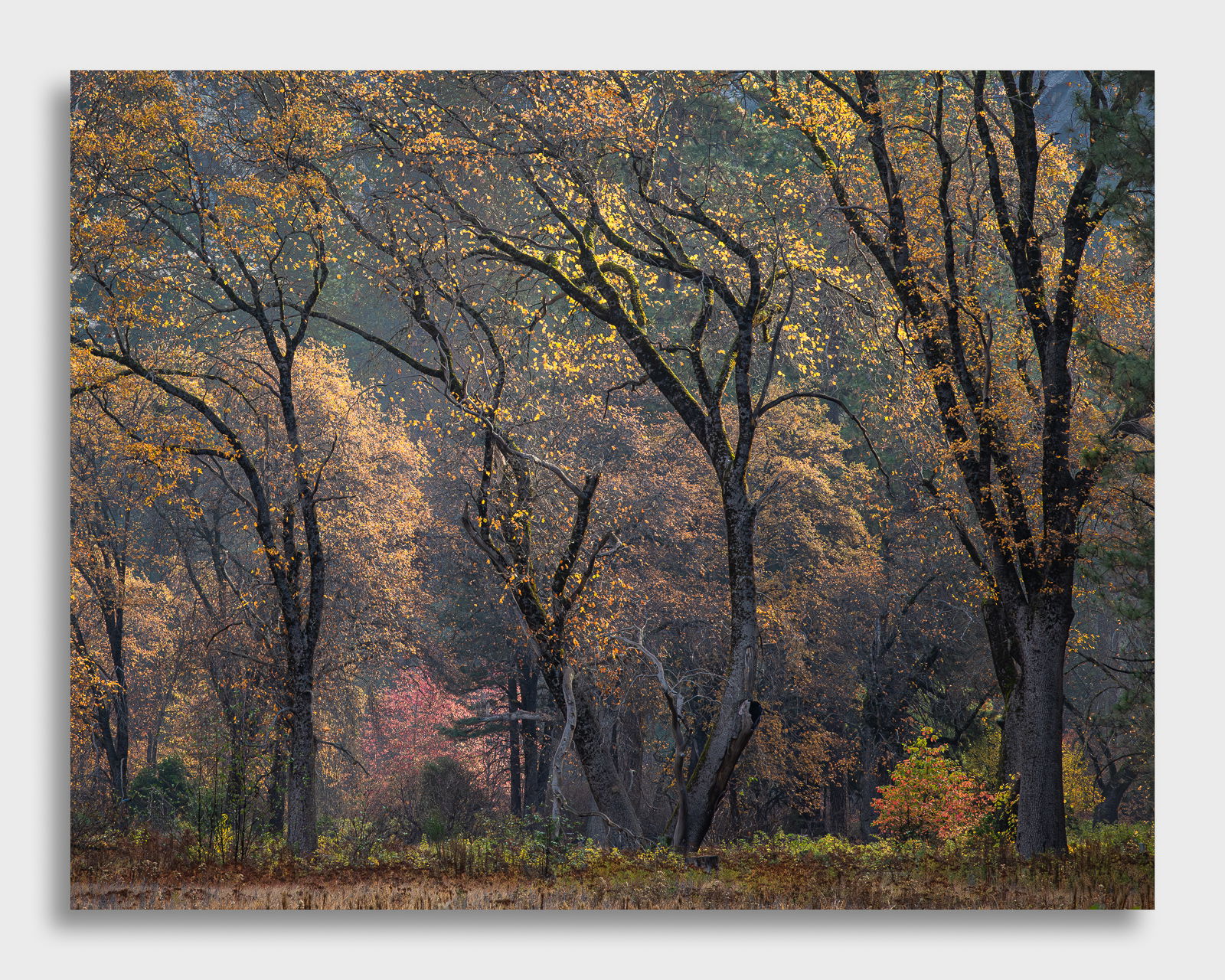
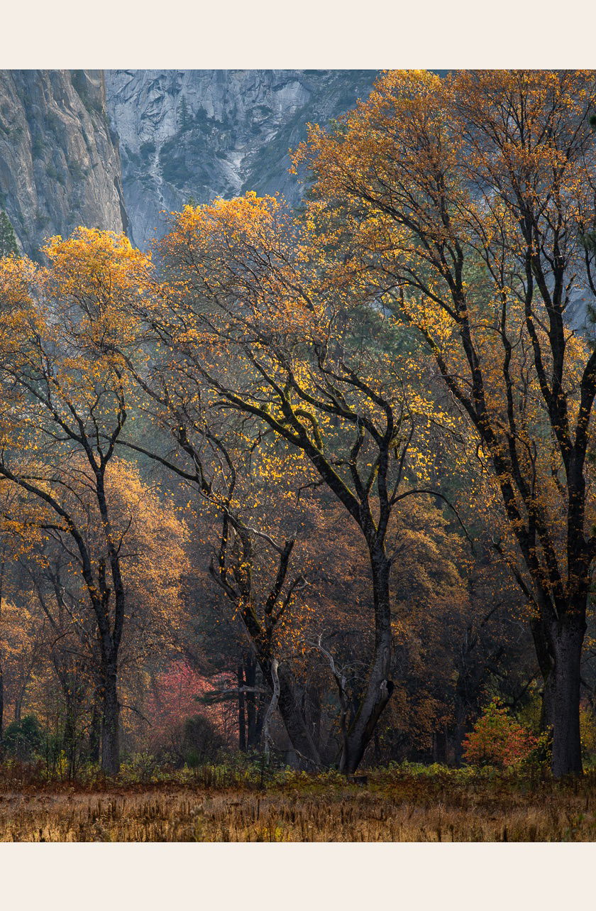
I provided a full frame version as well as a cropped in version. The full frame version provides a little bit more of “place’” as you are able to see some of the Yosemite granite walls. In the cropped in version, it’s more about the trees, the bending, and the colors.
I’m curious which image you prefer and why.
I’m also interested in hearing about the colors and if you feel they are about right.
Technical Details
Z8, 24-120mm lens @ 120mm, 1/320th, hand held, ISO 1000, f/9,
Critique Template
Use of the template is optional, but it can help spark ideas.
Vision and Purpose:
Conceptual:
Emotional Impact and Mood:
Composition:
Balance and Visual Weight:
Depth and Dimension:
Color:
Lighting:
Processing:
Technical:
Must have been a fine day to be surrounded by colors and cliffs.
For me there is a Goldilocks between the two crops, as the first has so much in it that it does not convey to me the excitement you felt about the dancing trees. The second seems too tight to me, and omits the drama of the canyon walls. Both might benefit from punching up th yellow foliage that you said impressed you.
Attached is a quick Snapseed attempt to convey my thoughts. The foliage needs more punch than I was able to manage in order to convey the backlight you were enthused about.
Oh! This is so good! I love the first. The colours are extraordinary with the cliffs showcasing the beautiful dancing trees. Yes. They do look like they are dancing. If I had seen the second image only, I would love it as well. I would hate to lose a pixel of the first.
I cannot honestly comment on the colours., apart from they look believable with just enough colour not to be overdone. Whispering not screaming.
If I was to consider anything that I would change, it would be the tiny lighter patch on the broken branch. I don’t notice it so much on the bigger crop.
Both images are beautiful. In the full image I like the color contrast between fall colors and the granite. It also screams Yosemite. The tree trunks and colors in the second tell a different story. Both are valid interpretations of the scene. Why choose?
David, both versions look great. Each has creates its own feeling. The full frame tells me the story of a deep valley where the trees and especially their colors are contrasted by the grey rock walls. The crop is all about the trees and colors. That small red tree in the back is a great addition to both views by adding a new color. I’d try burning in the lightest section of wall (on the left) in the full frame view to let the trees have a bit stronger presence in the view.
Hi David,
Both of these images are quite lovely and tell a different story; at least for me. The first one is about a sense of place while the second is more intimate and makes the trees the star of the show. I am loving the color palette of warm and cool tones in the image and the backlight on the leaves is exquisite and gives them a life of their own. Hard to pick a favorite, but I am leaning towards the cropped version as I love the intimacy; plus you still have hints of the granite walls in the BG. The colors look perfect for my tastes. I also think the cropped version would work with keeping the meadow of the original. BTW, the trees do appear to be dancing. Beautifully done IMO. Bottom line is you can not go wrong with either version.
Both versions are really nice in their different ways. Hard to choose between them but I lean towards the full frame shot (or possibly an intermediate crop as @Dick_Knudson suggested, to include some rock but make it a little less obviously classic Yosemite).
Both images are very nice, but I am partial to the full frame image. Not only does it provide a sense of place, it shows the grandeur of the tree’s magnificent shapes, but also the color contrast between them and the granite walls.
I think you could brighten up the foreground grasses and the oak leaves just a bit and also burn down the bright spot in the granite just above the left-most oak. It won’t take much for either one.
It’s hard to compare the two because they are different statements. It kind of goes back to the grand vs intimate argument. I prefer the intimate. I like the wavy black lines with the bright yellow dots thrown about. I prefer looking at images that way rather than what they are (trees in front of a wall). Nice job.
Wonderful two photographs. I like both and its hard to choose one. The wider photo gives a great sense of place. The line of the tree tops sloping down to the left and meets the lines in the granite that brings the eyes into the BG nicely. The tighter photo accentuates the twisted branches and the highlights from the rising sun. The glowing leaves are excellent in both. They each have qualities that make each a stand alone on its own. It looks like you had a good time in the Valley.
David, I prefer the og uncropped version cause I am infatuated with Yosemite although I’ve only been there once. I guess it’s the whole Ansel Adams mystique. And the rock walls scream with a sense of place. I know I’m being super picky (would you believe the algorithm wouldn’t let me post the word “banal without the b?”),but the horizontal branch about a third from the right and not even a 1/4 up from the bottom catches my eye. I think I’d open up the FG a little.
For me, I’ll stick with the first full-frame version.
I think the inclusion of the background creates a new level of complexity, and I like the color of this version.
In the cropped version, I like the “design,” but then I think it should go further and focus more on the central tree, eliminating the rest, including the blue spots from the URC
Hi David,
Your small tweaks have made an already stellar image even better IMO. I have to say that I am really liking that little extra bit of meadow in the cropped version. I know that I mentioned it beforee, but the soft backlight on those leaves is gorgeous. I find this scene so inviting and serene.
Very nice! The original full frame image has so much presence with the giant mountains looming in the background those trees with their (visually) strong tree trunks and I like it very much.
The cropped image is so different than the full frame but to me just as beautiful and powerful. You did really well by creating these two different images from the same subject. Hats off to you!
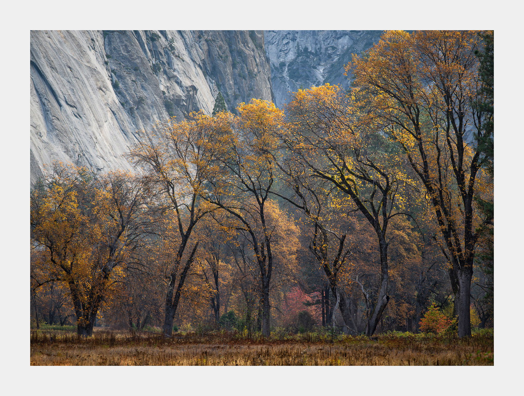
So I think Will said it best with his quote above. But I still wanted your thoughts on this and then @Dick_Knudson came up with the idea of something somewhere in between so I posted that one too.
There are now 5 images to choose from. I burned down that little bright spot that @Glenys_Passier noticed so thanks for that and I burned the left wall in the uncropped versions and added a little bit more highlights to the leaves and the foreground. I think that covers just about everything except for the branch that @Michael_Lowe discovered. Thanks for that Michael! Thanks again for your help and your suggestions.
David, these are all excellent. But in scrolling through them, the last one took my breath away. It preserves the sparkle and luminence of the leaves and the dancing lines of the trees, while also still keeping the blue-ish background for contrast and a bit of context. So that’s my humble vote. But really, all the versions are wall-worthy.
Well that pretty much nails it. I agree with the theme above that these are all nice variations.
With that said, I do slightly prefer the Original Cropped Reworked. The background rock is slightly disrupting, and this version really lets the eye settle on the beauty of the trunks and leaves. I think the colors look great.