Hi Danny,
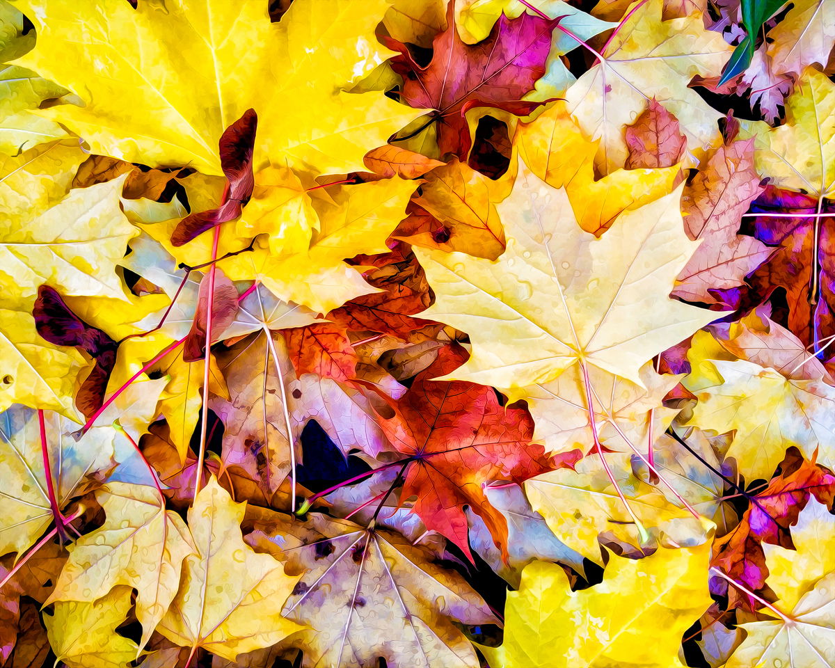
I like your composition as presented. The blue and strong purple/magenta areas in the shadows seem to be out of place. You may want to tone those down slightly. Other than that, this image is a lot fun to examine. Well done…Jim
I agree with Jim regarding the blue and magenta. Those can be desaturated quite a bit. The displayed image is quite bright and some areas a re lacking in detail, therefore I suggest reducing the brightness. I like the composition, and there is a lot to explore here.
-P
Danny, I like the composition, these leaf patterns are not easy to do, but you have done a pretty good job here. But I agree with Preston, on my monitor this just looks too bright and saturated. I also think the brightness is more of an issue on the right side of the image. I would recommend dropping brightness overall, but with more of an impact on the right 1/3 of the image.
Thanks everyone, next time I wont color correct at 2 Am, I’ve noticed the brightness also on right side. fixed it and the magenta and blue also. Darkened the image overall a bit also Thanks.
I’m not turned off by the bright colors quite as much. I think all that yellow in the top left quadrant is messing up you composition. I would build a comp around that one maple with the water droplets.