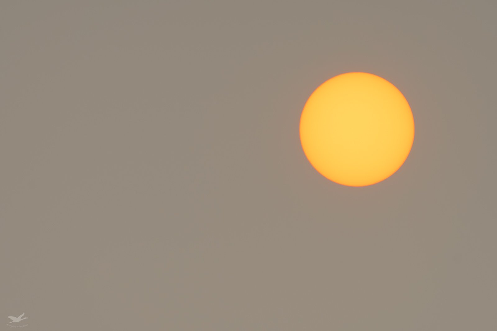
The sun was dull red when i fed birds an hour or two ago, but when I went back out to photograph it, it had yellowed up quite a bit, though you could still look at it. The software seems to interpret the colors rather differently depending on the exposure. When I had the sun looking right, the background was pretty dark but it came up fairly close to gray when I adjusted levels in PS. When I exposed for the sky and let the sun almost blow out, the sky came out a reddish tan. They make two rather different images, so I’ll post them both here.
Darker original:
And lighter original:
For this challenge, I deliberately avoided any elements other than sun and sky.
What technical feedback would you like if any?
Anything
What artistic feedback would you like if any?
Anything.
Pertinent technical details or techniques:
Sony A6500, FE200-600 @600 mm, tripod with ball head and Sidekick mount, Shutter speed was the only difference in settings. Both were at f/8 and iso 200. The darker was at 1/4000 and the brighter at 1/640. Processed in LR & PS CC. Adjustments to sun and sky done through Luminosity masks. Taken at ~9.)) this morning.
If you would like your image to be eligible for a feature on the NPN Instagram (@NaturePhotoNet), add the tag ‘ig’ and leave your Instagram username below.
Such a sad, but beautiful, photo of an awful situation out there Dennis. I do prefer the “darker” version. Wonderful image. . . and hoping for the best for all of you out in the west.
Looks familiar. Did you try combining them - yellow sun with lighter sky? I like the orangish glow around the sun in the lighter sky version.
1 Like
I’ve been playing with a lot of alternatives @Bonnie_Lampley. I still haven’t found a combination that really gives the feeling the way I’d like. Unfortunately, I’ll probably have another opportunity tomorrow to get it earlier and see what I can do with it. I should go over to my neighbor’s place to get the blackened earth in the foreground to really make it come across.
I think it is really difficult to make it look like it is because of contrast issues. Bonny probably has a lot more smoke than we do. The darker image works best for me. I will also say there is something rather familiar about the subject matter.
Oh heavens, you’re burning there? I’m sorry. It would be dramatic, though, to get a foreground of burnt earth.
That is certainly a minimalist image. Minimalist art is supposedly of subjects that have geometric shapes.
Dennis, this is a good looking commentary (especially the darker version) on a sad event, the mid-Atlantic couldn’t see the sun on Wed. due to a thick layer of smoke at 30,000 feet.
Dennis, I have been thinking about you all out west. I can’t even imagine what it must be like. It is a sad situation. I like the darker image as well. Please stay safe.