At times I have some spanking good arguments with myself about how much I like/dislike cloudless skies. In my prior two posts, I fudged the conditions with a sun star in the first and the Milky Way in the second.
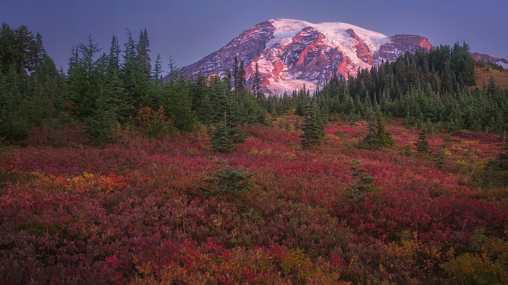
On a trip to Mt. Rainier last month with @Steve_Kennedy and Don White, we were again blessed/cursed with lovely weather and cloudless skies. The fall color was good, and we very much enjoyed the nice weather, so in the end we just rolled with it. This is the first of five with clear skies, and I’d love your feedback on how much you think that matters to you. As always, all feedback is welcome; you guys so often see what I don’t, and I really appreciate your wisdom.
I am always reluctant to participate in the Tragedy of the Commons, so rather than wander out into the vegetation opted to stay on the trail and cropped the bottom off to a 16:9 aspect.
FUJIFILM X-T30
FUJIFILM XF 10-24mm F4 at 24 mm (36 mm equivalent; cropped)
1/8 sec. at f/4.0 and ISO 160 (three foreground images blended for DOF)
1/30 sec. at f/4.0 and ISO 160 (1 image for exposure blending)
Beautiful scene and what a popping foreground. I would be inclined to add back a bit more sky for some breathing room up to. Not a biggie at all, but it feels a bit tight to me. Otherwise, quite nice!
Wow, Rainier is not a location I’d normally associate with autumn, but this autumn ground cover is amazing. I’ve only been to Rainier in August, so it’s really cool to see it like this. Are those blueberry or huckleberry bushes? I also love the interplay of the red ground cover and the alpenglow on the mountain.
Here’s another vote for adding a bit more sky (should be easy via CAF). I actually think having a cloudless sky helps keep the attention on the autumn colors, I just think you need slightly more breathing room at the top.
Color gets to be a very personal and subjective thing. I think the image works as presented. For my personal taste the blue in the sky, and the reds on the ground feel a slight bit too magenta. I might try backing magenta off a hair. And I would suggest playing with some PS Selective Color tweaks to get some more color separation between red and yellow in the foreground. Take red more red, and yellow more yellow.
I agree with much of what @Ed_McGuirk wrote, especially on the color separation. A couple of other point: 1) I would raise the exposure just a tad 2) I would crop off the left to the first large notch between the pines (although that makes a small difference).A greater separation between the reds and the greens would be nice as well.
Now I realize that you wanted to feature the yellow patch on the left and for that reason you extended the left side. Forget suggestion #2 as it would cut through the yellow patch.
Everything has been said above. I just want to say that the cloudless sky is perfect here. I think the texture in the sky would start to compete to the color variation that we see in the ground cover.
The absence of clouds does not bother me at all in this scene, John. I particularly like the way the trees frame the mountain and direct the viewer’s eye in that direction.I too would add a little canvas to the top edge along with pulling back the magenta just a little. I really like the FG here as it reminds me of the lowbush blueberry in Maine with it’s crimson autumn color. Lovely image!
John, the redo is perfect. I don’t mind the magenta cast in the original but I do like the repost better with added canvas and less magenta. Superb color in this. Like others, I had no idea these fall colors existed in this region. Lovely!