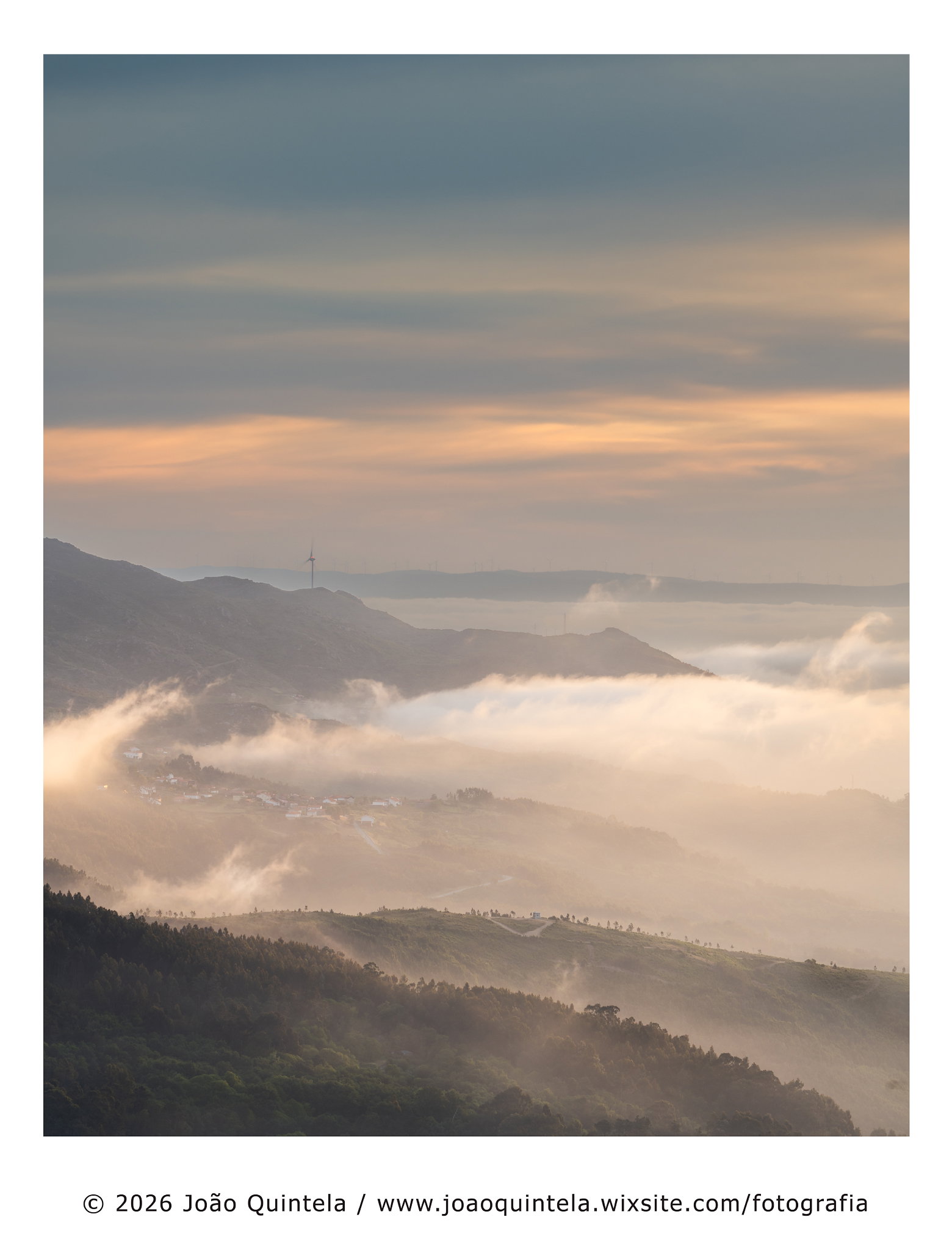
Please share your immediate response to the image before reading the photographer’s intent (obscured text below) or other comments. The photographer seeks a genuinely unbiased first impression.
Questions to guide your feedback
I changed the aspect ratio from the original file to 5:4, which seemed more balanced to me. The 1:1 ratio seemed far too obvious and cramped.
What do you think?
Other Information
Please leave your feedback before viewing the blurred information below, once you have replied, click to reveal the text and see if your assessment aligns with the photographer. Remember, this if for their benefit to learn what your unbiased reaction is.
Image Description
By the time the sun rose over the Serra da Estrela, I’d already been up for a while. I took a few photos in the pre-dawn light – they were nice, but none of them gave me the same thrill as actually seeing and editing them – I’m not really a fan of sugar-coated skies!
As soon as the sun rose, the landscape changed completely, helped along by a slight cloud inversion.
It was a lovely morning…
I love the atmosphere and mood here. This is wonderful. I would agree with you on the 5:4 format and that a square crop would be to cramped. To be fair though, that was one of my initial thoughts was cropping some of the sky; which you still could do, but then you’re in no-mans land in terms of some viable format/ration for printing or whatever. The good news is that the clouds up top have enough variation that what you’ve presented works very well.
I’m also enjoying the very hint palette of pastels. Maybe not all that pastel per say, but I like how there is a tint - at least to me, of color in the swirling mist over the landscape.
Can’t really suggest any improvements. Totally enjoying this as presented.
João, you’ve got a fine, touch of the mysterious here with the softness from the clouds and flying mist. That’s quite the contrast to the storminess, especially with the clouds lifting on the left. While you could crop half of the sky and tell the same story, there’s a sense of spaciousness as presented. I am torn about whether or not to keep the windmill, it’s an interesting presence but somewhat distraction form the storminess and the layers of land.
Hi João, I really enjoy this image. The balance in the frame between the sky and the land below feels right with the low clouds toward the bottom third. I like how the wind turbine anchors the scene. When viewing the image larger, the juxtaposition of the grouping of buildings in the middle ground stands out against the singular white building in the foreground and the solitary wind turbine in the background.
I love the 5:4 ratio. Excellent call although I think a square crop could also work really well. It’s a twofer for me. Two images out of one depending on if you want to hang this and what fits. My preference though is for the 5:4 perspective.
You had gorgeous light to work with, Joao. I love the curled lip of the clouds on the left side of the image. I also love just barely being able to see the two windmills on the distant hill. Beautiful soft colors add to the dreamy effect that the cloud cover has given you. Really liking this one, Joao.