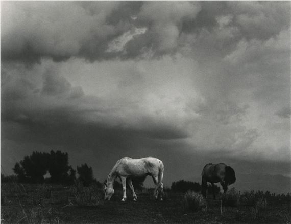
The photographer is looking for thoughtful feedback on the image as a whole, especially around the areas noted below.
Feedback Focus: Artistic + Technical
About This Image
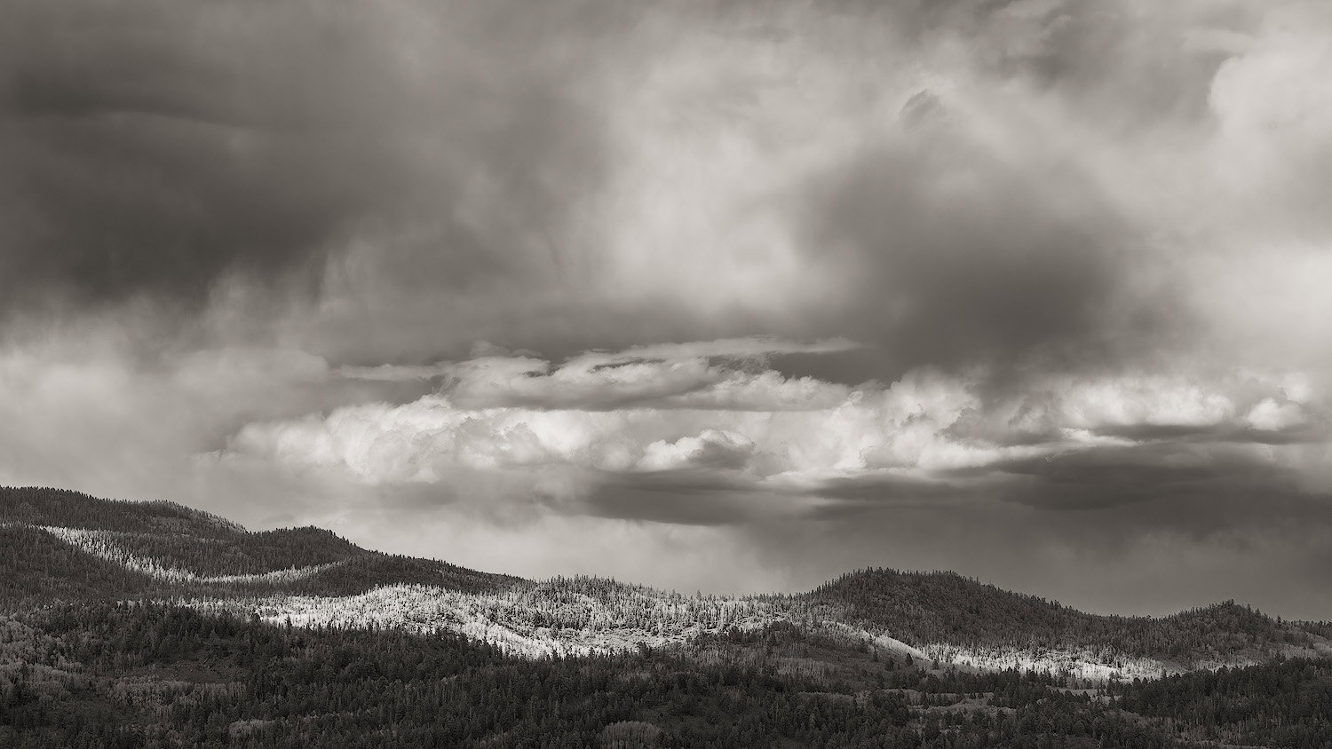
Here’s another from our evening up on Hell’s Backbone near Boulder, Utah. The curvy sweeps of light on the hills was lovely and they were my original idea for the subject. After everyone’s feedback on the previous photo from here, I tried to equalize the levels of light and contrast between the sky and the land.
Feedback Requested
Any comments welcome. Per Marylynne’s comment on my previous post, I cropped this one 16:9 to emphasize the horizontal expanse of the light on the hills and the brightest clouds.
Technical Details
Camera: SONY ILCE-7RM3
Lens: FE 24-105mm F4 G OSS
Focal length: 96mm
Shutter speed: 1/250s
Aperture: f/11
ISO: 400
I think I might prefer the drama in the clouds a bit more in this one Bonnie. Even the spotlight on the landscape - while not as concentrated as your first version, I like that the light is more scattered over the entire range; keeps the eye moving through the frame.
I know you said in the previous image that the color wasn’t really working… and I get it. I bring this up because of an observation about the scene and utilizing b&w in general. You also mentioned trying to equalize the light/contrast between the sky and the land. My observation is that while there are certainly some nice whites, some dark blacks in the trees and the contrast is pretty good, it seems to me there is a lot of mid grays of varying tone. Without color, one relies on tonal contrast and perhaps there’s just too much mid tone? Now, take this with a grain of salt because I am NO expert in b&w processing… so I just say as an observation.
I did download this - and correct me if I’m wrong, it still showed as a color profile in ACR? It almost looks like there’s a slight tint or warmth to he b&w. Curious on how you do your b&w conversions.
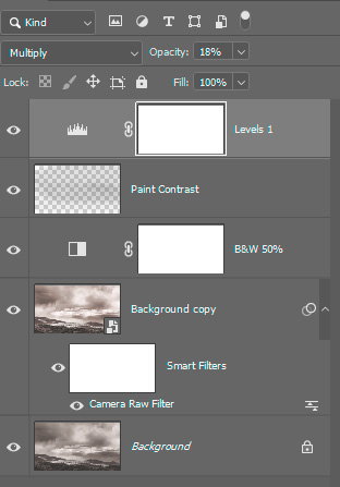
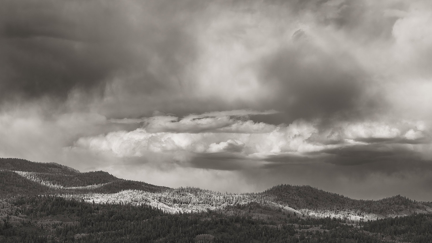
I have no idea if this version is better or worse. I’m adding my layer stack; and within the ACR layer I just tweaked the standard exposure sliders and dehaze a little. Maybe in hindsight I was trying the take some of the midtones more towards black or white. (I’m making this up as I go along.)
And maybe I wanted to play with this one because it’s a grand scene and most worthy of making it the best it can be.
edit: I wanted to include a screenshot of the layers stack, but I can’t see how to add that beyond just the example.
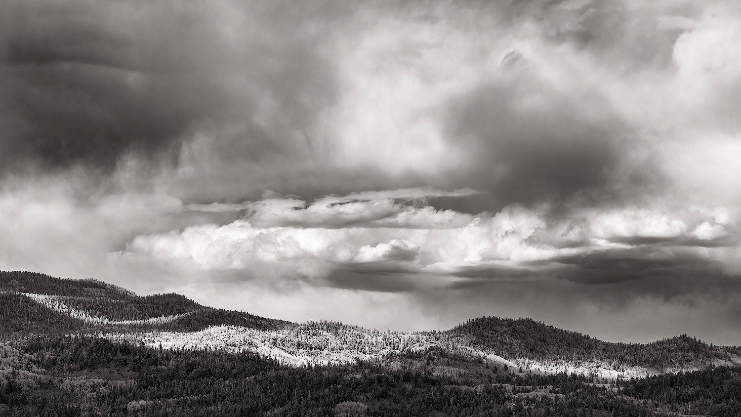
I played with it in PS and found that the histogram wasn’t reaching white and black. I set the white and black points to 240 and 5 with a levels layer and thought that brought a small but noticeable boost in contrast and brightness. You might want to try that but I like it a lot as is.
To my eye the clouds look really good. They’re not Ansel Adams clouds. But Paul Strand did great work in that area with clouds like that. I think the forest is too dark.
Have to agree with you there, Lon. When I get a chance I’ll go back and adjust contrast.
As far as the color profile, I think I changed it back to a color profile after the b&w conversion in ACR so I could adjust the toning. It was toned a bit warm in ACR after the b&w conversion, but for some reason I wanted to adjust it in PS.
Hi Bonnie,
It lLooks like you had a great workshop there. I’m liking the black and white treatment, and to me, the slight sepia tone works well. I do like the increase in contrast in the versions shared by Igor and Lon. The cloud contrast is a matter of choice and intention, but if I remember correctly, your previously shared image had more cloud drama than you wanted. If you want to keep the focus on the hills, avoiding more constrast up top is a good idea. In this case, Lon’s version seems to promote that in the sky, while Igor’s version keeps our focus on the land.