ORIGINAL:
NEW VERSION:
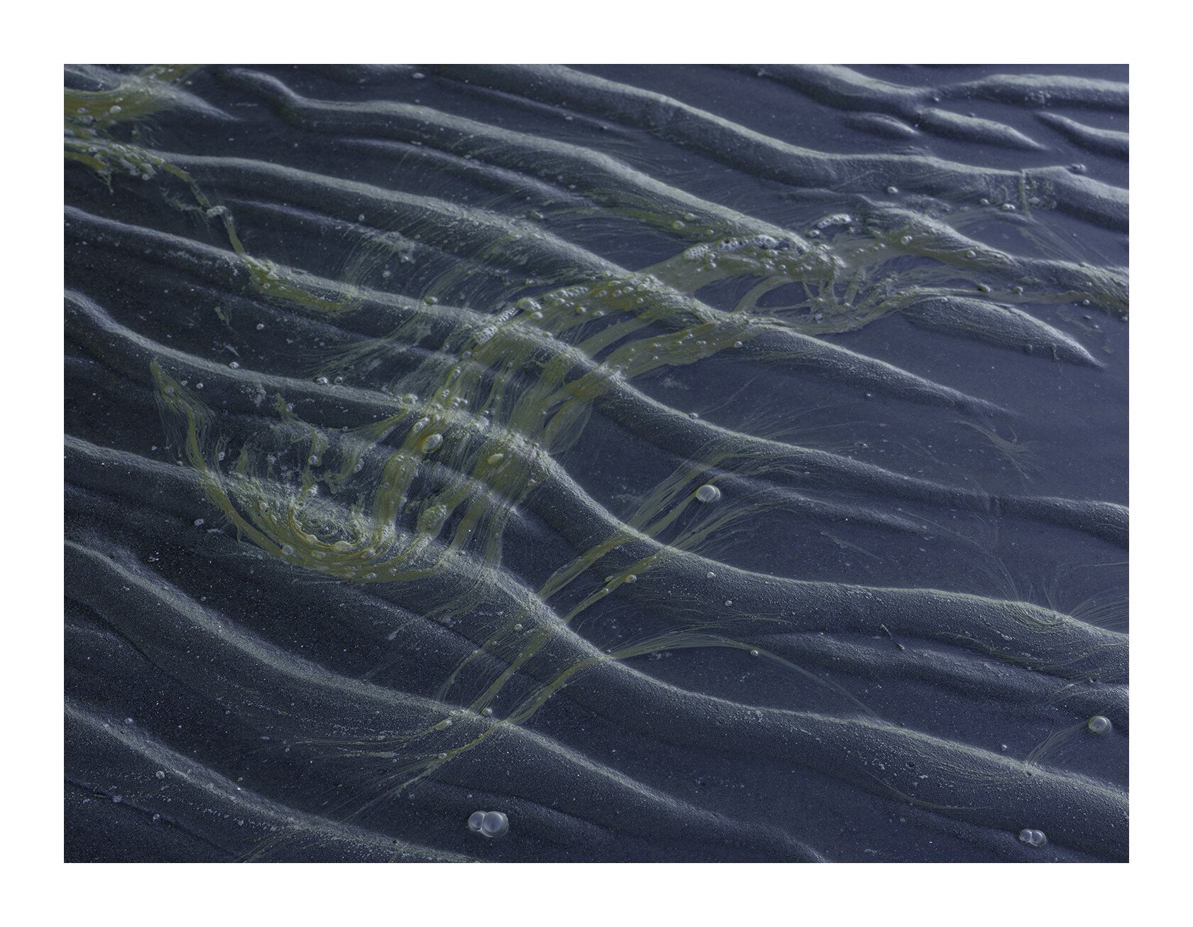
I found this expressive composition at low tide and was drawn to it. I don’t really know what it is but I suppose it really doesn’t matter for my purposes. As usual, I was looking for something else when I stumbled upon this.
I haven’t processed this very heavily (I never do) so there are many directions this could have gone. I have a couple of questions for you:
-
Is the color palette optimal. Should the greenish blue be more blue rather than how it is?
-
Do the bubbles add to the image or are they a distraction? There is no way to get rid of them so I guess it’s a mute point. I could reduce the number, however.
GFX50R, 45-100mm, f/11, focus stacked.
Hi Igor, I’ll let others comment on the colors, they look fine to me though. The bubbles don’t bother me, it would take a long time to clone them all out.
I think the composition is very well done. I feel a sense of peace when viewing it. I think it’s partly due to the opposing sinuous lines of the sand and the…algae?
It is a fine scene, well captured.
For me, Igor, the soft colors emphasize the melancholy mood I feel while look at this scene. The gentle s curves (created by sand bars) along with the organic shape of the seaweed (?) work very well together. No, the bubbles don’t bother me at all. They add to the story, a sort of 3rd dimension. I am curious, do you remember how many photos you took to get this image?
Very nicely seen and captured.
Yes. There were 2. After capturing the original I felt there was too much coming in from the upper left and decided to fill the frame a bit more with the algae:
Initially I was searching for basic sand patterns during low tide. Here is one that came out all right after sever cropping. The vision was poor in the field and I had to ‘fix’ it on the computer.
Thanks, Igor. I like the second image also, although sand pattern feels a little more stilted for me. Guess I just am enjoying the flow and movement of the first image more.
Hello Igor.
I like your image very much.
I find it very balanced.
I would try to make the blues a little more blues, and would try to enhance just a tad, the yellows on the LLC.
Igor,
Better late than never as they say. I meant to get to this earlier.
As part of the new NPN 3.0, I personally am going to make a better effort in studying and absorbing images before I comment. Spent more effort critiquing what I see and what was intented, vs. fewer nitpicks…
Anyway, mention “stumbling” across this, but clearly your mind and eye are able see these wonderful mini landscapes. What strikes me is that moment in time where the repeating, direction patterns of the rippled sand are being crossed over by the free-flowing moss (sludge? or whatever that is…) And visually I think the perpendicular positioning between the two is quite dynamic.
If I get your drift of “free” (which I used oblivious to your title actually), it is that free flow of the moss over the more ridged patterns in the sand? This just has great continuity to it that is pleasing to view - despite the slimy nature of the moss.
From the tech perspective and your question on color. I think it works well as presented. Of course there’s always room or reason to play around with that. I could see the channels with the water more blue to color contrast with the browns of the exposed sand - increasing the separation between the two.
bubble? Here’s where I hope I can improve my reviews. Sure, there are some bubbles, or even tiny white specs you could remove, but most all of the bubbles are yet a third element to this that I think add to the natural flow of the scene. I hope to get over, or at least recognize the “bigger picture” before getting to picky (although I will always point out dust bunnies!) 
Lon
Like most people, I have difficulty coming up with titles for my posts. I think that’s because often the visual meaning can’t be put into words. Other than words like ‘mysterious’ or’enigmatic’ or ‘moody’, which are used too often and don’t get at the crux of the matter. This image was easier. By free I mean unfettered, unbound, freedom of movement, unrestricted. I felt the lines and shapes of sand and seaweed suggested that.
The bubbles on the other hand don’t add to that idea. I am hoping that the image works on 2 levels. On what it implies and what it actually is. The bubbles bring you back to the real world. It’s the same idea as the questionable leaf in the other image. Frankly I don’t know if I’m conveniently assigning meaning to the fact that the bubbles are inconveniently there. But I suspect that the image without the bubbles would be simpler and less intriguing. That’s what happened when I removed the leaf.
3 Likes
Thank you for your comments. I incorporated some of the color suggestions and came up with one that is slightly more flamboyant than the original. I tried to make the yellows more dominant while cooling the image overall. I felt the original yellows had a strong green tint to it. I resorted to using the LAB mode to achieve that. Perhaps using the Tint slider would have achieved that. I also made a small crop adjustment to the raw but I can’t remember if I had done that to the original version. Frankly I don’t know how much of a difference this all made.
The subtle brighten of the yellows, Igor, help to make the seaweed more integrated with the softer blue curves. And the crop helps to simplify the scene. I like the new version a lot.