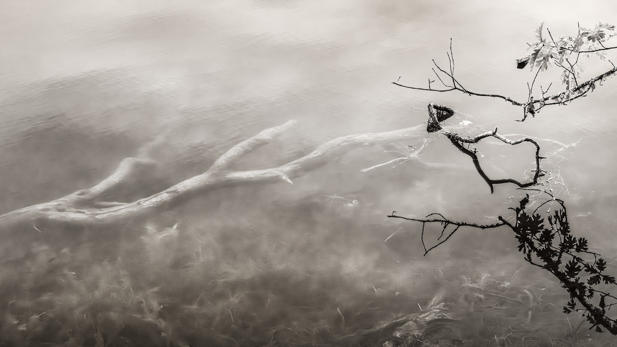
What changed: Started over on this because of the weird artifacts. I finally figured out where they were coming from. Cloning out bits in the original, then adjusting things made the artifacts because the cloning made noisy spots. Tried to incorporate a bit of everyone’s suggestions. Thanks again, all.
Added after receiving feedback from the community.
The photographer is looking for thoughtful feedback on the image as a whole, especially around the areas noted below.
Feedback Focus: Artistic / Expressive
About This Image
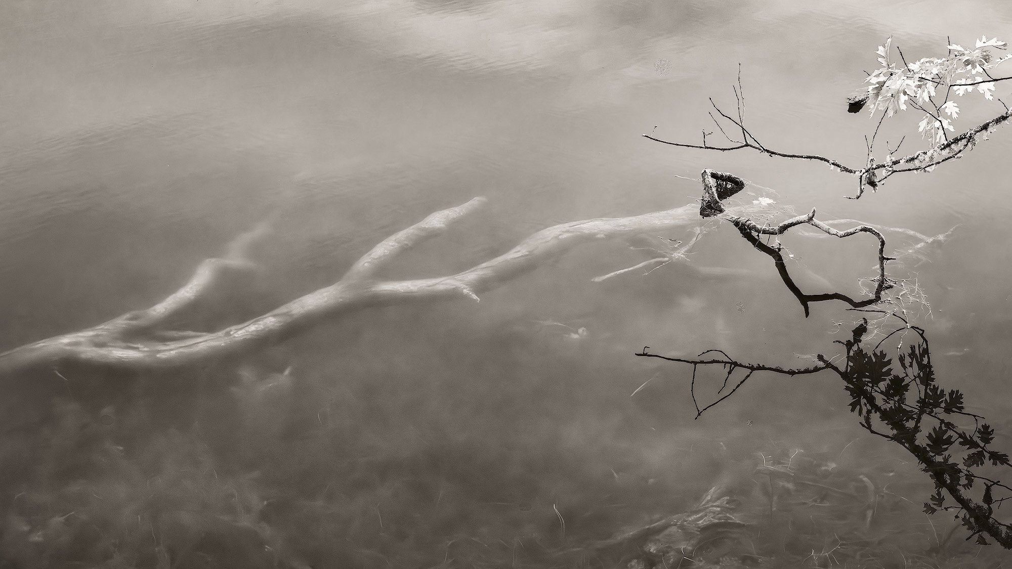
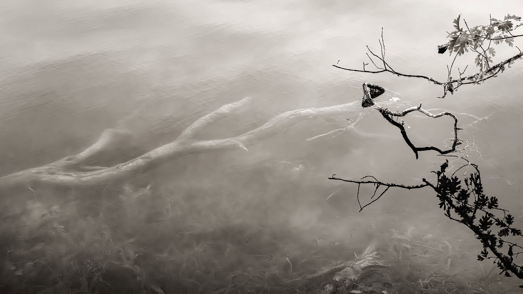
Another in my collection I call Ghosts of Forest Past that feature submerged trees combined with above the water trees and reflections. I feel like the submerged tree here is reaching back out to the living.
Feedback Requested
The composition would be considered unusual I think, but I felt like the higher contrast living branch & reflection balanced the lower contrast submerged tree. Does it work for you? Any other comments welcome.
Technical Details
Camera: SONY ILCE-7RM3
Lens: FE 24-105mm F4 G OSS
Focal length: 78mm
Shutter speed: 1/80s
Aperture: f/16
ISO: 2000
Processing software: ACR, PS
Major adjustments: Lots of targeted adjustments to equalize exposure across the frame and bring out the submerged plants at the bottom.
Blending/stacking: None
Other notes: Warmish tone applied in PS.
Really works for me. Love the composition with all the above water stuff very much over to one side
All the contrast adjustments seem to work to aid the narrative
A little “Sally Mann”-esque only a lot more subtle.
Visual Notes
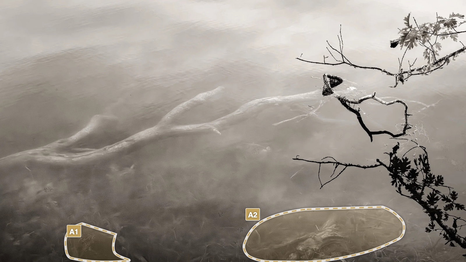
[A1] strange artefact
[A2] make this area maybe not so sharp - pulls the eye and could be blurred more?
Thanks, @Huw_Thomas. I’m honored to be compared to Sally Mann!
Good eye on that artifact. There’s actually a bunch! It looks like they are from cloning out bits, although I don’t know what A1 was - there isn’t anything big there. I’m going to have to go back to square one to get all the weirdness out. And yes on the A2 log. I’d brought that out with some dodging/burning, but can dial it back. I’d wondered about whether it was too prominent.
Amazing stuff. This reminds of the work of Tarkovsky - the cinema poet. Yes this is visual poetry. I think this is really good. I really like that submerged branch at the bottom and would love to see more of it. I’m just wondering how it would look if the you darkened the dark tones on the left side of the long branch. Just a small amount.
Another Sally Mann fan here. I think this hangs quite well with some of her work. I know it would go against the theme of your work, but I think it would also work quite nicely without the above water plants. I love it.
This is wonderful, Bonnie. I had to go look up Sally Mann’s nature photography since I tend to think of her as more of a portrait photographer. No more! And the title (of your series, I suppose) is apt. There is something a little gothic about it (about all submerged things, in my mind, unless they are bright and cheery). The reach of the dead toward the living (and the arching of living to oversee the dead) is a wonderful metaphor.
This works for me, and I’m eager to see the revisions. The foreground A2 struck me as well, but it also added to the sense of things down there that you can’t really grasp.
Hi Bonnie … This is way to COOL !!! I really love the Tone and the softness and also the sharp in this image. It has so many things to look at. This WORKS for ME !!! A very Interesting and Unusual image. Really nice Lady. Perfect in B&W.
My first thought was that the tree in the water was reaching for the live tree. So, the composition works for this. And I really like the title of the work. Now I need to go find more of yours. One thought that I don’t think the others had yet was, maybe darken the top of the frame a little more. That might help the the underwater tree be the lightest tonal area. And with that striking diagonal line, I think it would really come out. Lovely image.
I see your point. I already darkened the upper part considerably and brought out the “clouds” more. I’ll see what I think about darkening it more.
Exactly. I’m leaning towards leaving it there, just dialing back the contrast I added to it.
I’d never heard of Tarkovsky, so I looked at some of his polaroids and stills from film. The poetry probably comes out more in his films, I imagine.
Are you talking about Huw’s A2 branch? There isn’t much more of it to show IIRC, but I’ll look when I rework this. That’s a good idea about darkening the shadows on the left of the long branch. I really brought up the shadows in the LLC to bring out the submerged vegetation and included those around the branch. I’ll keep your suggestion in mind when I rework.
I think the original was better. I thought the tonal tension between the black branches and the ghostly water was important and it has been diminished in the revision. The water is less ghostly and more murky.
Interesting isn’t it. The A2 area needs to be noticed to pull the viewer to see all the lurking underwater stuff , but mustn’t be too prominent so it looks unrealistic or competes with the sharper above water stuff. I agree with @Igor_Doncov the first version really made that underwater area drive the whole narrative. On my monitor it still works but is more subtle . The submerged stuff closer to the surface it is likely to be a bit lighter but maybe not blurred. Have a play until you get a version you are happiest with.
Screens are different - the whole series needs to be printed and you’ll be able to decide the relative tones then.
Have to agree with @Igor_Doncov. Posted a 2nd revision closer to the original. Also brought out the submerged plants a bit more.
Someday? LOL. I have a lot of these types of photos, most aren’t very compelling, though. I really should make an effort to get them together to see if I have a decent series.
This image reminded me of one your earlier images. It’s the one that was awarded by NLPA. I’m glad that you have returned to that direction you took. I thought it was very promising.
I’m so glad this popped back up to the top of the feed - I had intended to comment, but then never did.
I definitely get the sense of the submerged limb reaching out. But even more than that, there’s and eeriness and mystery to this. I’d even reference many movies and stories about “what lies beneath…” or even something like “The Creature from the Black Lagoon.”
What makes this even more masterful are the “live” branches above the surface; the combo of the above and below the surface elements create a mysterious tension.
I’ll go out on a limb here (ha ha, pun intended…) and say that I prefer the 1st revision. for me, the murkiness hiding some of the other submerged details really keeps the attention on the submerged limb. I just think the story is stronger in that revision. Of course each version is outstanding and I’m just getting picky.
 And yes on the A2 log. I’d brought that out with some dodging/burning, but can dial it back. I’d wondered about whether it was too prominent.