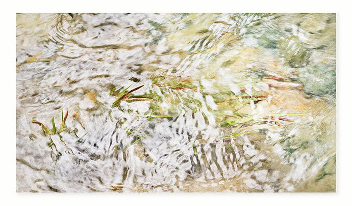
REWORK (with Jens and Eric’s suggestions):
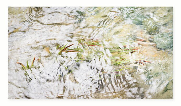
ORIGINAL:
Critique Style Requested: Standard
The photographer is looking for generalized feedback about the aesthetic and technical qualities of their image.
Description
Another from a local creek, flowing high this year. The light on the water and the way the grasses were moving and interacting with the water were beautiful to me.
Specific Feedback
I don’t have any particular concerns, but welcome any comments.
Technical Details
Basic dodge/burn, color adjustments, crop to 16:9 to emphasize directionality.
1 Like
Very beautiful and peaceful. I’m drawn to the patterns of the white reflections and the bending of the grasses. It’s brightness is uplifting. A lovely image - well done!
Hi Bonnie,
that looks great once again. I love the subtle colors and the high-key look.
All elements are very nicely aligned in the image. All the water ripples seem to lead in the center of the frame.
If I were to be picky, I would dodge the dark area at the top of the image and at the bottom of the image slightly (both in the first quarter from the left). They belong to the darkest parts of the picture and attract some attention.
The High Key processing treatment works perfectly for this image, but maybe by just adding a slight hit of midtone contrast you could bring out some more separation and detail, mainly in the left half of the scene that is predominantly white right now because of the glare.
Thank you @Steve_Layman, @Jens_Ober, and @Eric_Bennett for your thoughts. I appreciate your taking time to chime in with comments.
I’ll post rework, taking into account your suggestions. As far as increasing the midtone contrast in the bright areas, do you think I took it too far? I didn’t want that texture to take away from the grasses.
Hi Bonnie,
I really like your rework. Adding some midtone contrast as suggested by @Eric_Bennett took it to the next level.
1 Like
The rework looks great with its more pronounced detail Bonnie.
1 Like
I like the high-key look, too, and the rework has much more depth and richer colours that keep me in the frame a lot better 
Bonnie,
Beautiful indeed. I continue to be amazed and impressed with your vision.
I think your re-work really elevated this and so thank you for taking the time to consider the suggestions and comments of others. I think the whites/glare of the original were such that the grasses were actually more obscured. The added contrast and work on the midtones actually brings out the grasses more - at least that’s my impression.
Can’t think of anything I would change. At first I thought maybe cropping in from the right (as I tend to want to migrate to square…) but I’m finding the variety of colors and less glare compliment the scene, and also allow the bright ripples to transition or fade as the eye moves around the image.
Beautifully seen and captured.
Thank you @LauraEmerson and @Lon_Overacker for your appreciation.


