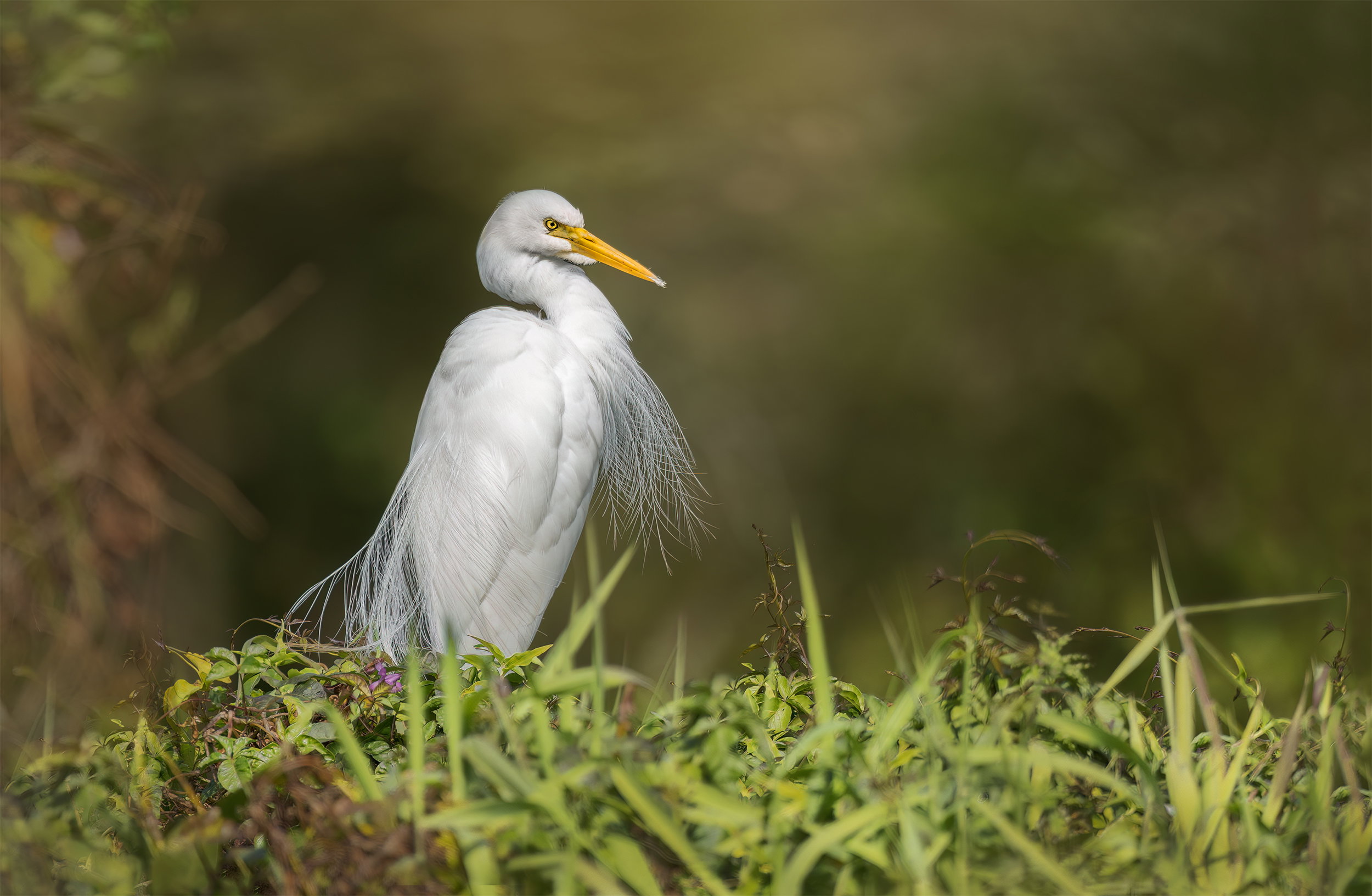
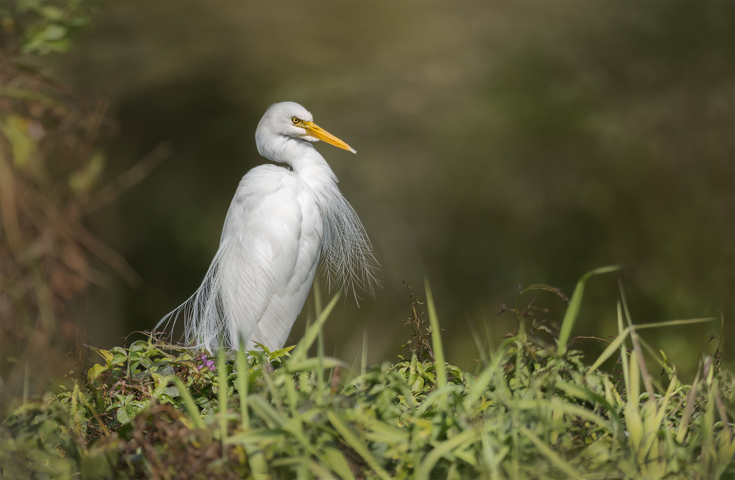
What changed: Upper left leaves made less obvious. A bright grass blade gone, via “remove” (maybe there’s a couple more that need to be gone?) and the yellows boosted a tiny bit in the grass.
Added after receiving feedback from the community.
The photographer is looking for thoughtful feedback on the image as a whole, especially around the areas noted below.
Feedback Focus: Artistic / Expressive
About This Image
We went for a walk far later in the day than normal. It’s winter here and the walking was pleasant…not so good for bright white feathered birds. I struggled a bit with the whites.
Feedback Requested
All comments and suggestions are welcome and appreciated.
Technical Details
Camera: 5D4
Lens: Sigma 150-600mm
Focal length: 600mm
Shutter speed: 1/640
Aperture: f6.3
ISO: 160
Hand Held
Basic adjustments in ACR include Shadows and Highlights sliders. A few masks of the bird to bring down the whites. The shoulder has had three seperate masks to tame. Linear Profile used and worked a treat. Linear gradient from the bottom and a small radial gradient around the head.
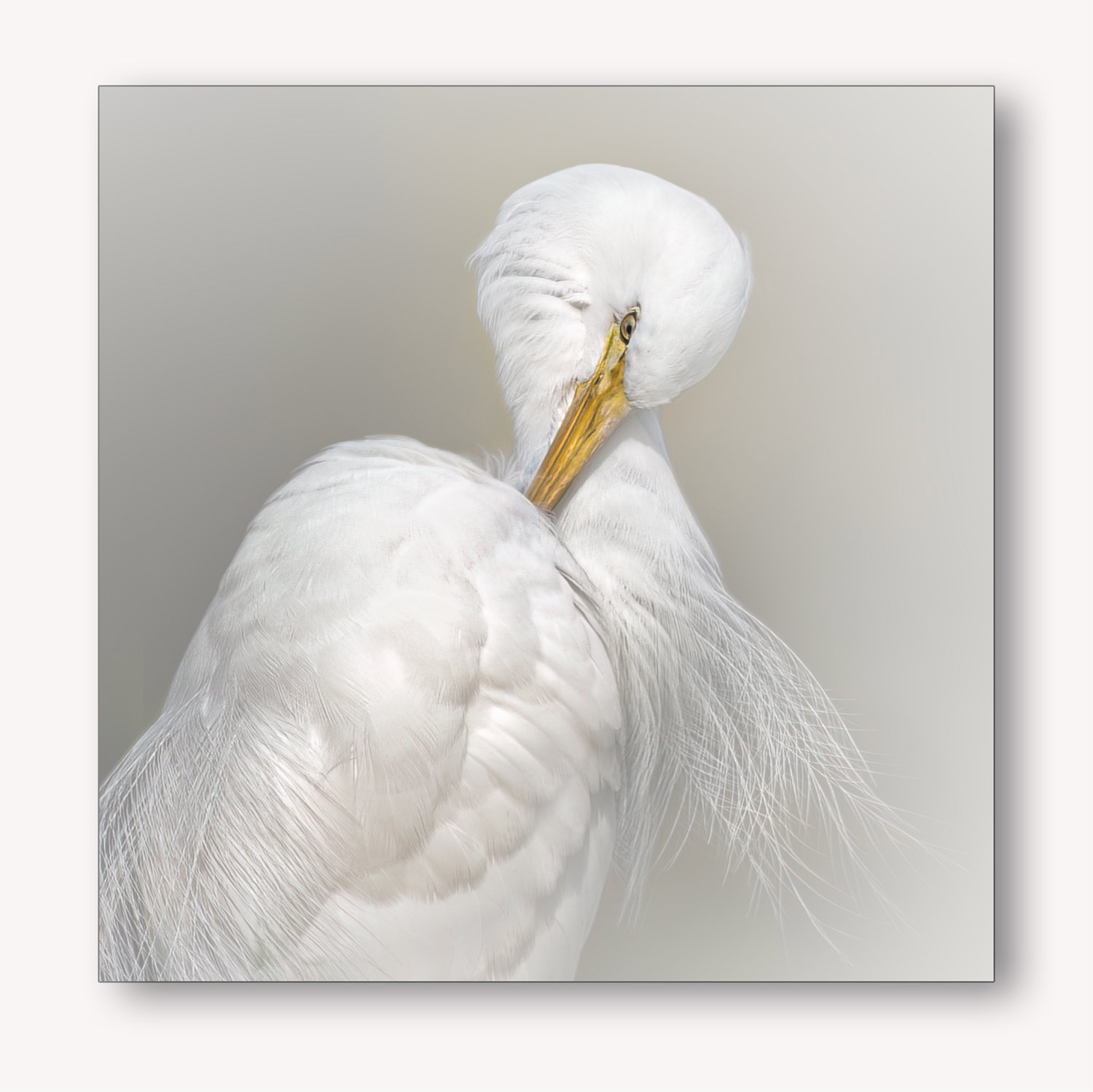
Both images had the same EXIF. The second image; too many flaws to be bothered with, so a bit of fun instead.
Wow, The main image is beautifully crafted with a perfectly muted background.
Low angled POV and OOF foreground work very well too.
The high key portrait is brilliant too - an inspired idea which is very well executed. Might try and steal this creative idea - love it
Dont know what this is ??
Researched it - presumably this …Linear profile in LR or ACR?
Do you actually find a benefit starting from this profile without the camera assumptions of the default profile ? I guess yes otherwise why do it!
I’ll try it for sure ..thanks
Both of these photographs are great. The whites, feather details and eye contact are spot on. In the first frame, the grass in the right-hand foreground is a little distracting, but that is minor. The shadow box-portrayed should find a prime place in your home.
You captured two great poses by the Great Egret. Both images have wonderful sharpness and great eye contact. I agree with @Peter_Morrissey 's comment about the grass and I might add that I would try and take out some of the green color of the leaves in the upper left. These are very minor points, of course. I really like the background of the second image. It really makes the beauty of the bird stand out. Both are fantastic images!
Hi Glennie,
Oh, I’m in love with that second image. You said “too many flaws to be bothered with” but I don’t really see those. Maybe some loss of detail where you used multiple masks? Maybe some chromatic aberration or color noise? But that’s only when I look to see what “errors” you are referring to.
What I see is that amazing pose and the fantastic detail in the plumage from the neck and lower part of its right wing. To me, this image has a ballet quality. I think it’s partly the color palette, a kind of swan-lake white with musky, well-used ballet shoe color for the background. And then there is the pose itself. It’s like performative curtsy, but perhaps with a modern twist aimed at drawing attention to the artificial nature of ballet poses.
Maybe I just had one too many cups of coffee, but while I came to comment on the first image, it’s the second one that steals the show for me, and it seems highly referential to other forms outside the realm of avian photography. To me, that’s a good photograph.
ML
@Huw_Thomas . Thank you for your kind comments. I usually go straight to Adobe “standard” when processsing images. However, when the light gets tough with areas seemingly blown out I’ll go to the Linear Profile. It’s stored in the same place as the other profiles. You will get a shock when you first open the image. It’s dull and uninspiring, but it turns out fine after a few tweaks. A lot of highlights can be saved. @Diane_Miller commented a little while ago on the benefits of using it. Image by @holly1 “A morning stroll”.
Thankyou @Peter_Morrissey ! You are too kind. I’m glad we all think a little differently. I especially wanted to keep those grasses on the RHS. LOL. I thought they added a full-stop for my eyes. I can see your point though. I might lessen their appearance.
Lovely images Glenys. What a facial expression from the egret in the first image. Really intense and well captured. I like the overall surroundings and composition.
The preening portrait in the second is quite nice too. Love the frontal feathers coming off the bird (and in the first image too).
I’m debating if the bird in both images is just a little gray. Looks nice but wonder what a boost there would do.
Terrific images either way.
Yikes – how did I miss these?? Glad I found them now and have to say how much I love both! The first feels like a unique surrounding and adds a lot to the image. And interesting to see that your versions of these seem to look just like ours. The second is definitely a show-stopper! I love the way you framed it and the detail in the whites is wonderful in both. No suggestions for any improvement but one thought is that the bird in the first is majestic enough to warrant a treatment like the second one!
What a fantastic portrait of the Egret in plumage. The second one is a jaw-dropper, but I’ll get to that in a minute. Awesome portrait in the first. My only suggestion was already mentioned a bit by perhaps burning down the grasses in an adj layer; but actually it’s not too bad and of course not much to be done with that in the field. I would agree some minor toning of the leaves in the ULC. But that’s pretty minor.
To the second image, I’m assuming you mean too many flaws in the original uncropped version? Because the portrait you created with the crop and vignetting is simply gorgeous, outstanding! If you’re hiding flaws, so be it! The end result should be hanging on your wall!
Both images have great poses, Glennie, and I’m particularly fond of the high key presentation of the second. In the first image, the grass has a rather muddy look to my eye which may be from that linear profile or it could have been that way in the field, but i think I’d look at bringing up the saturation on it and maybe messing with the hue a bit. I don’t think it would compete with the egret.
Nice capture, Glenys. Love the detail in the feathers and the whites look pretty good to me. I like the environmental nature of the first one and the second one works well as a portrait .
Thank you everyone for the kind words! @Dennis_Plank Thank you for your comments. I think you are right about the muddy appearance of the grass. I have a habit of always desaturating yellows in greens and I generally always add a subtle Linear Gradient to the bottom edge…just to give a base.
The RP is a nice touch – I didn’t think I minded the leaves in the corner but now they are nicely subdued. I didn’t comment on the grass but it did feel a bit under-saturated and I like the change you made to it. Sometimes just darkening the yellows in green foliage will reduce saturation enough.