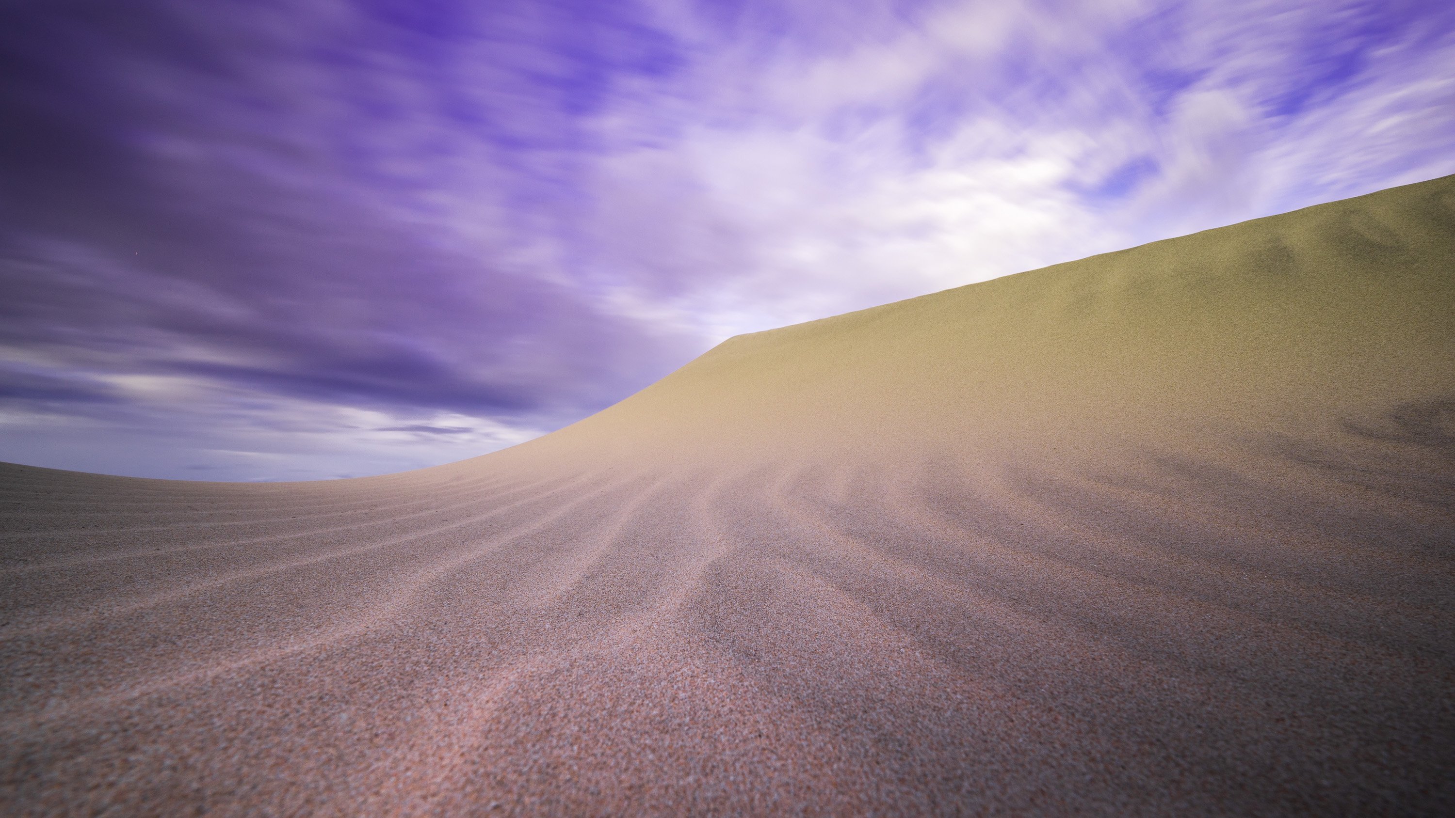
I was happy to find a section of sand dune at Sandbanks Provincial Park that was pristine, with no footprints. The windy day certainly helped by sculpting the sand in it’s image. I was obliged to lay fully on my side for the low angle but also to eliminate some distracting trees from the background. I wanted to convey a sense of wildness and aloneness, with very few elements in the frame. I was happy with the dark cloud moving over the dune on the right side, because I thought it added some contrast to the otherwise light colours in the image. I’m still trying to get the sand out of my hair.
Specific Feedback Requested
Hello everyone. I signed up a while ago but haven’t had the time to post yet. I generally like this image but feel like it is missing something to give it a bit of kick. I’m wondering if the image should be darker and less saturated, perhaps even black and white. I welcome all critiques. Thanks in advance!
Technical Details
Is this a composite: No
Taken with a Nikon Z6 and the 14-30mm f4 S @ 14mm, f13, 25s, iso 100.
I’ve adjusted the basics in Lightroom, adding a few grad filters, one for the background and another for the foreground. I adjusted exposure and contrast within each grad, as well as added a small amount of dehaze to the sky, and some texture to the foreground. I also decided on a negative global clarity to smooth out the atmosphere a bit.
@jasonpettit.photography
Love the composition! The sky looks a bit too purple to me.
Thanks Ronald. I agree. The sky was a problem for me in this one. Cheers!
This is very nice. Your composition is very precise, very dramatic.
On the other side your colors looks a little unbalanced for my taste.
1 Like
Thank you . Any suggestions?
I love the composition, the low perspective, and the effect of the long exposure on the clouds. The image does effectively convey a sense of vastness and alone-ness.
However the colors here don’t work for me. Not only is the sky too purple, but the sand in the foreground is reddish, while the background dune is very yellow. What bothers me most about the dual colors in the dunes is that the color shift from red to yellow is very abrupt, with no transition. I would aim to get all of the sand a more consistent color.
If you are looking for more drama, exploring it in B&W might be a good way to go. It would eliminate colors as an issue. And in B&W you could darken it and push contrast harder than you could in color.
Thanks! I think part of the problem is that the sun was partially illuminating the top of the dune but not lower down. I’ve since desaturated the sky a bit and went away from the slight tone I applied in the grad filter, because as you say, it’s too purple. I think you’re right about bnw…this may be the course to go. Thanks again for your help!
I like the composition with the radiating patterns in the sand. Agree that B&W might be the way to go because the colors are a little off. And to my eye the FG is a little out of focus.
I really like the image. B&w maybe the way to go but I wouldn’t quit on the color version just yet. A shift from purple to blue will help the sky and the dunes shadows as well. The yellow in the dune seems to be favoring green I think and it looks a bit flat. Maybe adjust its luminosity and color slightly. B&w is great for drama but this has a calmer more poetic beauty which you might lose.
Jason, this is a great image. the composition is great, the patterns in the dunes and the long-exposure clouds add to the quality. I agree with @Igor_Doncov that there is a large potential in the color version of this image, but the colors to be adjusted as proposed by others.