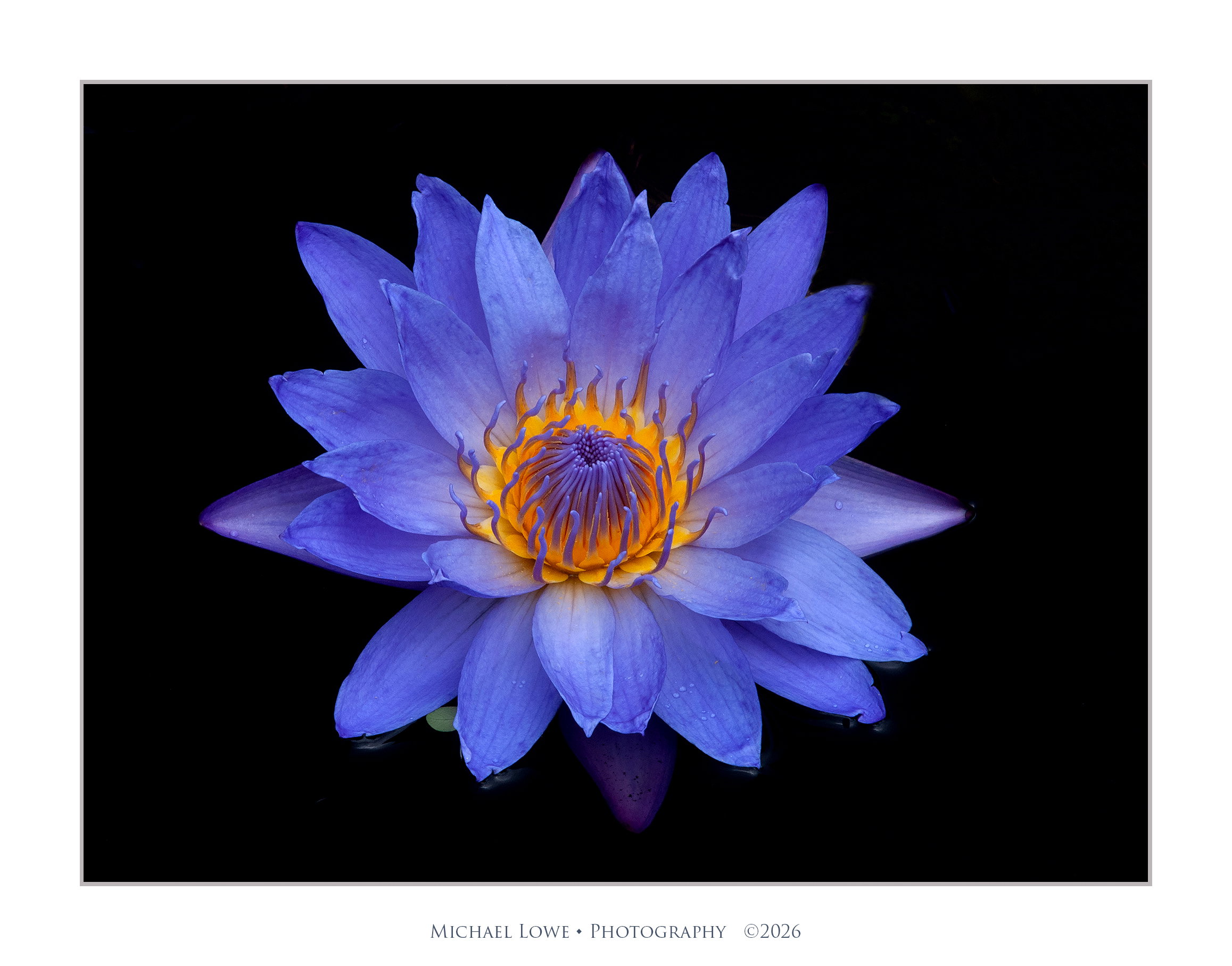
The photographer is looking for thoughtful feedback on the image as a whole, especially around the areas noted below.
Feedback Focus: Artistic + Technical
About This Image
Longwood Gardens, PA. The dark bg is not post processing. Dye is added to the water to keep algae at bay, hide plumbing, etc. and to make the flowers stand out. Addition of a CP completes the job and removes all reflections deepening the black.
Feedback Requested
Does the top down angle work? I can’t get on my knees anymore to get down on the flower’s level. How is the color? Does the black bg work?
Technical Details
Nikon D200, 135 mm, 1/45 @ f/18, circular polarizer, basic adjustments in PS, removed a lily pad
It’s perfect, Michael. Color combination, sharpness, background and the top down angle, all works fine. The center of the flower is fantastic with the orange “fire” and stamens looking like flames. I don’t think that such an effect would be achievable from a lower angle. The sequence of colors: blue - orange - blue - black make a very pleasant impression, the contrast is high but not aggressive.
Lovely photo.
By the way, I asked AI which shade of blue it is. There are three: cornflower blue, indigo and ultramarin in different areas of petals.
Mike, the details in the flower are outstanding. It is a beauty. I also like the sense of there being a fire in the middle…carefully developed by the hybridizer, I’m sure . I see hints of texture in the surroundings on the right, I’d be tempted to get some of those on the left also, but that’s me…
Mike, I see some green “leafy stuff” in the upper right corner approaching halfway across and halfway down. I also see dark shadows from some of the petals near the bottom. My monitor is set moderately bright because I work in a bright room, but it’s not as bright as my calibrator would like, given the room brightness…
Fantastic, Mike. The colors in this are amazing, and with that background, they really pop. Initially, I’m taken by the glow in the center. It looks lit from within. And then I notice other details, like the tiny ripple of water at the edges of some petals.
Thanks Mark. It is a monitor difference in brightness issue. What you see is what I suspected, because I turned the exposure way up in PS and I can see the bg stuff I thought I cloned out. Guess I’ll have to work on it some more.
Mike: Classic water lily portrait of a pristine and beautiful subject. One easy way to “fix” the BG is to open a curves layer, find a spot where the black is lightest and make that your black point. It ought not to affect the rest of the image and will make the BG more uniform. BTW, is this a recent shot? I know you and Ed had some issues with the Longwood tripod ban. However you captured this it looks pretty darn good. >=))>
Mike: Here’s the adjustment. I just used the color sampler tool to snoop around in the URC for light spots and found a few with values in the upper teens and low twenties. Marked the brightest spot, did the curves layer black point trick and voila. >=))>
This is very nice and the colors go very well with the dark BG. Bill’s edits elevate the comp even more. This would have been a fun one to use stacking if using a tripod. Otherwise, I like the sharp, yellow orange center which grabs the viewer’s eye. great job capturing this image…Jim
I somehow missed this beauty on the first go round. The yellow and blue color combination of the water lily is quite striking as is the black BG of water. I am also enjoying those water drops on the petals. I too like the small tweak of the black water made by @Bill_Fach. Beautifully done!. I should get a couple of mine ready to post this week.
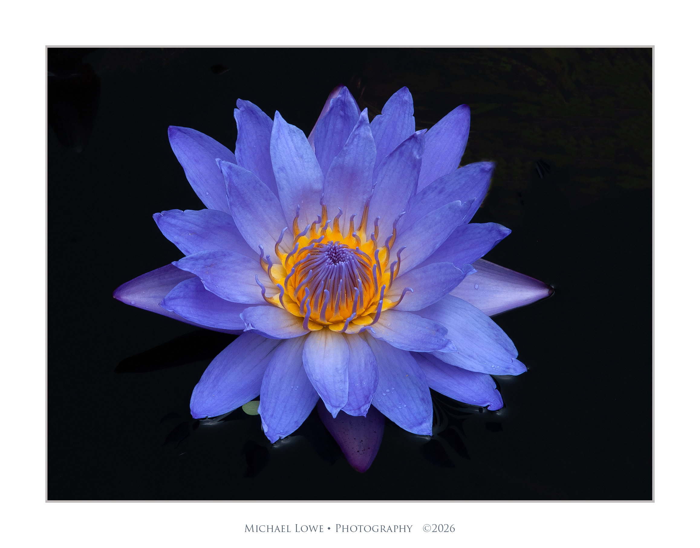
 . I see hints of texture in the surroundings on the right, I’d be tempted to get some of those on the left also, but that’s me…