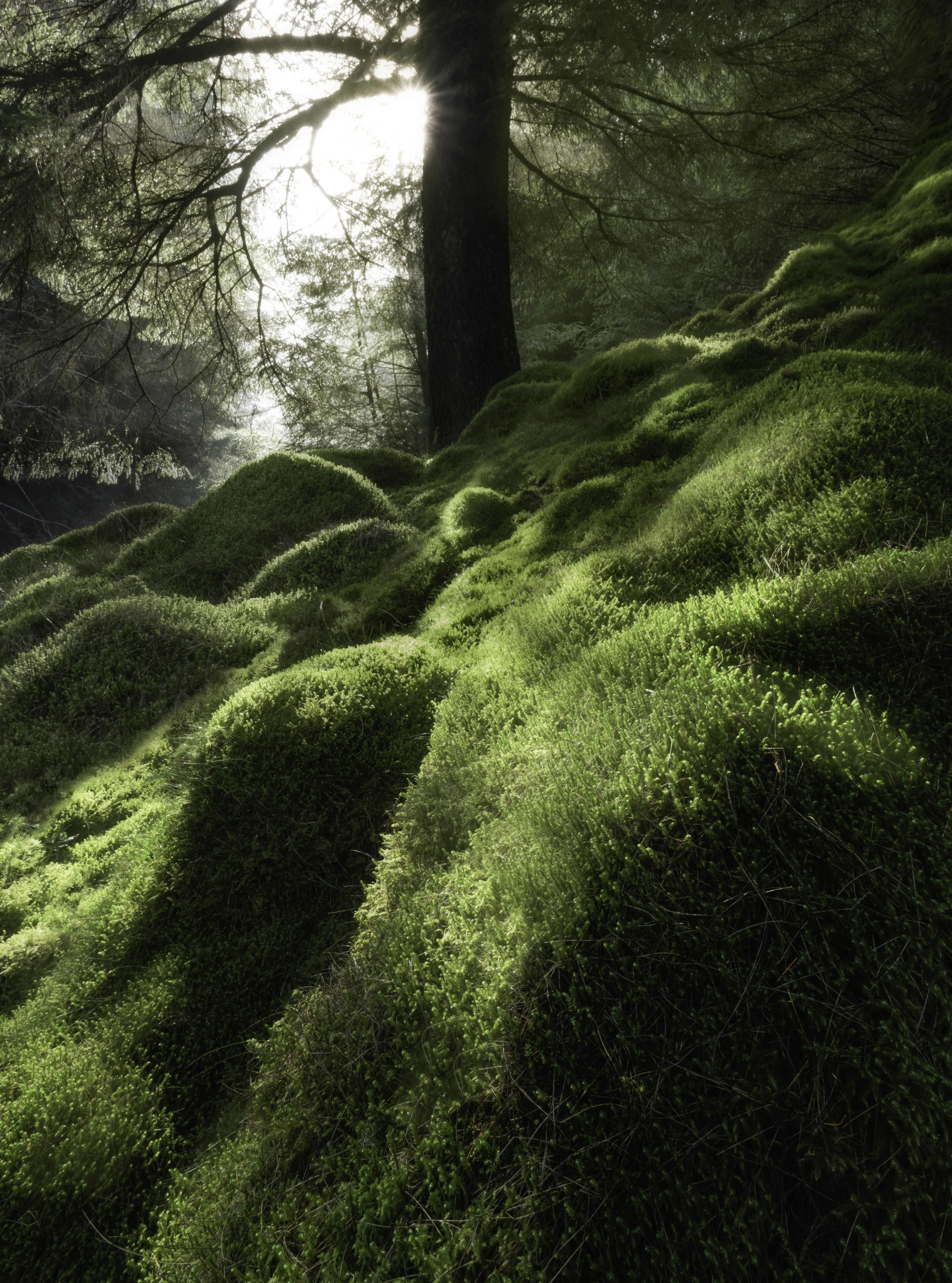
Hi everyone. I’ve never had a go at woodland or forest photography before but on a recent wander I came across these strange mossy bumps on the forest floor, the closest seemed to act as a nice leading line towards the tree and sun.
I quite like how to light was hitting the woods making for an almost dreamy scene.
As always, feedback and critique welcome.
Chris
Chris, what a marvelous find this was, that moss is a photographer’s dream. I like your composition, I think having the tree in the center works well, and your arrangement of the mossy boulders creates a nice radial effect. I might consider a slight crop from the bottom, but I also thinks this works as presented. In terms of processing I think the WB looks great, you nailed the greens and yellows in the moss. I’d consider darkening the shadows a bit to create more contrast, I think it would make the highlights in the moss pop even more. This image might also be a good candidate for adding some Orton Effect, to enhance the dreamy feeling even further. I think you have a great subject and composition, and and a few tweaks to the processing would take it up another notch.
1 Like
Thanks very much Ed. I’ve got an Orton effect added to the highlights, maybe it needs to be stronger?
I know what you mean about the shadows. They are darker on my macbook but I’ve had to make that many adjustments for uploading to the web that I was losing the will to live and left them a bit lighter.
Thanks again for your feedback.
Beautiful mossy textures. If possible I would bring down the highlights a bit to make the sun star stand out a bit more and I agree with Ed that a slight crop off the bottom might help. As is, it’s a beautiful shot though.
1 Like
Thanks Blake. I was wondering how to make the sun star more prominent.
Chris,
Great find and great job handling both the composition and the exposure/dynamic range. Sure the sun and bg light are bright, but somehow fitting and well handled in this scene.
I like this very much as presented, although agree with other comments that a slight crop off the bottom could work too; say just enough to eliminate the dark square LLC.
The color/sat is quite natural. Under the guise of personal choice, I think you even have room to warm up the scene generally including the sun and the bright area. Speaking of which probably not possible to recover all that area to improve the sun start dramatically, but I think you can bring it out a little more simply by dropping the brightness. Either through a luminosity mask, or tweaking the white values in a Selective Color adj layer. or combo of both. Of course when values reach their peak (ie. 255…) things can get wonky quickly trying to change that.
Not too many other suggestions. Perhaps burning down the bright moss towards the bottom left edge. Not overexposed per se, but burning that just a wee bit will help keep the eye in the frame.
Great job seeing and capturing this.
Lon
P.s. I Love the title! Quite appropriate.
2 Likes
Thanks for the feedback Lon. I will make the adjustments based on everyone’s comments. I think the crop is definitely a no brainer.
Great image , Chris. for me the comments you got were very interesting for me as a learning member. So, thank you and your critiques.
1 Like
Thanks Ben. It’s invaluable, I’ve made the changes and it looks so much better!
1 Like
Hey Chris, I definitely agree with the comments above, but just also wanted to say that you should totally post the newly edited shot! It’s fun to see how further edits from the critiques changed the image, and probably a good learning opportunity for others.
Thanks Brent. Yep I completely agree. I’ve made the changes and will upload it later on. I have to agree the crop has improved it dramatically.
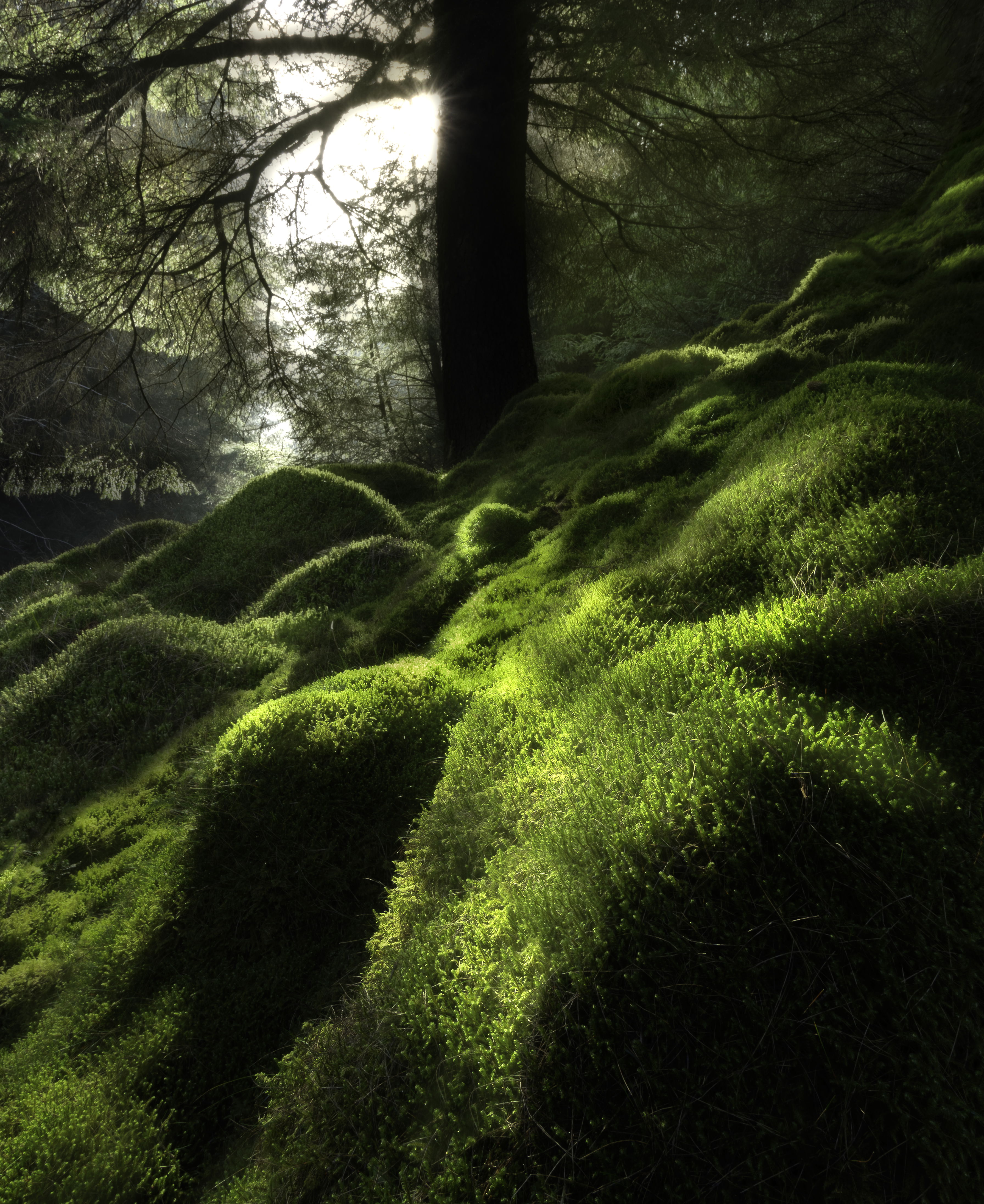
As requested here is the updated version incorporating a crop, added contrast to darken the shadows, warmed up slightly, stronger Orton effect, burned bottom left hand corner and reduced highlights around the sun to try and bring out the star.
It looks slightly too warm when viewed on my phone I think but looks OK on the mac.
All comments welcome.