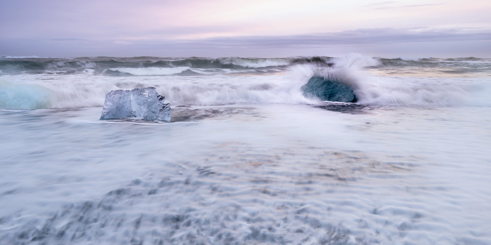
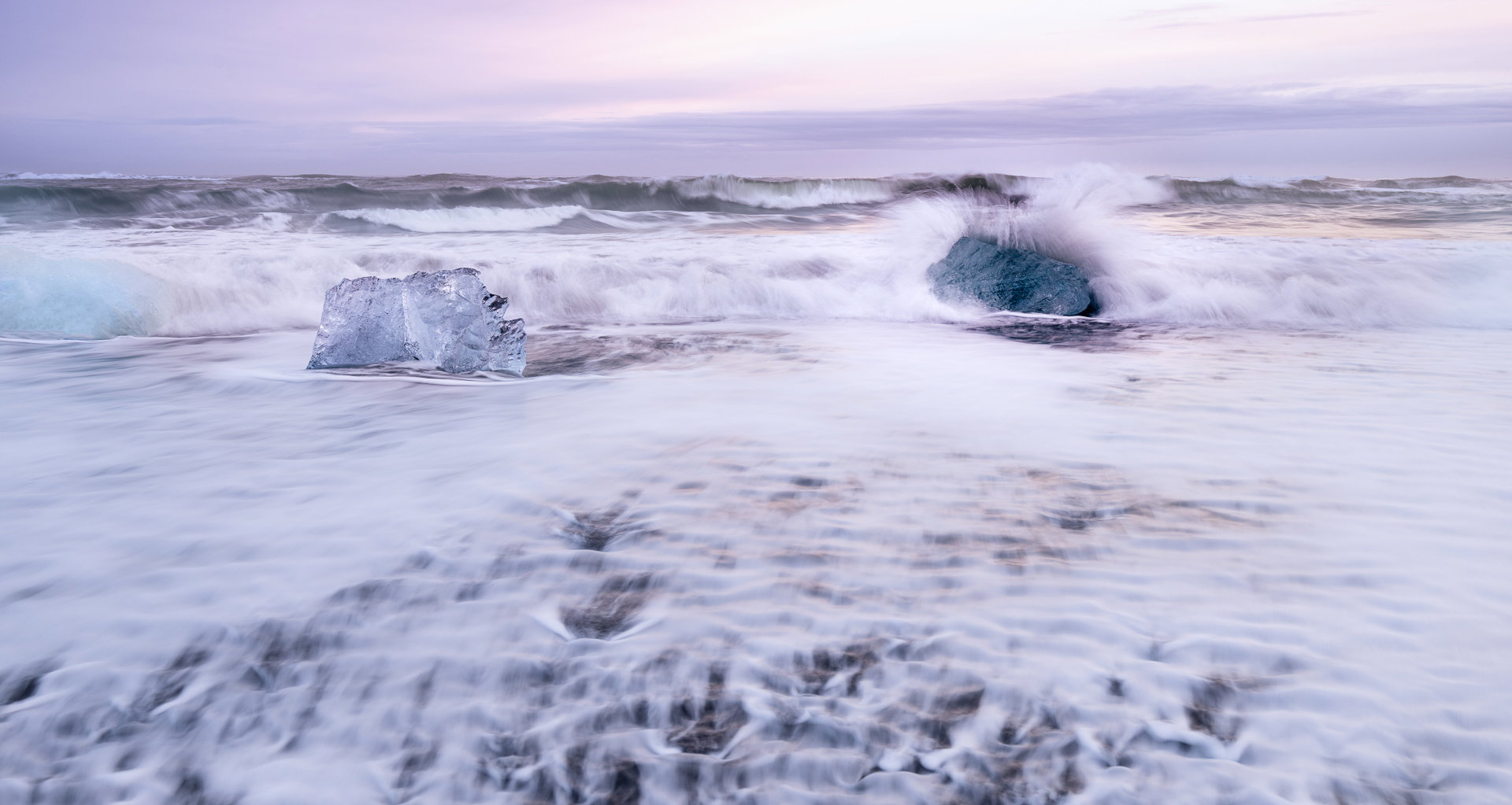
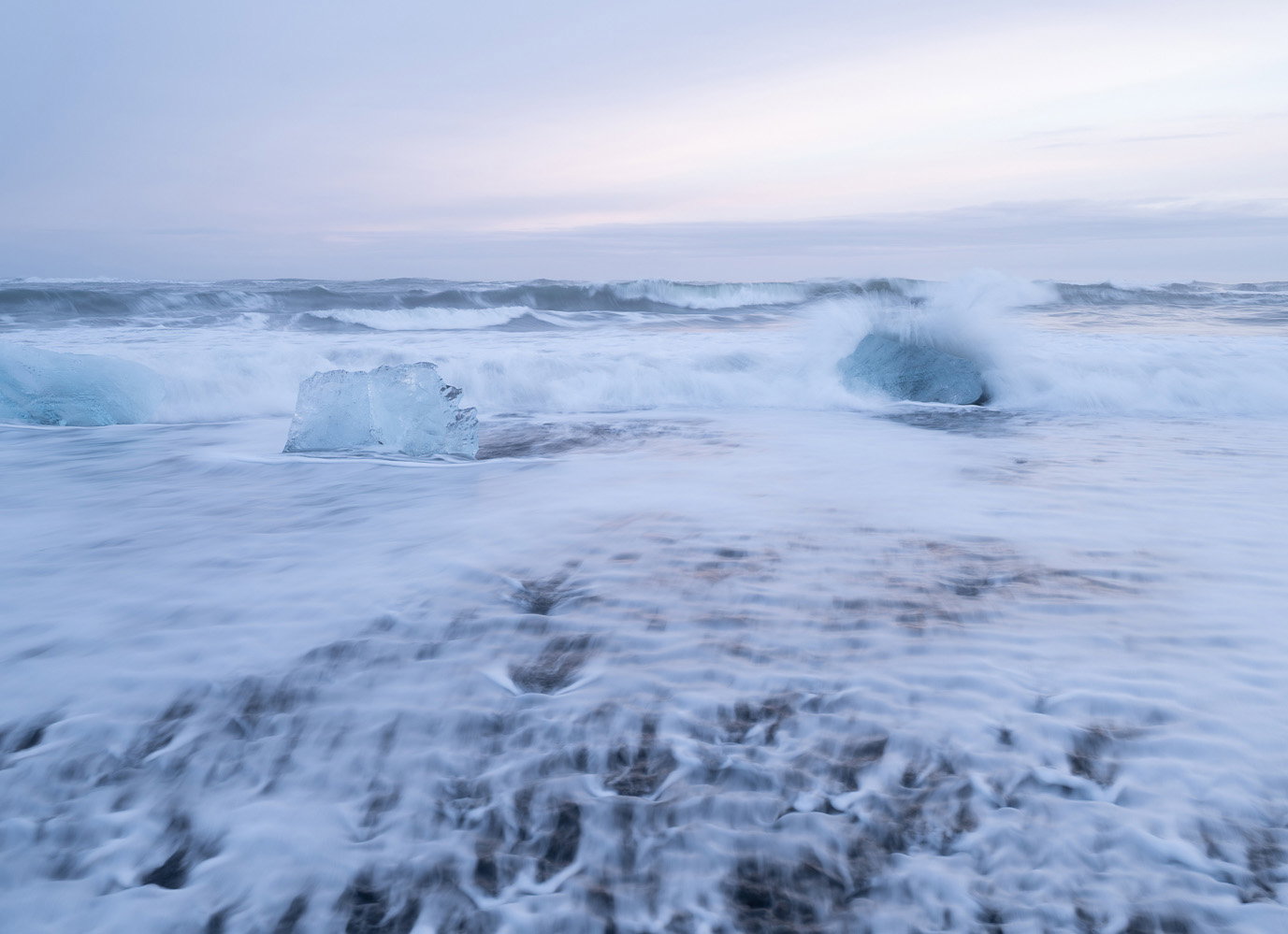
What changed: Reduced the reds in the midtones and highlights slightly, increased texture in left clear ice. Now I am questioning if it has a slight hint of green?
What changed: I tried to use the crop changes suggested and then processed the entire image, trying to emphasis the two main pieces of ice, especially the one with the wave hitting it, and deemphasize the blue ice at the edge of the left frame. I tried to have the pastel colors in the sky. The large area of white water in front of the ice being hit by the wave bother me. Thoughts?
Added after receiving feedback from the community.
The photographer is looking for thoughtful feedback on the image as a whole, especially around the areas noted below.
Feedback Focus: Artistic + Technical
About This Image
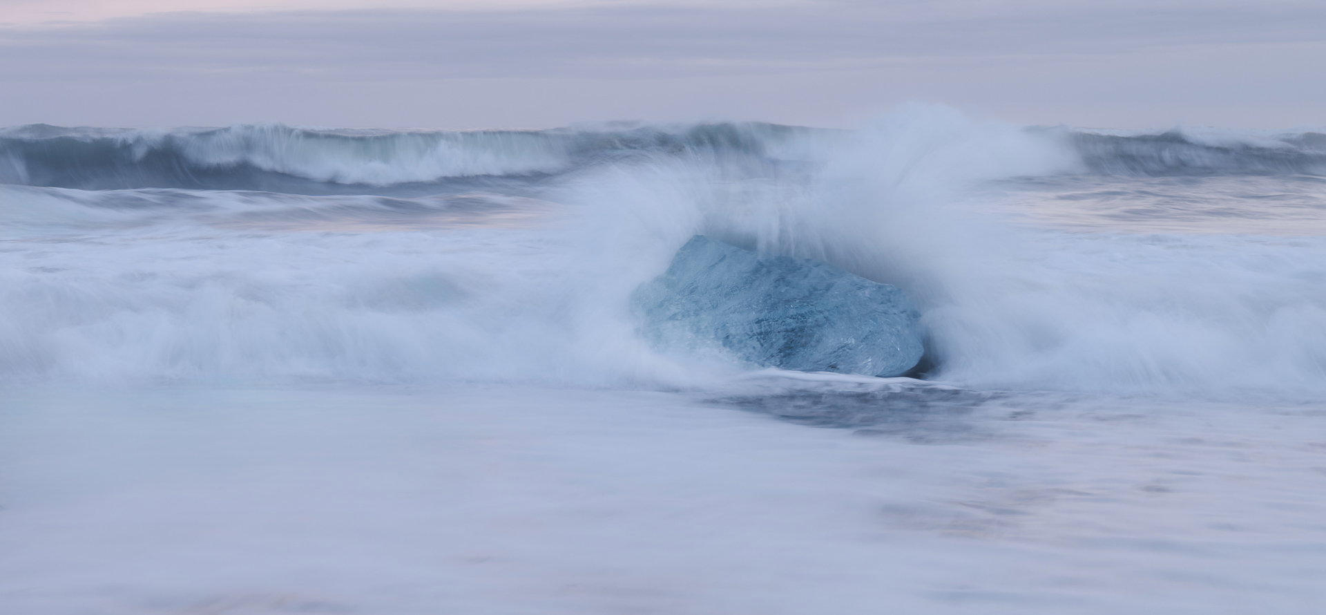
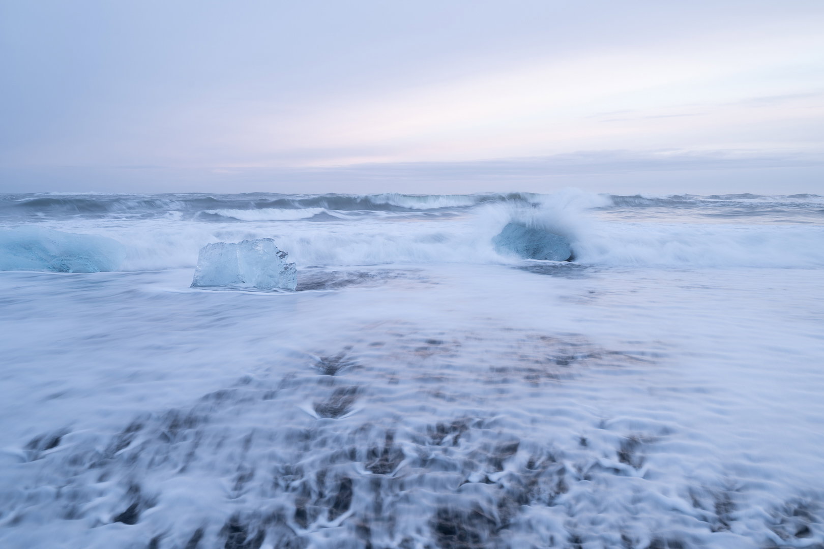
Taken on Diamond beach in Iceland. I included the original without any real processing because I am doing a serious crop.
Feedback Requested
Is the dramatic crop the best choice? Is anything pulling you eye away from the ice and the splash? Any processing suggestions? In general any feedback welcome.
Technical Details
Camera: NIKON Z 8
Lens: NIKKOR Z 14-30mm f/4 S
Focal length: 30mm
Shutter speed: 1/3s
Aperture: f/8
ISO: 64
I prefer the og over the crop version. I like the hint of pink in the sky and the receding wave patterns in the fg. It also gives me more of a sense of place. I know it’s Iceland with the ice and the black sand/gravel beach. I like the processing, so no suggestions there.
I lean toward @Michael_Lowe and his preference for the original, Elizabeth, though I’d really prefer something in the middle ground. The extreme closeup loses a lot of the gorgeous foreground and the spray coming over it kind of gets lost in the incoming wave behind it, which makes it lose impact. I attempted a crop somewhat in the middle for your consideration. I kept the left ice block in because it looks a lot more like ice that the one with the wave breaking on it which could almost be a rock and thus establishes more of a sense of place. Other than that, I didn’t do any processing, though I might be tempted to play with accenting that pink glow just a bit. A fine scene.
I too prefer the original version as the crop loses some wonderful elements included in the original. I could see a little crop from the right, left and top sides placing more of an emphasis on the two icebergs as well as the surf and the slight pink pastel color in the sky. Maybe something like this; just my opinion of course.
Elizabeth, I think @Ed_Lowe’s crop works well as the splashing in the foreground leads my eyes to the two main icebergs, then the big waves and finally the quiet sky. The iceberg at the left edge blends in well with the surrounding water, so it doesn’t get much visual attention. You might be able to reduce that even more with some dodging of the darker part at its bottom or doing a local blue/cyan desaturation.
Elizabeth - I prefer the cropped version. i think it tells a story about the power of the sea and it exploding around the ice. I’m wondering if you played with bringing in some texture and contrast into the exploding water and darkened the ice block (again for contrast versus the wave), it might help tell that story. But i really like it. I think selecting the longer shutter speed was a superb choice. Very nice.
I really like the composition in Revision 2, Elizabeth. I think I’d drop the red tone back to about the original as it still is looking a bit strong to my eye in that revision,particularly in the ice chunk. I like the way the boundary between the rippled area and calmer area of the foreground forms a leading line to the impact zone. Nicely done.
Hi @Elizabeth
Bit late into this but I basically love Revision 2
With a title impact it is best conveyed to me with the one block of Ice being swallowed by the wave and the other one standing pristine awaiting to be engulfed.
The colour of the sky doesn’t really bother me - but taking out the red adds to the bleaker view. The wider cinematic crop with less foreground brings the burgs closer and more impactful. The colour of revision 2 doesn’t look to have any tint to my eye.
A lovely example of a nice image and interesting appraisal discussion. I very much like the end result.