In the Company of Quiet (with Repost)

Critique Style Requested: Standard

The photographer is looking for generalized feedback about the aesthetic and technical qualities of their image.

Description

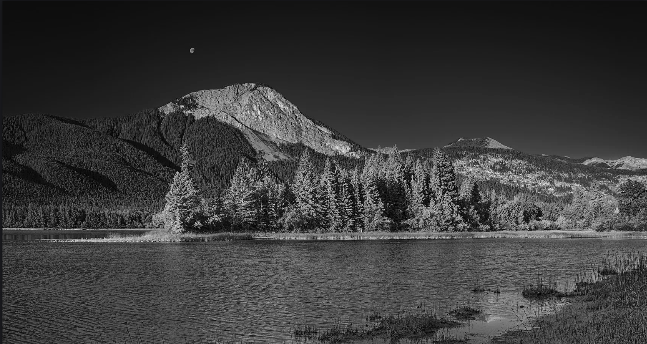
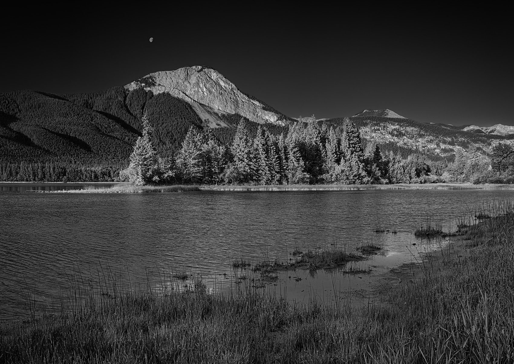
I came across this small lake earlier this year while poring topographical maps, searching for new and interesting places to photograph. It seemed perfect – it’s not too far away, with access that looked fairly easy, requiring less than half a kilometer of off-trail hiking through open meadows and thin forest. What intrigued me most was that I couldn’t recall ever seeing any photographs taken from this spot.

The mountain face here looks north, which means it stays in shadow for most of the year. But from early June to late July, there’s a brief window when the rising sun lights it up. With that in mind, and loads of excitement, I set out to explore the area one morning last June.

I arrived well before sunrise, but to be honest, the sunrise itself was a disappointment. The light was weak, the sky was completely clear, and there were no clouds to add any interest. I walked along the shore searching for a pleasing composition and found it surprisingly difficult. The water’s edge was a muddy mess that threatened to swallow my shoes, while a bit farther back the trees and shrubs grew so densely that they made movement slow and awkward.

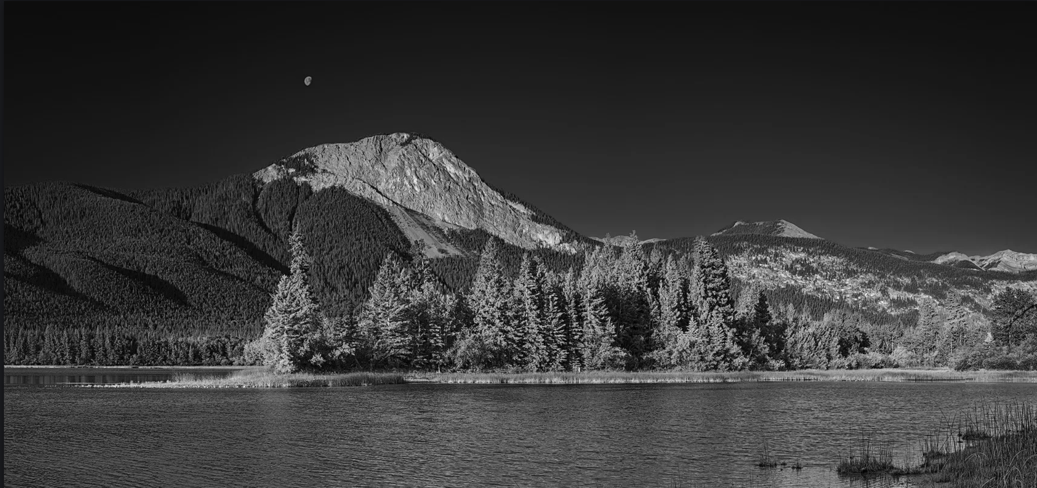
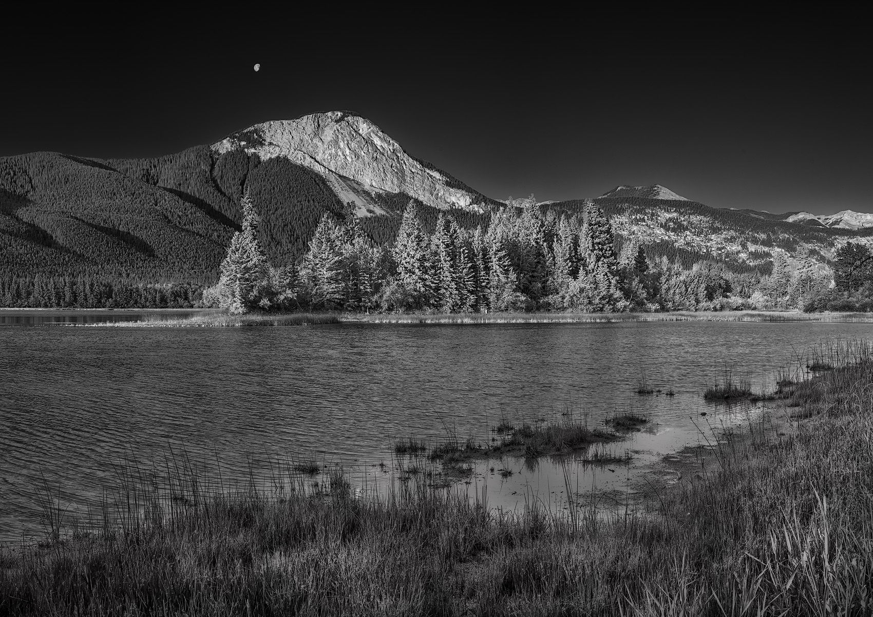
By the time sunrise came and went, I was feeling pretty dejected. I slowly started making my way back to the car, but just before leaving the shore, I stumbled upon this little spot. It had more potential than anything else I’d seen that morning, so I decided to take a few frames as a scouting shot, something to reference later if I wanted to return. I especially liked the small peninsula that juts into the lake. My 45mm lens was too tight, and the 24mm too wide, so I stitched together three vertical shots taken with the 35mm. The resulting image is roughly equivalent to a 30–35mm focal length.

Specific Feedback

I decided to make this a B&W because the colour and light were so bland but because I don’t do B&W all that often I find them challenging. How does the B&W conversion look to your eyes? Is the sky too dark? Is it ok?

How do you feel about the foreground? Too simple? Too boring?

Technical Details

Canon RP with the 45mm TS-E lens. 3 vertical frames stitched.

1/30 sec @ f/11, ISO-100.

Tripod, no filters.


Critique Template

Use of the template is optional, but it can help spark ideas.

Vision and Purpose:
Conceptual:
Emotional Impact and Mood:
Composition:
Balance and Visual Weight:
Depth and Dimension:
Color:
Lighting:
Processing:
Technical:

Tom, this does convey a strong sense of peacefulness. I think the b&w works well. The darkness of the sky is completely adjustable with the blue luminance slider. I do think that a bit more separation between the sky and the ridge at the left edge would be good. I have two other suggestions, make the moon and the main peak brighter plus add some contrast to the foreground grasses to let them better balance the mountain’s brightness.

Great Image. Works perfect in B&W. Maybe make the foreground a little brighter. Really a Cool image. To Capture the moon is so cool. Great Composition and Tone !!!

Hi Tom,
Great idea to look at maps to find a new, promising location. This one seems like it is definitely worth revisiting periodically, especially during the long days when the north side gets some light like it does here.

I like the dark sky. I agree with others that more tonal separation from the evergreens is a good idea, maybe adding texture too? Just a tish perhaps, and the sky could even be darker down lower where it meets the trees and mountain. I love dark skies in black and white. You did well with that here.

I’m glad you asked about the foreground. I can imagine on a windless day standing as far out as possible and getting a reflection. That could be cool, but clearly this day had some breeze.

My instinct would be to get rid of some of that shoreline. As your question hints, it is a little underwhelming compared to the trees and the far shore. I see a couple of options:

  1. crop up to keep a bit of the lake and eliminate most of the grassy foreground, perhaps even removing some of it digitally.
  2. crop up to remove all but the right hand side of the foreground grass, where the patchiness holds more interest. I did a quickie, screen shot example of that here.

For me, the diagonal line of the foreground doesn’t add much and the diagonal feels like an attempt to create energy in an image that doesn’t need that kind of energy.

Here’s my quickie version of an alternate crop:

Actually, I think it might be even better to crop up further, including only that next projection of grass with its really narrow peninsula adding some directionality:

Tom,

It is a nice photograph overall, but I am particularly attracted to the moon in the sky. It seems to have the most interest for me.

I’ve hit those walls where I was in a drop dead gorgeous location and just couldn’t seem to come up with a composition. I empathize with the struggle and am glad you caught this before leaving. I agree about that peninsula, and I like the shadowed contrast on the slopes behind it. I too like the moon, and the peak below, and the trees below the peak, are also highlights of the image for me.

I like the black and white, although without knowing what the color version was like it is hard to fully judge the conversion. I think the sky is okay, but like the suggestion to brighten the moon.

The foreground is tricky. Although it adds context to the image, it struggles to keep up with the more distant parts of the image. I like the diagonal that it forms, but wish the diagonal pointed towards the mountain and the moon as a opposed to away.

Hi Tom,
I think you made the right call in converting this scene to a B&W with the conditions you described. The FG works for me as I like the diagonal you created with your positioning. I also like the inclusion of the moon in the image. My only suggestion would be to add a little contrast as it looks just a little muddy in the FG. This looks like a great place to revisit when you get the right conditions.

@Mark_Seaver , @Gill_Vanderlip , @Marylynne_Diggs , @Youssef_Ismail , @John_Williams , @Ed_Lowe

Thank you everyone for your feedback. I’ve taken some of your advice and reworked the image. I tried to make the forest stand out more against the sky, made the moon brighter, increased the luminance in the water and also brightened and added contrast to the grasses. I like the moon in the image but in a perfect world I wish it were further to the right of the peak to help visually counterbalance the mountain.

I’m still not 100% thrilled with the foreground and Marylynne’s crop suggestion addresses that nicely but I’m still not decided on exactly where I should crop the image. In any case, I’m definitely planning on revisiting the location next season. I’m sure that things will look differently but at least now I “know” which part of the lake shore I want to go straight there and be able to focus more on finding a suitable foreground that will work well with the conditions I find there.

Repost:

Cropped Version:

I love your RP, both versions, but think the cropped one is my favorite. I hope we’ll get to see more from here! I wonder about shooting long exposures to compare, to calm the water.

I agree with @Diane_Miller about both versions, and also that I slightly prefer the crop. With that said, I love your plan because I think the potential to find a foreground that was even stronger would look really good.

Thank you for your comments @Diane_Miller and @John_Williams . Now I can’t wait go back summer to shoot this scene again. :slight_smile:

1 Like