The photographer is looking for generalized feedback about the aesthetic and technical qualities of their image.
Description
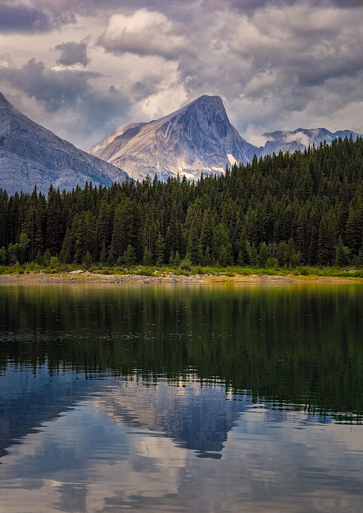
Last summer, I spent a lot of time paddling some of my favourite lakes in the Canadian Rockies. In the spring, my partner Kate and I bought a pair of kayaks, and from that point on tried to spend as many days as possible on the water.
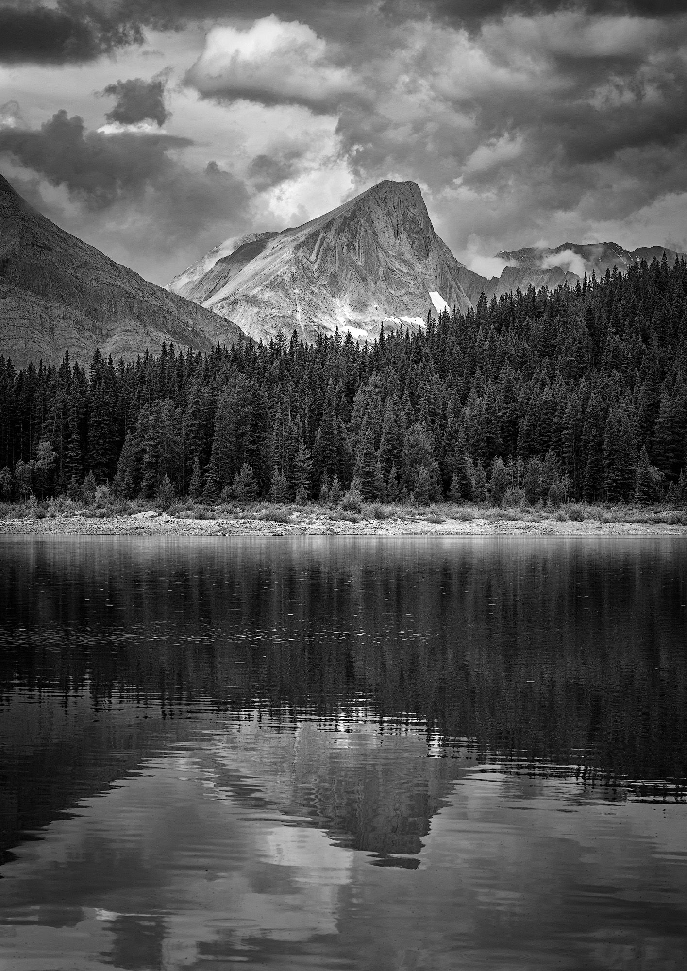
This photo came from one of those days. We had just pulled up, unloaded the kayaks from the trailer, and were sorting out our gear when I noticed the way the light was hitting a mountain across the bay. I stopped what I was doing and grabbed my camera. I took a few quick frames, then packed it away, climbed into the cockpit, and pushed off.
Specific Feedback
I processed this as a colour image because I guess that’s what my mind defaults to but when I saw the thumbnail of it earlier today in Lightroom I realized that the colour wasn’t at all necessary and that it may on the contrary be a distraction. What do you think and which do you prefer?
Technical Details
Equipment: Canon RP with a 24-105mm lens at 105mm.
Exposure: 1/320 second at f/11, ISO 100. Handheld.
Hi Tom,
You are making this hard to choose which one as both are quite lovely, but I am leaning towards the B&W version. I love the blue tones in the color one, but the B&W just seems to be more dramatic; especially that cloud laden sky. Kayaking is so much fun; in fact I need to head down to my oldest daughter’s home when it warms up a little and do some more kayaking with her as we have a trip later this year to view some petroglyphs on some rocks in the Susquehanna River. Do you take your camera with you while out on the kayak? Bottom line is that I do not think you can go wrong with either one. Beautiful scene.
I think the b&w is definitely the superior image. That image has a better tonal balance the the colored version. The sky is better integrated with the land. By darkening the sky the contrast between the sky and the trees has been reduced as separate blocks of tone. As for the color I’m not sure if that yellow vs blue goes well. Perhaps the yellow should be desaturated for greater harmony. Not sure.
I’d say both images work very well, really great light and composed very well. I kept going back to the color image, I think the colors, especially on the mountains and the color of the sky in the reflection are quite nice, very subtle and beautifully seen.
I go with the B&W.
For me, I´m not into the combination of blue and (yellow) green that much. But the color symmetry, blue on top and bottom & green in the middle, is in a way interesting for me.
The sky (and the picture itself) in B&W looks more dramatic, if the intension is to have it in a way more calm, then color.
Tom, to me the b&w version is a classic landscape view. It does a better job of showing off the cloud structures and, especially, the side of the central peak that’s facing to the right. That side looks like a strongly glacier carved mountainside, with the textures and geology show more clearly than they do in the color version. The reflection in the water is nicely muted and distorted so it supports but doesn’t compete with the mountains, the ridge of trees and the wonderful sky.
Ed, yes I bring my camera with me when out kayaking. For the first 3 or 4 trips I didn’t because I didn’t feel comfortable enough and it was all still very new to me but later on I did. I have a small waterproof case that I strapped to my kayak right in front of me that’s fits a smaller camera and lens that I can grab anytime I see something interesting. It would be nice if I could fit my camera with my 100-400mm lens on it because I’d love to photograph the loons I often out on the lake.
Put me down for the black and white also, Tom. I think my preferences is a result of several things:
Black and white creates a classic feeling, especially with that sky, thereby preventing the scene from being merely a nice picture.
The shoreline is less distracting in the black and white, because the tones of grass, tree, rock, etc. are more synchronous than their hues, and this allows the viewer to immerse themselves in the reflections of the trees and the mountain and clouds.
The reflection works better in black and white too–emphasizing the trees and the subtle texture of the ripples rather than the colorful clouds and sky.
One thing that keep catching my eye, and it’s natural, so feel free to keep it as is, but that one dark cloud that is almost square? It bothers me, especially in the reflection where its tails are cut off making it even more square. If you can modify the shape of that cloud in sky and reflection without having an ethical conflict, I think the image would feel more cohesive and (ironically) natural.
Another thought: The color version, cropped to show only the reflection, is quite nice as an abstract. There is a impressionistic aspect to it, especially the clouds, that is really pleasing.
Tom, I carry my R5 and the 100-500 zoom in a waterproof soft bag when in my Liquid Logic kayak. When I’m not trying to take pictures, it fits in the small storage compartment behind me. Yes, damage might be possible if I turn over, but I’m not pushing whitewater and carrying my camera… Carrying it on top and in front of you makes it much more accessible.
Marylynne - It’s funny, I hadn’t noticed that square cloud until you mentioned it but now I can’t unsee it. Funny how that works I’ll take a stab at altering it and will see if I can still get it to look natural.
Mark - I’m looking to see if I can find a decent waterproof bag like you mentioned. Something that won’t involve me having to do some gymnastics to get my camera in and out of it. I ‘m still not a 100% comfortable in the boat and I’d hate to flip over and loose my camera.
The way that this layers from top to bottom, and the drama of the range of tones, work really well Tom. Definitely black and white for me too. Well done!