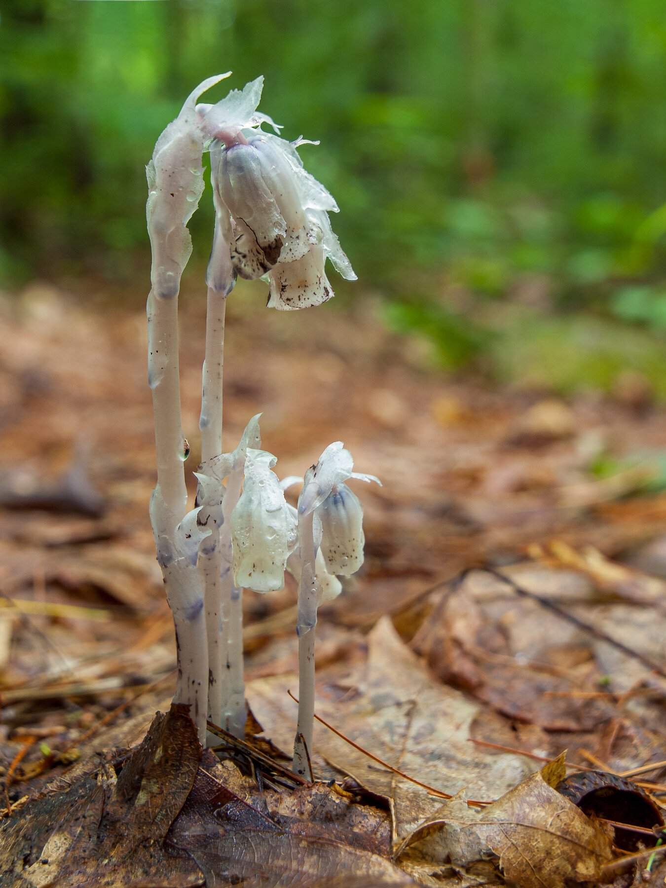
Reaching into the archives to put together a two image stack out of two shots that didn’t work separately. My favorite wildflower deserves a second look and a go with the stacking software.
Actually this shot came about because I’m having a big purge of my enormous Lightroom catalog. Deleting thousands of shots that are a decade old that aren’t worth the time. Maybe this one is though.
Specific Feedback Requested
Does it work? Should it have gone in the digital bin?
Technical Details
Is this a composite: No
Tripod and maybe a polarizer, but honestly it was 2011 so who knows.
Lightroom for initial processing and then Zerene for stacking two shots. Retouched the background and a little of the flowers themselves then back into Lr for more massaging - particularly masked the flowers and increased texture without affecting the background. Also Photoshop to remove some distractions here and there. It was already a busy enough scene.
Kris: Kudos to you on your purging efforts. When I shot slides I was pretty ruthless with a trash can right next to the light table but with digital I have hard drives full of images I’ll never do anything with. I am glad this survived your culling. I’m unfamiliar with this flower so it’s a treat. I like how you have it isolated against the BG. Nice POV and a fine result. >=))>
Thanks @Bill_Fach & @Diane_Miller - purging is hard at first, but then it sort of feels good. Especially when I see my total catalog count go down to under 100,000 images.
When you say color blending (or did you mean bending???), how do you mean? Do you mean making the color green more uniform than it presents now?
Indian pipe are a saprophytic flower that uses a symbiotic relationship with fungi in the soil to absorb nutrients instead of producing leaves and chlorophyll. I have been photographing them for a decade or more and have even put a book together about them with my images. You can see the gallery here if you want more of these pale lovelies.
Yeah, being semantically lazy again. I use the term bending to mean tweaking a color’s hue – in this case to be a little more brownish to blend better with the main part of the image. That unifies different areas a little, although it tends to remove some very pretty greens in a lot of images.
The idea of “unifying” colors is always just an idea, which may be good for an individual image or not. I think it got rooted in my thought process by the bold greens (which are predominantly yellows) that I often get with digital processing. They are often just too bold. (But then there was Velvia, so it’s really not new. In fact, maybe that’s where it started.)
With this particular image it’s just a thought, not a suggestion. Contrast vs. unification is always a quandary for me.