The photographer has shared comprehensive information about their intent and creative vision for this image. Please examine the details and offer feedback on how they can most effectively realize their vision.
Self Critique
How can you improve an image in a setting like this? Direct light and blue skies…
I feel like the composition could be improved but not sure I’d want the subject to appear any smaller in the frame.
Creative direction
I just want it to look good. Being that I tend to rely on awesome light during the golden hours for beach shots, that was not possible this time.
Specific Feedback
Feel free to critique anything and everything. Let me know if you just don’t care for it.
Technical Details
Shot on Canon 6D .
f/8
6 sec. exposure
ISO 100
21mm
Used a 6 or 10 stop ND (I forget which)
Processed in PS using basic luminosity masks to warm up the highlights and cool down the shadows just a bit. Also a slight Orton effect.
Description
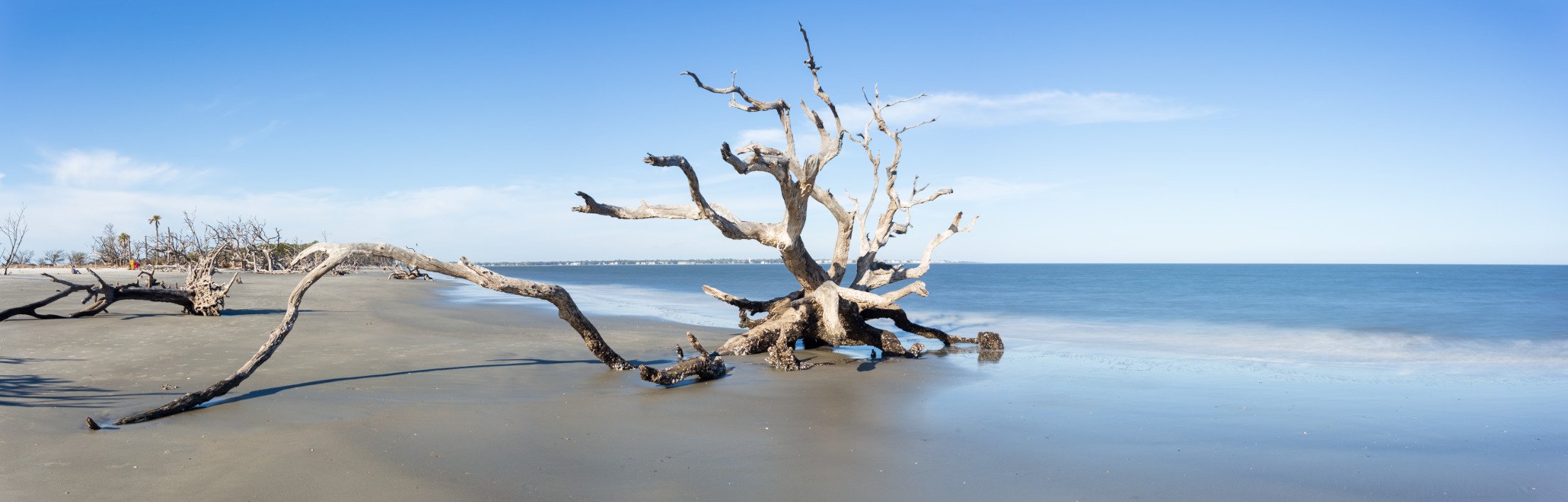
I drove 3 hours to visit Jekyll Island, except I didn’t arrive in time for sunrise and I didn’t stay for sunset. So I was stuck with shooting at the “worst” times of day for landscape photography. I tried to make the most of it but with the receding tide, I couldn’t even get the added effect of smooth water using my ND filters to shoot long exposures. The day after I shot these, I reviewed them all and was not inspired at all, so they have sat on my hard drive for the past few months. I recently pulled this one up and gave it a try in post, but I’m not sure it really warrants keeping.
Hey Aaron, thank you for sharing this image. Jekyll Island seems like a really amazing place. My wife was there recently with her sister and enjoyed it. I’ve had some non photographer friends go there and immediately tell me I needed to come! You’ve done well to handle the daylight conditions which is always a struggle for me. I think going with the long exposure was a good call to not add any additional elements on that right side. My main concern is with the “clutter” I will call it on the left side. There are some mergers or overlaps right on the edge of the frame that draw the eye as well as the “island” in the background. I have no clue what the beach looks like so I’ can’t really offer many compositional suggestions for how to reduce this. Maybe shooting it wider and getting closer to the main subject would have highlighted it while also pushing those background trees further away from you. Otherwise looking at a different angle on this tree or a different tree entirely without the background issues.
What a cool bit of giant driftwood. Seeing things like this makes me wonder about what kind of journey it had to arrive here. And where did it come from? I agree with David about the processing and going with a longer exposure - that aspect looks great and I like the reflection in the foreground. I wish you’d gotten on the other side of it and used the water and sky as a backdrop rather than the rest of the shoreline. Compositions like this feel unconsidered; a snapshot. Of course, some snapshots have value and can convey artistic intent, but this one just doesn’t. Maybe there was a reason for choosing this view and that looking out into the water presented its own problems.
I agree! That’s why I am feeling very “meh” about this image. I have another composition that I tried with this tree, some include your suggestion of shooting it against just the sky and water.
Those have a bit more of the desired effect I think. Did you get on the other side of it at all? By that piece of wood coming in from the left? That might have worked, but not being on site, you have to be the judge!
Maybe this executes the vision more cleanly than those other ones.
I still think this is a great location to shoot, but one that probably warrants multiple visits and experimentation with different lighting and compositions.
I think you had a nice idea here, but the conditions you chose to capture the image in are not doing you any favors with the harsh bright light here. Additionally, there’s not really much else beyond the cool driftwood that commands any attention, but there are other things in the image competing for my eye. Particularly there’s something else on the beach at far mid left that looks to be an eyesore of sorts. It also looks a bit overexposed to me. I wonder if you were to walk to your left a bit and just have the driftwood and nothing else w/ a long exposure, if isolating your subject in such a fashion would help out. Just some thoughts!
Thanks Matt, I agree with you. It was a challenge due to the conditions for sure. My take away is that I can revisit this location with a pretty good starting point, as long as I have good sunrise or sunset light to help out… or even some cool storm clouds / lightning.
Aaron, what fascinating pieces of beach “art” these are. It must have been disappointing to get there outside of the golden hours. Oh, for an infrared camera in situations like this. The first three pictures have the challenge of an interesting subject with a neighboring piece that distracts from the main subject. Unfortunately, its long curved shape points away from the main subject out of the frame. The roots of the tree are very interesting. I wonder what you could have done by forgetting the whole tree and focusing on the interesting shapes of the roots.
I like the last picture with the upright tree. The emotional impact is powerful. It remains standing, reaching to the heavens; what strength and endurance. The smaller tree has fallen, but it too, reaches toward the heavens. Nik’s Silver Effects Pro might turn this into a significant piece of art. I had to see what it might look like. All I did was crop a little at the bottom and on the left. Then I cleaned it up by removing the shadow on the right and a few distractions on the left. The filter I applied in Silver Effects Pro was a present I used for one of my pictures. Wow, Aaron,
I actually really like seeing it in black and white, and to be honest I’m so unfamiliar with b&w post processing that I have not explored this as an option. I think I’ll do some research and give it a shot. Thanks Barbara!