I do Love Bridges. The shapes are always different.
Critique Style Requested: Standard
The photographer is looking for generalized feedback about the aesthetic and technical qualities of their image.
Description
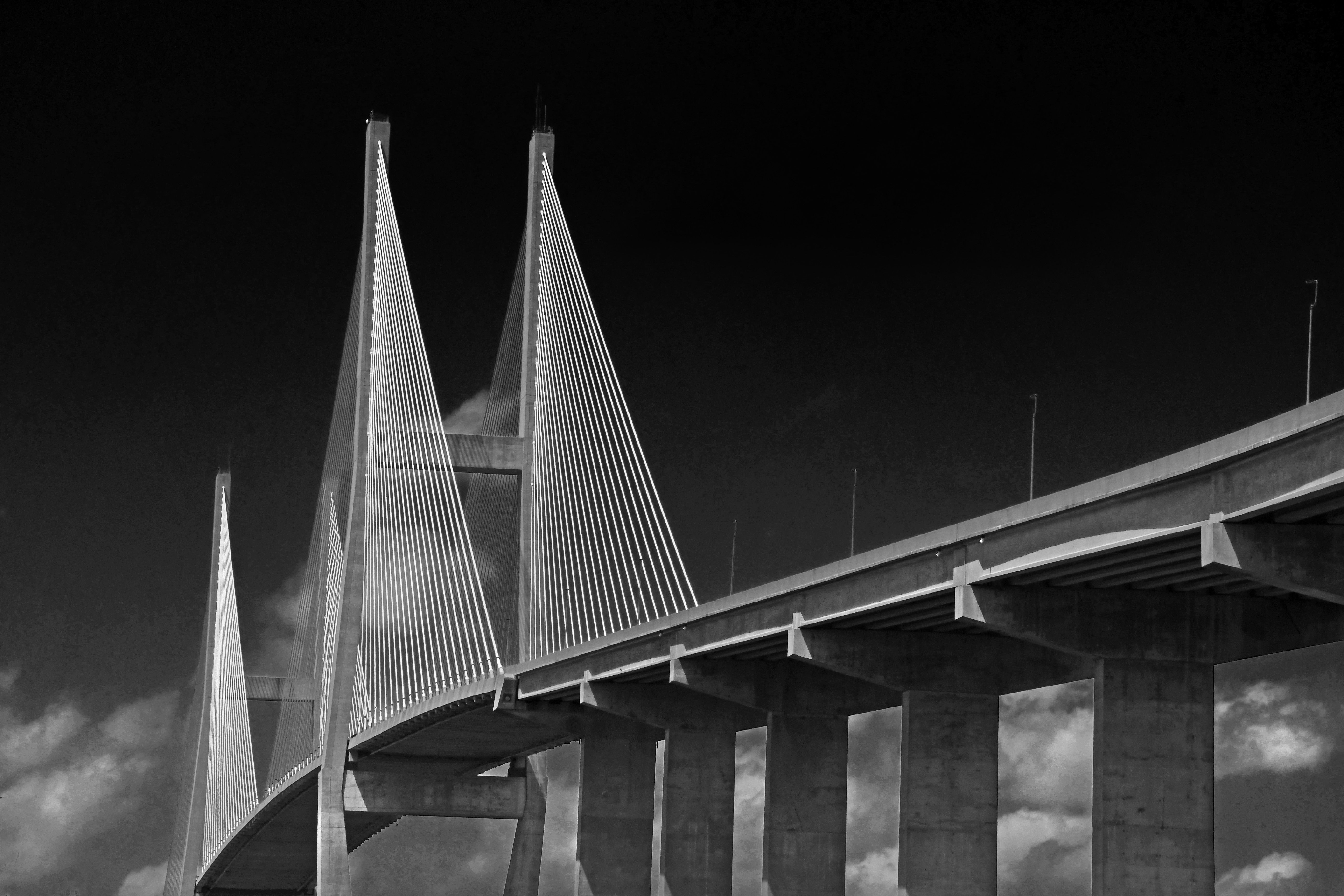
Went to Jekyll Island to do as much photography as I could. Broke my shutter cable yesterday. So I hand held everything. Had lots of fun shooting the Bridge and Driftwood Beach.
Specific Feedback
Just wanted to post a few thing over the next few days. The lighting was pretty cool but maybe a little better .. Afternoon shot. I do like this image.
Technical Details
ISO 500 Shutter 400 f18 edit in photoshop
Critique Template
Use of the template is optional, but it can help spark ideas.
- Vision and Purpose:
- Conceptual:
- Emotional Impact and Mood:
- Composition:
- Balance and Visual Weight:
- Depth and Dimension:
- Color:
- Lighting:
- Processing:
- Technical:
I like the geometry of this shot a lot, Gill. All the straight lines merging to create that graceful curve are great. Well done.
Gill, this is an outstanding perspective here on this bridge. Interesting to see some of the cloud cover below the main deck line from this angle too. Nice work… 
Good work, Gill. No suggestions.
Thanks Don. I hope I achieve the film look on my images. I didn’t want to look modern and pretty on images I’ll be posting.
This is wonderful!! The light on the bridge is so striking and the clouds are a perfect touch to contrast softness against geometric forms. It could be an intentional “filter-like” effect but there is a lot of posterization. I’m guessing it’s from the large pixel size being compressed too much in the JPEG export. If not intentional, try a quick comparison, changing the size in the export (not for the master file) to about 2000 pixels on the long side and the “quality” factor to maybe 80%. Let the file size fall where it may. It should give a cleaner look, but maybe that’s not your vision. There are filters to give various “soft” or texturized looks, but letting JPEG compression do it gives an unintentional look. (But the Pictorialists would have loved it and I’m certainly not going to criticize it!) I love your dark skies with their lovely subtle gradients! So much nicer than slamming the dark end of the histogram against the wall. The gradients are giving it an intentional look!
Thanks. Shooting at Jekyll Is proved to be a real challenge. The Driftwood Beach was harsh and raw. The trees and so beaten and the sun was so harsh and hot. But I did the best I could and learned a lot.
Thanks again.