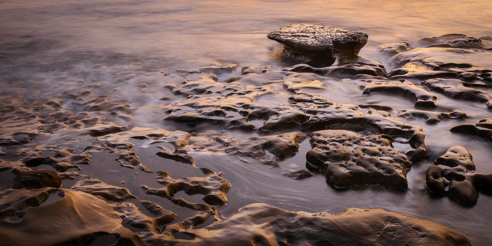
I spent an evening at the La Jolla potholes this spring and came away with two variations of a scene. I’m not quite sure if one is clearly superior so I’d like to hear opinions on the two versions from a compositional standpoint to find out if any one resonates more with viewers.
Which composition do you prefer? Does the panoramic format work for you in this image? (I’ve been enamored with 2x1 panoramic crops lately.)
I’m also curious what people think about the processing, especially saturation levels.
Any pertinent technical details:
D810, Sigma 24-105 f/4 at 38mm, f/16, 4sec, ISO 31
Update:
I was finally able to spend some time with this. Thanks again for the feedback. I reprocessed the 2nd version and backed off the 2:1 crop a bit. It’s still panoramic but has some more space to breathe vertically. Thanks again for all the super useful feedback!
I would say that option #2 is the better of the two compositions. It gives the eye a space to travel to and relax rather than be trapped by a leading line of negative space that leads to nowhere. I also like the warmer tones in the second image as it feels better balanced with the tones of the shadows. 2x1 crops work well when you can commit to composing directly for them and I think you have done well here. Keep practicing and composing these types of scenes as I enjoy your work!
Go with the second–the rock and warm tones in the upper right work better for me over your first version. Contrast seems better in the second as well…Jim
Another vote for #2, definitely. In the first, my eye just goes directly to the centered top rock. The second image flows better. I also like that it flows out of the rocks and includes more of the water at the top. I like the color in the second better with the bright spots being less harsh.
I’m also leaning toward the second image. The flow seems constrained in the first one, but the second one feels really natural. Also, the small pedestal seems to have a slightly better angle in the 2nd.
definitely the second image. The warm foreground rocks create a point to start drawing you in. There is also a nice line that takes you from right to left and then you hit the blurry (textured) water and the line kicks back right towards the background feature…this is nice.
Saturation levels seem fine to me. My cc would be to check if the blacks are clipping or not. They seem a bit dark in some places but that may be the image on the webs.
Thanks for your feedback Jim. I was worried about overdoing it on the saturation on the 2nd image but I do like it and it seems to resonate with you guys.
Thanks for the feedback Dan. I started with the 2nd image, then discovered the first one and processed it as well. I guess I should learn to trust my first instinct…
Thank you for the detailed critique of the composition Eugene. I will double check the blacks and make sure nothing is clipping. Fortunately raw capture definitely isn’t clipping in the shadows so I have options.
I like the light and action better in option #1 but the composition is better in option #2. The reflection on the rocks and the motion in the water in the foreground holds great interest. However it is somewhat constricting the movement of the eye at the top with no where to go. Option #2 is much more open and allows the eye freedom to move around. I hope that helps.
Thorsten, I much prefer the composition of the second version. But the light, contrast and subdued colors are wonderful regardless. For a while I also “got hooked” on the 2X1 format, but eventually I got somehow tired of it and use it very seldom now. It would be interesting to know if the same happens to you? There’s certainly nothing wrong with it, it simply stopped working for me after a while, for whatever reason.
Thanks for your feedback Youssef. Both frames do have more water above the crop in the original framing. Maybe I need to try a different aspect ratio and see how it looks then. I’m worried I might have had tunnel vision when deciding on the aspect ratio.