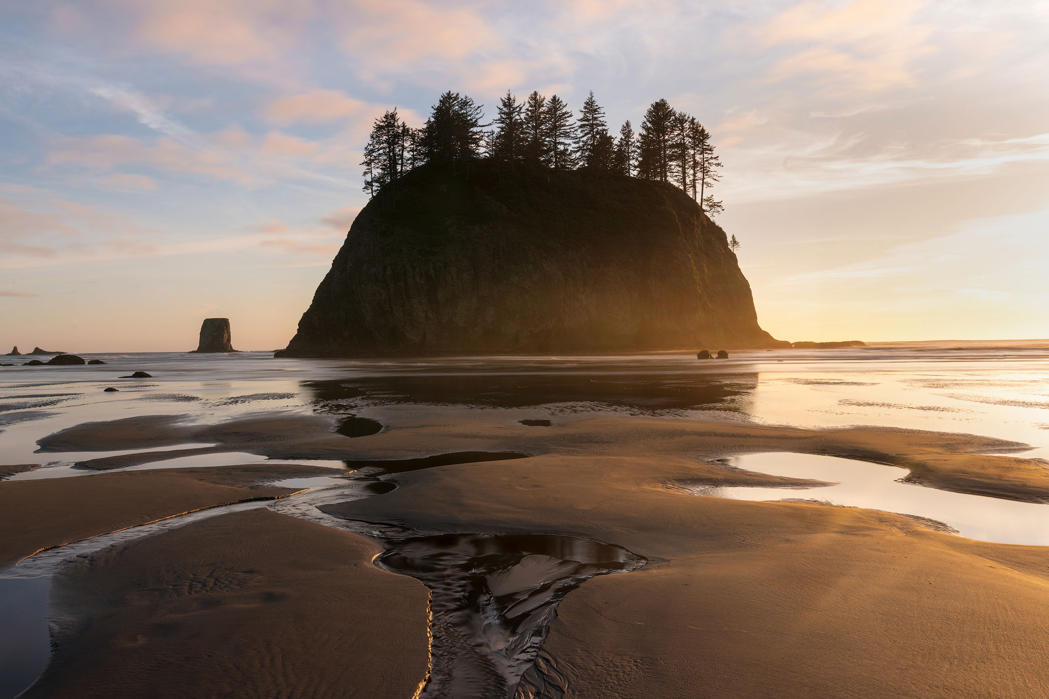
I recently visited the iconic La Push region of Washington and spent a sunset at second beach. The main sea stacks were swarming with a workshop so I drifted further south and found solitude at another stack. The side light and patterns created by the outgoing tide caught my attention and I thought I’d try a centered composition which is unusual for me for seascapes.
What technical feedback would you like if any?
Anything
What artistic feedback would you like if any?
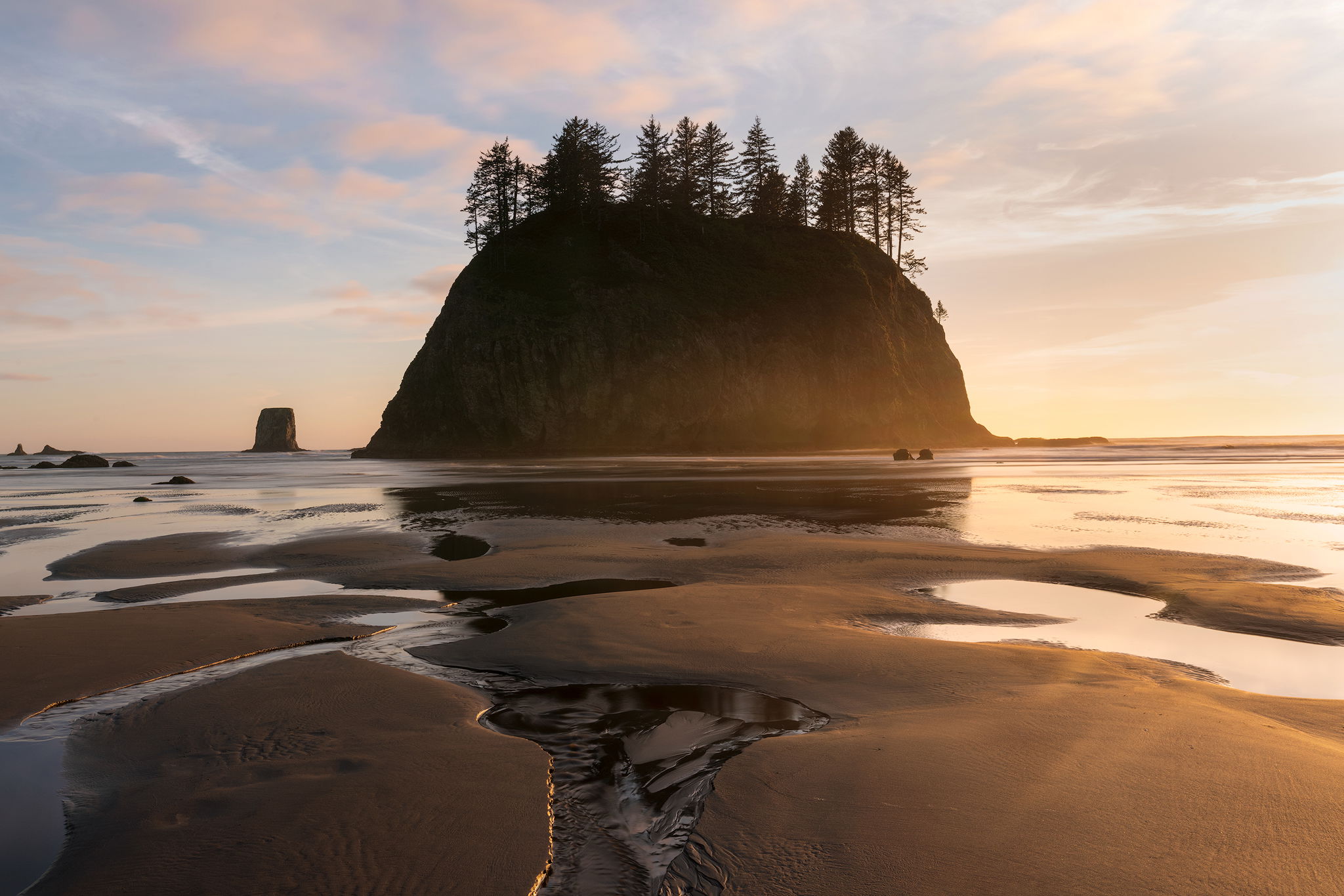
I’m in two minds here about colour balance. In the first image I’ve retained some of the cooler tones looking for a transition from cool to warm. For the second rendition I’ve gone much warmer for the whole image.
Any feedback on how the different colour balance changes the mood of the image from your perspective will be appreciated. If you have a preference please let me know.
Finally, I’ve presented a third image here with a crop to a 4:5 aspect ratio. Do you prefer the 2:3 or the 4:5 and for what reason?
Pertinent technical details or techniques:
(If this is a composite, etc. please be honest with your techniques to help others learn)
Single capture at 4s, ISO 50, F16 @29mm
If you would like your image to be eligible for a feature on the NPN Instagram (@NaturePhotoNet), add the tag ‘ig’ and leave your Instagram username below.
@nathankleinphotos
You may only download this image to demonstrate post-processing techniques.
2 Likes
I especially like the blue in your first image Nathan. It nicely complements the warmer tone of the sand and clouds.
Nathan, I can just imagine the workshops, not only ruining the experience, but even worse, how footprints can destroy the beautiful sand. Think I would go for the first with the little extra boost in the blue. And I would probably prefer not to crop like the last, as for me the extra formations add interest, and the decentered version looks better to my eye, while the centered crop feels too static, just my 2 cents. I really love that bit of golden glow from the sidelight that you got on the little ridges of sand - gives them a pleasing definition.
Workshops can wreak havoc with the atmosphere of a photo outing. Nice take from there. I like the sky in the first with the foreground of the second. I also prefer the wider view. It gives me a better sense of the place and the edges curving in are nice leading lines heading to the stack.
Good Work Nathan, It;s unfortunate about the workshops but looks like you made lemonade. I’m in agreement with Harley, I really like the blue tones in the sky on the first one and the warmer foreground in the second one. I would even try to maintain some warmth in the clouds but keep the sky the cool tone of blue from the first image. I also prefer the wider crop.
@Eva_McDermott @Bill_Leggett @Harley_Goldman and @David_Nilsen Thank you for your input. My instinct was that the option with colour contrast was the best option but it’s often good to put it to the community.
I think I have a balance between the two options. I created a mask using the TK panel where I subtracted the blue channel from the red channel so that the warming filter only applies to warmer tones.
I also prefer the wider compositions. I might be inclined to de-center the stack (placing it right of center) and bring the viewer into the scene through the distances to the left of the stack. Then again, you have that nice warm light coming from the right. The bit of bright water to the right catches my eye, but if it were cut off by a crop, it might catch my eye even more.
ML
Nathan, I like the idea of a centered composition like this , it makes the seastack look very dominant and impressive. The lines created by the channels of water also make for a very dynamic composition. And the light here is gorgeous, the mist at the base of the seastack looks awesome. the workshop group did you a big favor by driving you to this spot.
I like what you did with color in the rework, warming only the warm tones. I might suggest going even one step further and apply warming only to warm highlights, leaving the shadowed sand a bit cooler than the rework. I also think a stronger vignette applied to the four corners would help. As presented the corners are fairly bright, and pull my eye away from the center.
Nathan, your centered sea stack works very well, especially with the leading line of the central rivulet and it’s golden edge. Both of your first two views look great. I do think that I see a bit more detail in the stack in the second view, which I like.
Nathan,
What a beautiful image from Second Beach. The first thing I notice was the refreshing moment of seeing light IN FRONT of the sea stack! We’ve seen and commented recently about the difficulty at these locations at sunset because everything is always silhouetted (unless you go at firs light…) and the dynamic range just makes it so difficult in finding good balance - having to go all the way to silhouette often times. Anyway, it’s great so see that warm light grace the front of the stack.
To the colors, I think your repost looks great. The first 2 were so very close, but I did prefer the warmer second version, which actually appeared to give more detail in the brighter sky. The 4x5 version feels a bit cut off to me, so I definitely prefer the others.
No nits or suggestions, you can’t go wrong with any of them!
Lon
1 Like
Nathan : I prefer the second, warmer image as better balanced to my eye. I do like warm/cool contrasts usually but here it’s such a delicate range of hues I feel an overall cast works better. I like the larger format images - they hit you in the eye !
1 Like
I like the color composition of the first image and the layout of the 3rd composition. The composition of the 3rd image strikes me as more unique and creative. Perhaps it’s because the subject is centered that a square format feels stronger. I find the water at the bottom to be the most interesting. It would be nice to have more definition in the water on the right. This image has grown on me with time. It’s quite unique and refreshingly different from the ones we always see at this location.
Hi Nathan. I agree with Harley. I like the sky and the blues of the first and the foreground of the second. Especially the the light on the sea stack from the second. I also like the 2x3 crop. My eye seems more focused on that crop.
1 Like
Thanks @Igor_Doncov I appreciate your insight