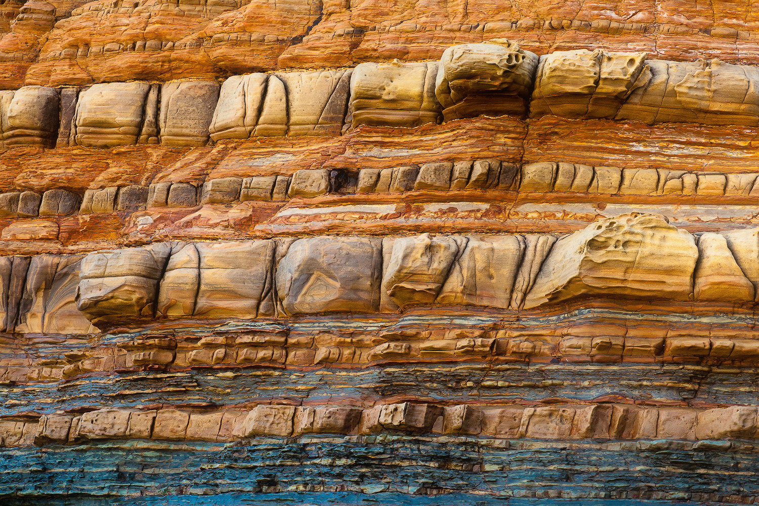
Sedimentary rock on the central California coast. The wet rock, just after a heavy downpour, brought out colors and texture not visually present before the storm. These layers make me think of history on a geologic time scale that can be difficult to contemplate.
Hey Rob, this is very nice. The color and textures come off very well–nothing like wet rock to punch things up. You might consider desaturating the blue/cyan along the bottom; it’s a little out of key with the rest of the scene.
Very interesting visually, and geologically. Nicely done.
-P
Tiramisu on steroids That pretty much defines layers, and I like the colors. (I’m okay with the contrast the blue adds.)
Have you ever played with adding a blurred layer with low opacity, and then using Smart Sharpen on the merged result? It can sometimes add a variation on the sharpening that is pleasing to my eye. Here’s an example below. (It’s a subtle change; you may have to download it to layer with the original to compare.) Take it or leave it, but it’s an interesting effect I like to play with for my sharpening.
I would have guessed this to be from red rock country in Utah, and not the California coastline. @Preston_Birdwell said it best, this is very interesting both visually and geologically. Here is another vote for the blue strip being helpful, although I might lower the saturation of the very bottom part that is adjacent to the frame edge, the blues above that look fine.
@John_Williams I really like the effect your sharpening technique created. Would you please mind explaining it in a little more detail, it creates some interesting results.
Looking at the thumb, I agree with @Ed_McGuirka that this looks a lot like Utah. I am quite enjoying the shapes, lines, layers, colors and textures. I am finding the blues a nice look but too saturated for my tastes (very much a personal preference). Real nice and very unusual take from the coast.
This is a really nice find, Robb. All the layering created with the different bands of rock is very thought provoking and interesting. I also like the combination of warm and cool tones throughout the scene. My personal preference would be to desaturate the blues a little as @Preston_Birdwell suggested as they do look a little intense. Either way great eye to spot and isolate this image.
Hi @robb_hirsch, i love how you arraged the lines and the elements, a very balanced composition in my opinion. I also like the post processing, i think cold tones in the bottom works well with the warm tones but i would decrease a little bit the highlights. Thanks or sharing.
@Preston_Birdwell, yes the blue/cyan is pretty strong in the original file as the sky was being reflected in the wet rock. I wanted to keep that unique color contrast aspect of the scene but agree it might be a bit heavy for many eyes.
@John_Williams, I really like what you did with the image and consider it an improvement. I typically do as little processing as possible as I have unlimited patience in the field but not so much in front of a computer. Thanks for your thoughts and effort.
Thanks @Ed_McGuirk and @Harley_Goldman and I agree it seems quite Utahesque. California has pretty incredible diversity.
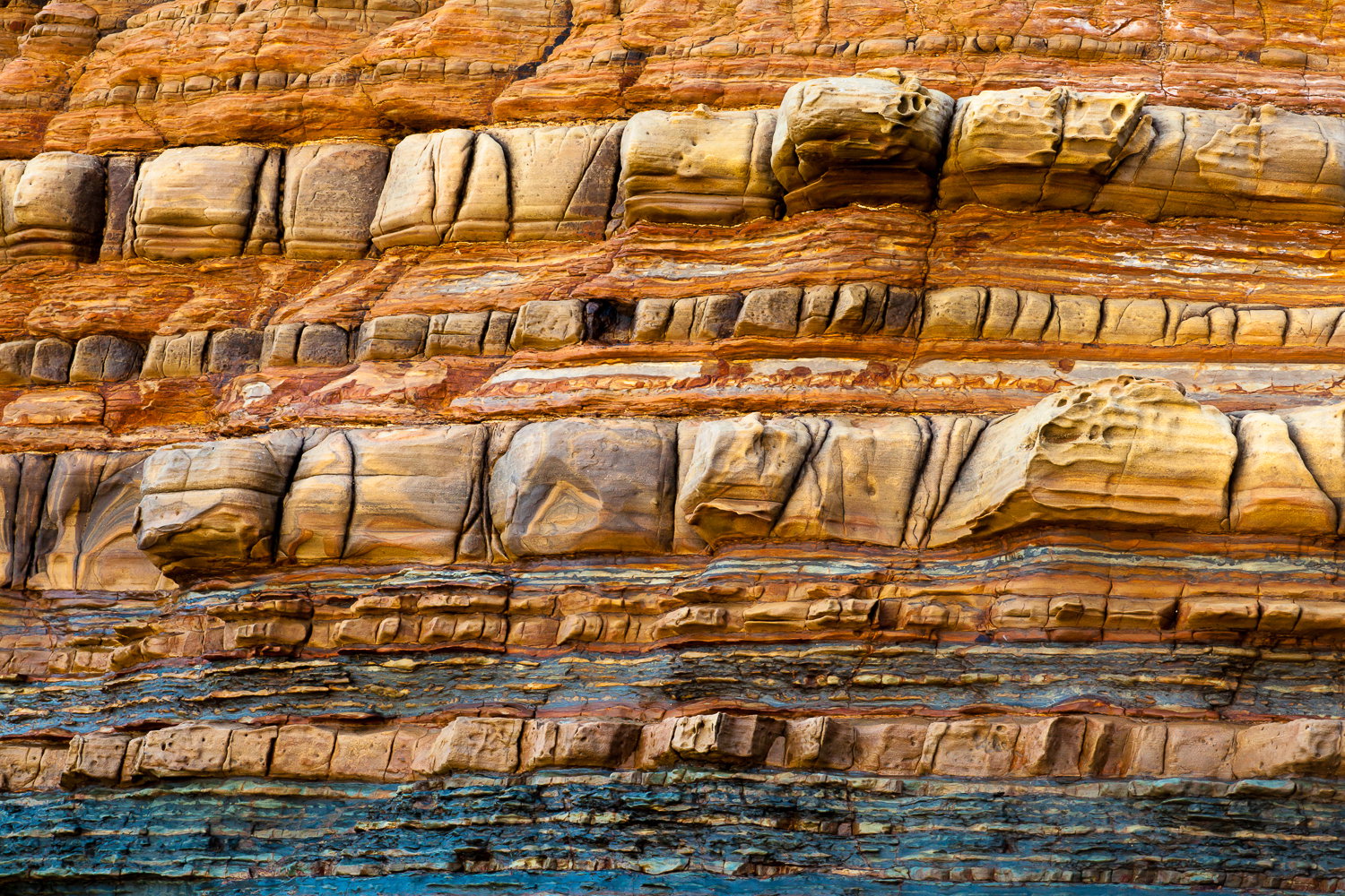
 That pretty much defines layers, and I like the colors. (I’m okay with the contrast the blue adds.)