The photographer has shared comprehensive information about their intent and creative vision for this image. Please examine the details and offer feedback on how they can most effectively realize their vision.
Self Critique
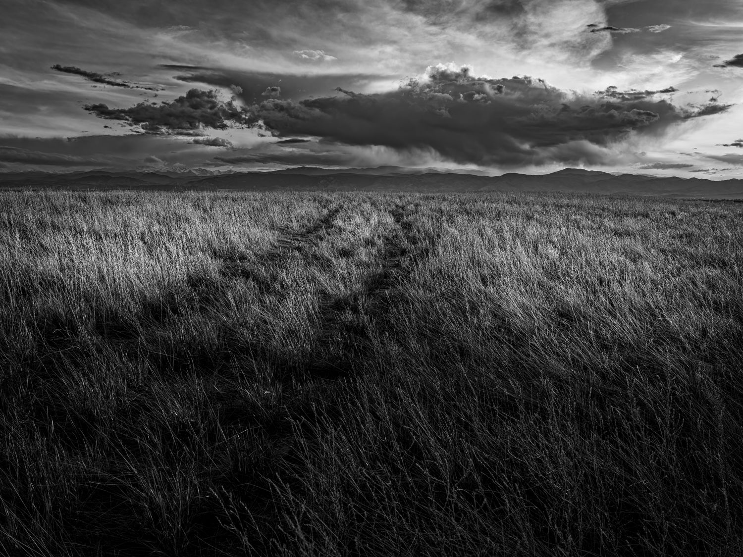
I am open to any sort of suggestions. Is the dark area at the bottom too large? How is the composition?
Creative direction
Trying for a feeling of space and depth.
Specific Feedback
Any feedback is welcome. I’m working at changing direction to a simpler aspect of landscape work.
This is a site I’m hoping to engage in a project with. This particular vantage point eliminates a lot of distractions that are visible from a higher or closer point. Perhaps it even could be seen as a trip back in time to before all the distractions.
Critique Template
Use of the template is optional, but it can help spark ideas.
Vision and Purpose:
Conceptual:
Emotional Impact and Mood:
Composition:
Balance and Visual Weight:
Depth and Dimension:
Color:
Lighting:
Processing:
Technical:
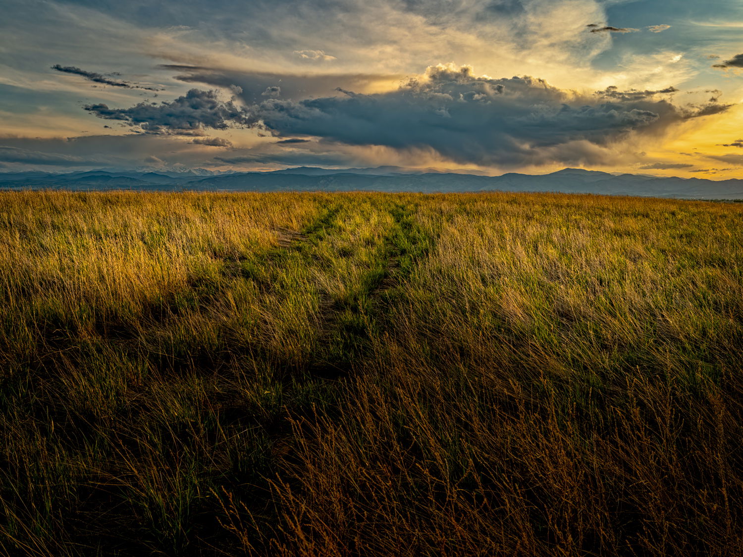
Fred: Reminds me of scenes in an old B&W western. The leading lines going to the clouds are very effective. I would also be interested in seeing the color version as I expect there is some real drama in the clouds and sky. Well conceived, captured and presented. >=))>
Hi Fred,
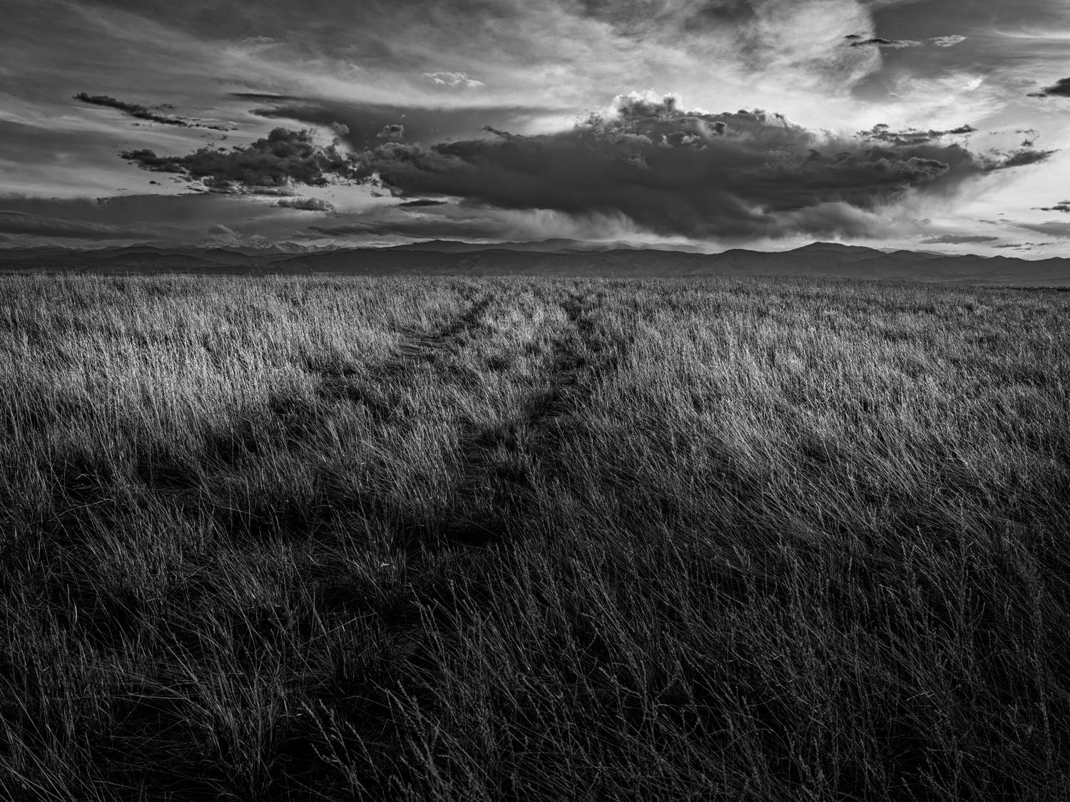
For my own personal tastes the B&W has more drama and mood than the color version. I like @Bill_Fach’s analogy about the old B&W western. The leading lines through the field are perfect for drawing the viewer into this wide open plain. I am also enjoying the drama laden sky as well. My only suggestion would be to lighten the FG shadow just a touch. Maybe something like this.
I hadn’t really considered a color version but it’s not too bad although it’s a bit off in color and the monochrome version is still better in my opinion. Thank you for the suggestion. I think you are correct. I’ll be working on it further for sure.
Great image in my opinion. It’s so engaging. That cloud looks so sinister. It’s like a manta ray or an enormous bat. Yet the tracks lead towards. There are so many thoughts and interpretations here. That’s why I find it engaging. It says something without clearly stating it. Ambiguity is the key to good art.
This is such a wonderful moody landscape, both in the sky and the foreground land. It gives me a feeling of loneliness (maybe being alone, rather than lonely!) and apprehension.
The track through the grass is calling me into the landscape. It’s so subtle, but so effective. I love the sky with the foreboding clouds, but wonder if they’re “too” prominant. Maybe that’s your intention?
I love the black and white treatment over your colour version.
I like @Ed_Lowe 's edit with a slighter lighter foreground.
It’s very gratifying to know the feelings this photo generates for you. I truly hoped to get an emotional response once I began to work on this. I would tend to agree the B&W is more effective and the suggestion by @Ed_Lowe is a good one.
I really like this Fred. I prefer my b&w’s on the darker side, so your foreground looks nice to me. I think it really creates a mood and give more depth to a scene that could look too flat with less contrast. It might even look deeper with a vignette all the way around. I think if the vignetted came down halfway between the top and the thicker cloud, it would look right. Also, as a former resident of Estes Park, I recognized the profile of Otis and Hallets even in the tiny thumbnail. Nice work and thanks for the view of one of my favorite places!
Fred: My apologies for being so tardy responding to your post of the color version which is equally awesome IMO. For me there is more emotion attached to the B&W but I love the drama in the sky with the color in a different way. Both make me seriously jealous of your opportunity. >=))>
Thank you for your appreciative words. I will definitely try a bit more vignetting as I work with this image. We, of course, have spent and will continue to spend a lot of time in Estes Park and RMNP. It’s a great place to hang out.
There Is no need to apologize at all. If you’re ever in the area I could give you directions to the site or we would be happy to show it to you. The sun is going down considerably to the south now, snow is on the peaks, and it’s time for us to go have a look again.
Leading lines? Nailed it. Those tire tracks lead the eye beautifully towards those terrific clouds and of course, the mountains. I love the horizontal splash of light moving across the foreground grasses which you’ve accentuated perfectly. I much prefer the black and white version although I’m sure you could make the color version into something that’s equally impressive. It’s just a whole different vibe and mood though.
Definitely black and white for me Fred, and I like what @Ed_Lowe did with his edit.
This is wonderful. It captures the emptiness of the plains, but the distant mountains and dramatic clouds beckon. The leading lines are a perfect touch to draw the eye to that distant goal. Well done.
Thank you for the helpful encouragement. I very much appreciate it. I may spend more time on the color version just as a challenge. As you say, they are very different.
Excellent composition! I like the broad expanse of grass in the foreground as it highlights the expanse of the prairie . The light and shadow in the grass is also very nice and accentuates the detail in the grass. Well done!