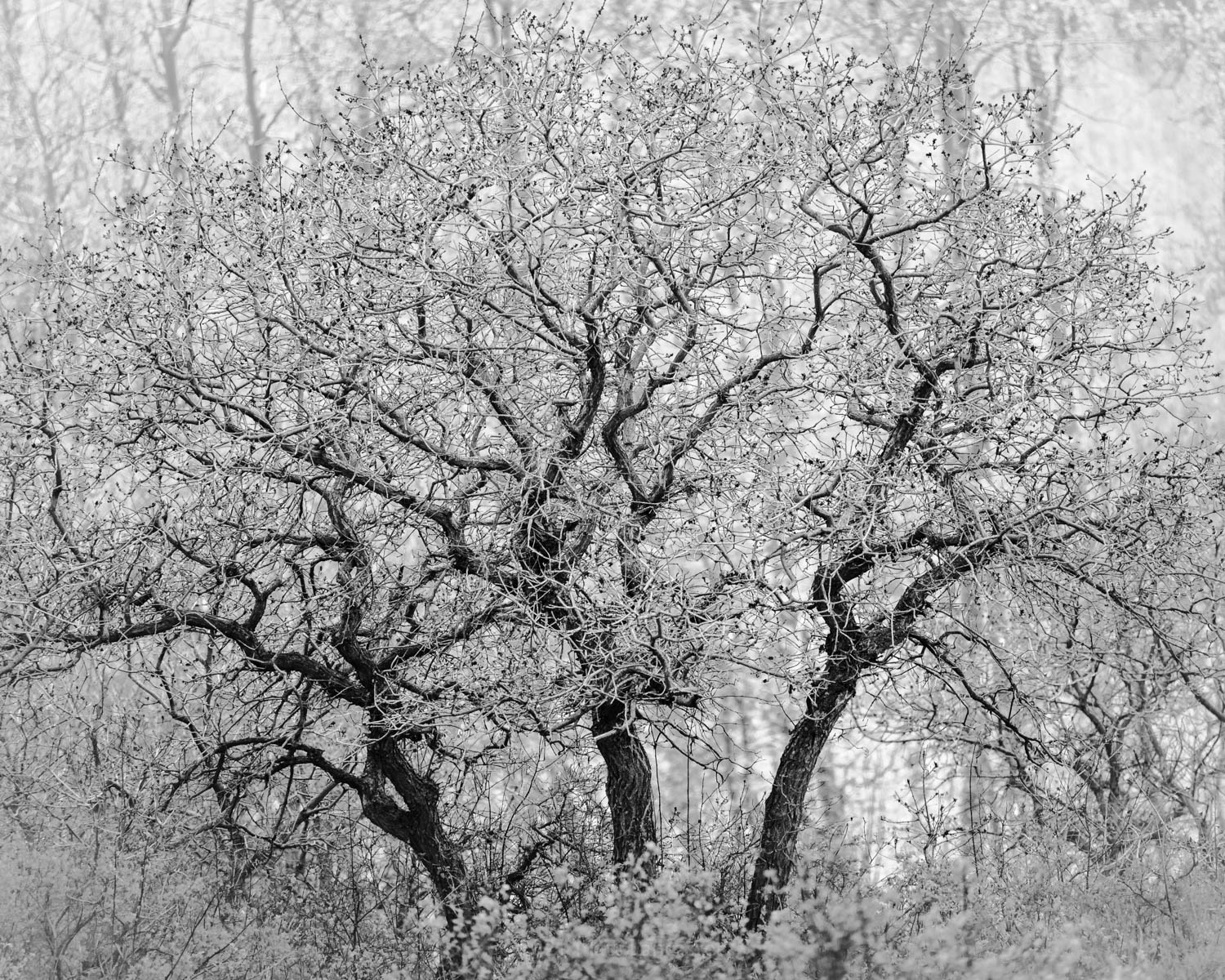
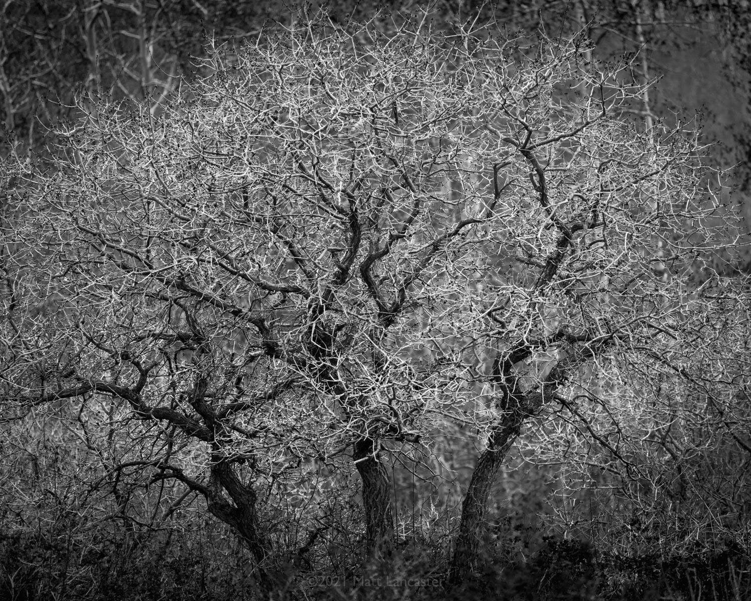
Last Spring I saw a group of scrub oak side lit in front of a stand of aspen. Under partly cloudy skies I made a set of images with varying light and shadow on the groups. The most interesting lighting of all captures occurred with the oaks in direct light and the aspens in shadow with direct lighting beyond the aspens. A real layered lighting show.
Specific Feedback Requested
Between the low-key and high-key renderings, which do you prefer and why?
Technical Details
Is this a composite: No
Nikon D610
70-300mm @ 300mm
f/5.6
ISO 400
High Key: 1/1000 sec
Low Key: 1/800 sec
The tree trunks and the main branches provide the main structure in this image. They stand out better in the first image. So, my vote is on the first one. I agree with Eva´s comment on darkening the ULC/URC.
Matt my strong preference is for the first image. I like the dark little round buds at the end of the branches, which essentially get lost in the darker version. I also think the shapes of the trunks are more appealing than the shapes of the twisty branches, and the trunks drive the high key version.
I also agree with @Eva_McDermott about burning the upper corners in the high key version.
Hi Matt, I really like the low-key (2nd image) best. But I also seem to have very different preferences in style from other people. And I’m an amateur…
I greatly prefer the first “light” version. In the top image the main trunks of the tree stand out the most, and make an appealing trio. However, in the bottom version, the smaller branches become more dominant and makes the whole thing seem a bit more messy.
To my brain, the top image almost seems more “real”, while the bottom looks like a processing trick (almost like a film negative).
I think I have a slight preference for high key images in general, which is probably influencing my choice.
It’s an interesting poll: most prefer the high-key version.
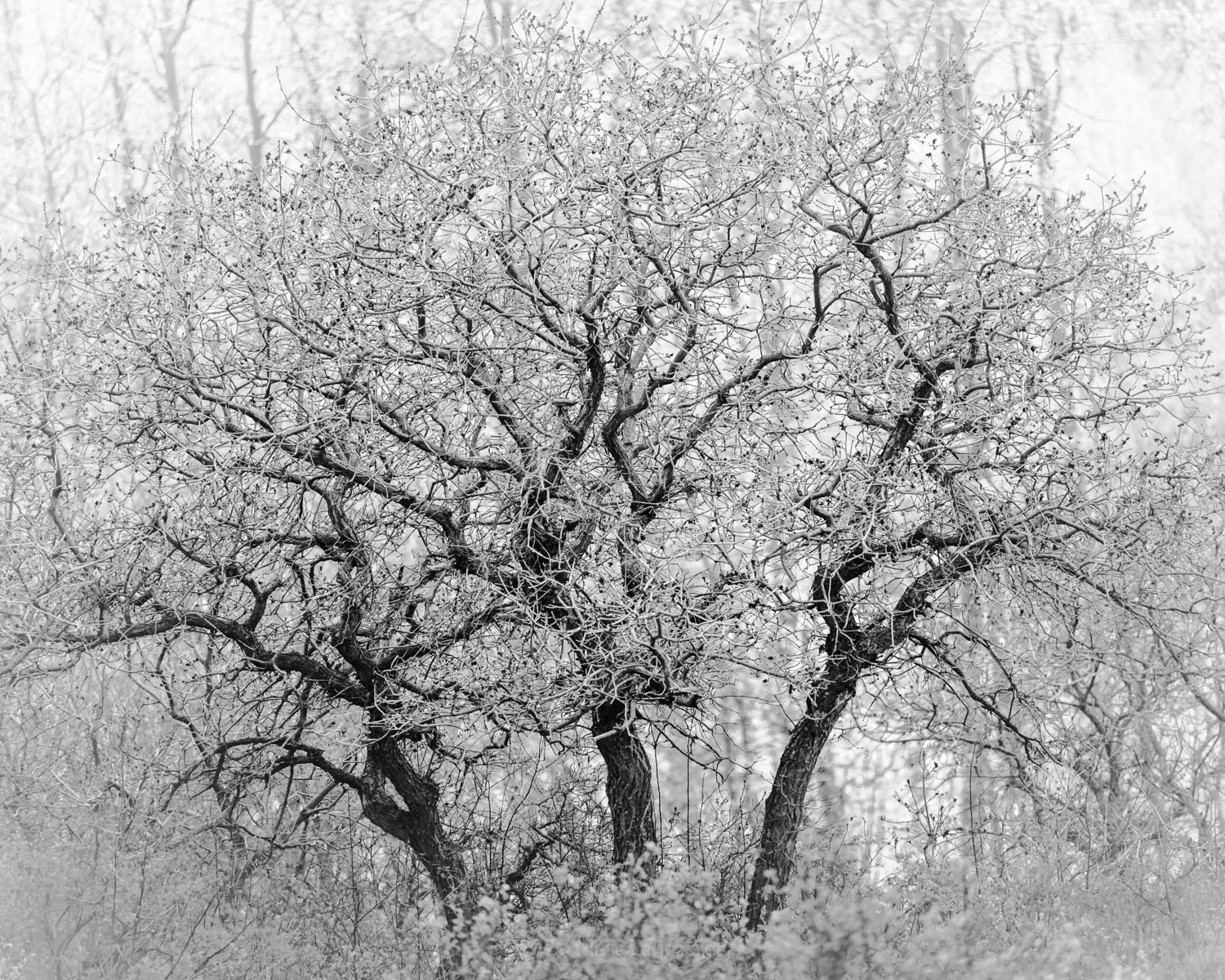
So I worked it a little to emphasize the lightness of the finer branches with the same logic as one would employ on a high-key image when placing a white frame around it: as a white frame around a high-key image contrasts with the lightest parts of the image to provide a white point of the image, I lightened the corners to provide the same contrast, reposted.
I prefer the repost the best of the three images, but if it were mine I would back off just a touch on lightening the lower corners. That is really nit picking, but I think this ia a fine image and worth the extra tweaks.