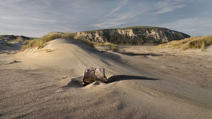
The sun was getting low as we tootled along Limantour Spit at Point Reyes National Seashore. I was taken by the way the sand had blown around the log, and it’s long shadow. The light on the sand textures was wonderful, too.
What technical feedback would you like if any?
Any comments welcome.
What artistic feedback would you like if any?
What about the compositional balance? Does it feel too weighted to the left?
Does the sky look too washed out? It was too blue for my taste, so I desaturated it.
Pertinent technical details or techniques:
Single frame, Sony a7, 24-105mm @ 24mm, f/16, 1/60s hand held, ISO 400.
You may only download this image to demonstrate post-processing techniques.
Not much here for me in terms of subject matter. Not sure if you want me to look at the dune, the wood in the sand, or the cliff wall in the back. I’d suggest you always figure out what it is you want to show first and then compose around that thing so that attention is drawn to it. Not seeing any kind of visual flow here without that subject drawing the focus.
1 Like
The sky does look slightly de-saturated relative to the colors in the dunes, to some degree it creates a sort of inconsistency. The processing of the landscape looks good to me for exposure, contrast, and color. The light on the dunes is quite nice actually. However, good light alone is not enough, I agree with @Eric_Bennett about wishing there was a more dominant subject here. I think it might have been interesting to get down low and pretty close to the log and dune with an ultrawide focal length, which would exaggerate perspective and make for a prominent foreground subject.
To some degree you could sort of accomplish this with a crop, though it’s not quite the same as doing it in the field. I have done a rework to illustrate this (and boosted the blues a little and added a vignette too). In my opinion this reworked crop makes the log and it’s shadow a more pronounced subject.
I have looked at this a number of times before commenting. First of all, I would definitely prefer more blue in the sky. Alternatively, this might work as a B&W image, but you would want to emphasize the contrast if you went that direction. I do like how you have emphasized the lines and texture in the foreground. The diagonal line coming from the lower right hand corner is a nice compositional element. Based on your description the log was your intended subject in the foreground so I would recommend moving in closer to the log to give it more prominence in the foreground. This would communicate more clearly to the viewer what your intended subject is and would make for a stronger composition over all.
Thank you, @Eric_Bennett, @Ed_McGuirk, and @Brian_Schrayer. Good suggestions, all. The main thing is that I should have gotten a better composition in the first place. Ed, your rework is definitely an improvement - thanks for taking the time.

