Critique Style Requested: Standard
The photographer is looking for generalized feedback about the aesthetic and technical qualities of their image.
Description
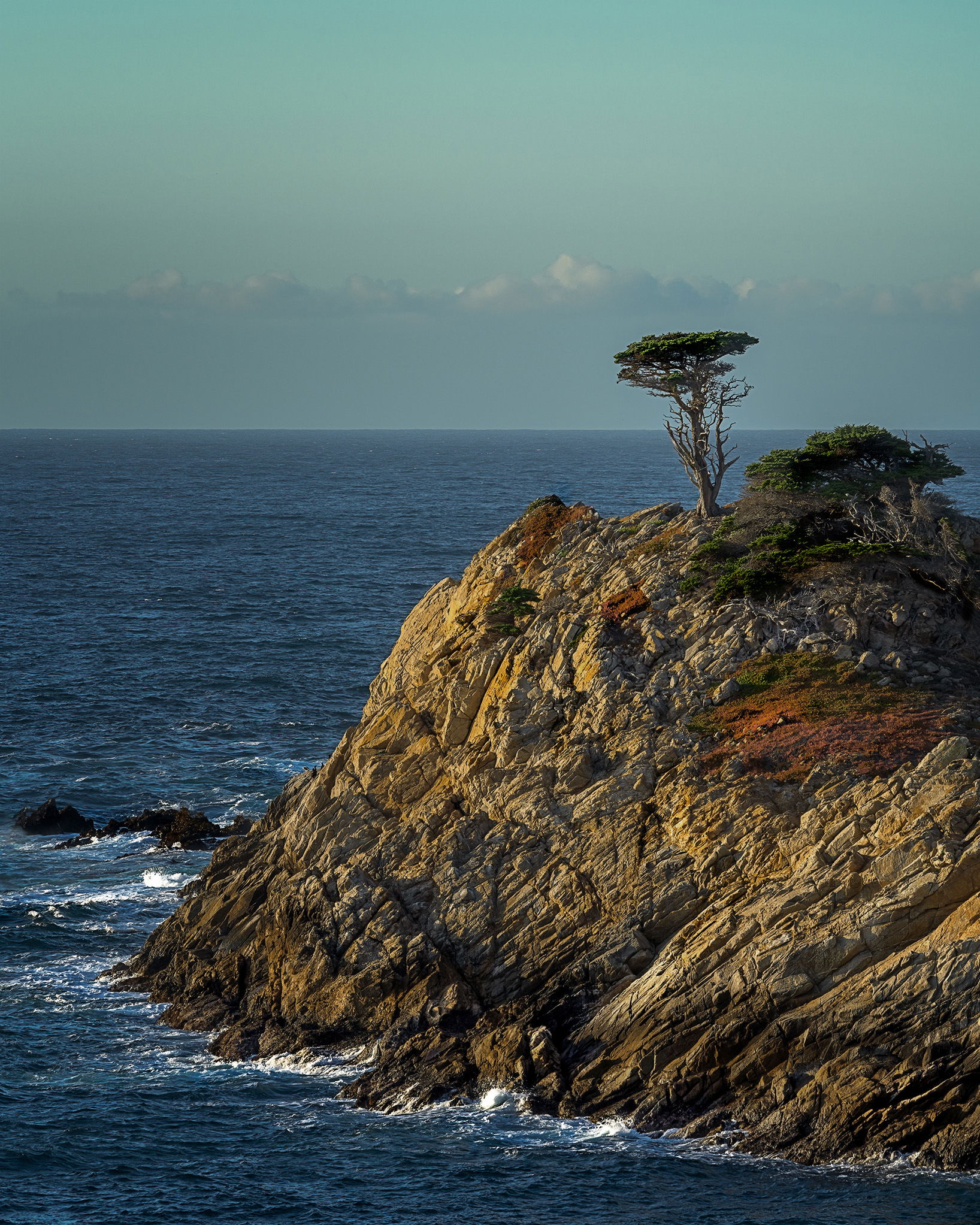
I took this at the end of the last day of a Big Sur photo workshop. I feared I was holding up the group and was under considerable pressure to get the shot.
Specific Feedback
I am wondering if I have over-processed the colors in the rock. General feedback on composition is also appreciated.
Technical Details
Taken with Sony a7iv. 1/60 sec., f/16, ISO 100, 225 mm, on a tripod.
Processed in LR & PS with TK9 filters, Topaz DeNoise, Nik Color Efx Pro
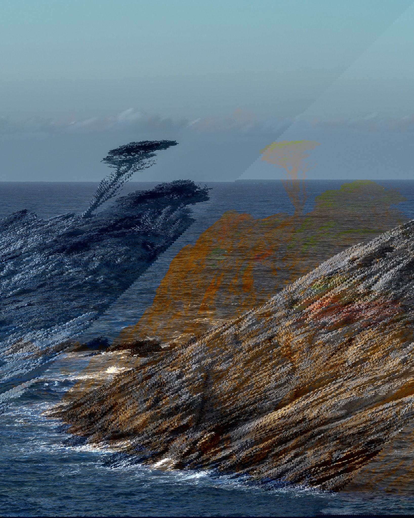
I have reworked the luminance in the sky and water as suggested by
@Giuseppe_Guadagno and
@Diane_Miller to make both more blue. I also toned down some of the rock to the right. I agree with
@Lon_Overacker that crashing surf would be the finishing touch. Maybe next time.

1 Like
Barbara, a beautiful photo of a beautiful place. The first thing that caches my eyes is the lovely color contrast: blue, green and red are the RGB colors. About the blue in my monitor there is a relevant component of cyan in the sky and in the sea. It is the fault of my eyes? If not maybe it is better to crop a bit of sky?
Nice! I think it could be good to compare one with less contrast on the rock, which would subdue the color a bit. I agree with @Giuseppe_Guadagno about removing some of the sky. It is a bit greenish – maybe see what happens elsewhere if you tweak it a bit. But it could just be due to air pollution?
Chris,
Oh, this is just wonderful! I swear after viewing this mulitple times that this was the famous Monterey Cypress on the 17-mile drive - only from a vantage point I had never seen before… then I read this was in Point Lobos! And still further amazed as I’ve never seen an image of this.
But no matter, it’s a beautiful image. I actually like the contrasts, both in light and color.
I have no nipicks or even suggestions for improvement. Ok, well, I suppose you could have been there in January during the “atmospheric river” and have a 30ft wave crashing on the rock… but I guess we can’t have everything… 
Lon
I think the color is better now – from good to better! Now I’m wondering about the slightest bump in exposure?
Diane, you are almost right, but it is the same picture. There was no change in exposure. I had used the Nik lighten/darken filter to give a subtle vignette to the outer part of the frame and lighten the area around the tree. The rework is really much closer to the original picture.
Changes are subtle, but I especially like the changes in the sky. I didn’t mention, but agree with Diane on slight green tint in the sky. Very, very minor, but I really like the repost. Great job!
Thanks @Lon_Overacker I had warmed the tone in the sky which gave it that greenish tone. My mistake.