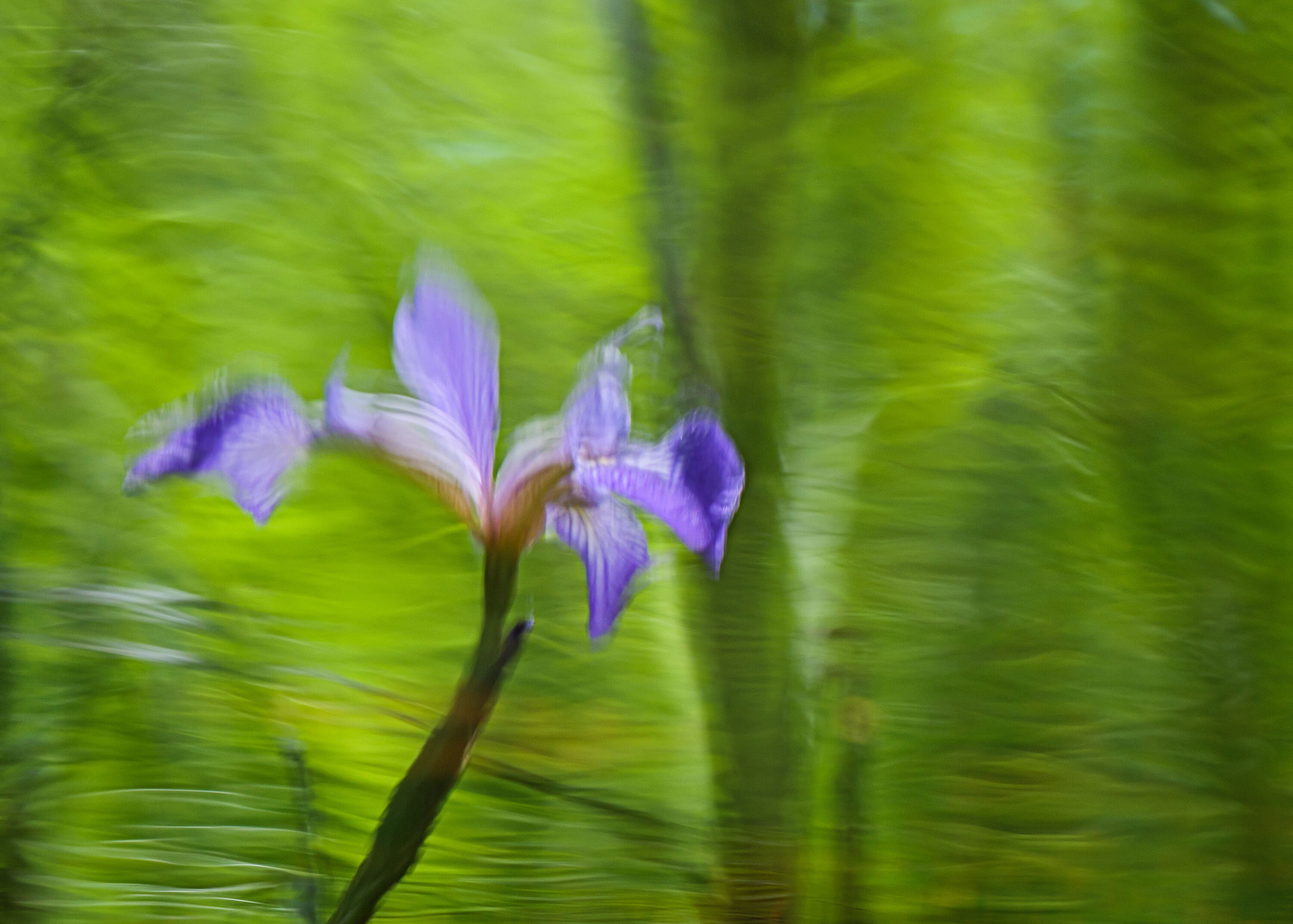
While sitting in a shallow backwater in the kayak, I got to looking at the wild irises and the reflections. Part of the joy of being on the water in a small boat that can get almost everywhere. It wasn’t easy to control what else was reflecting and so I did my best in photoshop to keep things reasonably non-distracting, but not too pristinely over-kempt.
Specific Feedback Requested
So…should I do any more artificial sculpting/cloning or toning of the different areas of the reflection? I’ve been noodling with this shot since June.
Technical Details
Handheld in the 12-foot boat in probably 8 inches of water.
Lr for most of the initial work to increase contrast, get some texture where it can take it and a final crop after it came back from Lightroom where I used a variety of techniques to tame the big reflection in the middle - color clone, color paint, a couple of passes with frequency separation and a clarity action constricted with a mid-tones 2 mask. Oh and I did flip the shot as well, not that you didn’t know that already.
Lucky you, Kris, to have a kayak to float around in. . .I always thought that would be a great way to discover nature from a different point of view. There is something I can’t quite put my mind around on this one. I am enjoying the movement, colors and the reflection, but, at least for me, the image is somewhere in-between a total ICM and a reflective capture. I think the lighting works nicely and shapes are engaging, but?? I can’t wait to see what your “noodling” comes up with!
Thanks @linda_mellor - I guess it sort of was ICM in the sense that I didn’t up the shutter speed as I usually do in the kayak - the boat was moving slightly and so was the water and probably the flowers and trees and bushes, too. Sort of surreal, but I was trying to hold still myself.
Definitely impressionistic! The colors are gorgeous. I could see cropping or cloning out the very bottom of the iris stem, the part that is most distinct. It’s the one thing in the frame that isn’t so impressionistic. It sounds like a wonderful place to be.
Hi Kristen. Yes the impressionistic Monet vibe is strong with this one. Love it. The dark bits at the bottom of the flower and the leaf are a little distracting though. I would crop them but then you would lose some of those nice green lines in the water. I would try to reduce the colour and tonal contrast in those areas by brightening them and shifting the hue to a more green colour. Thanks for sharing how you did it.
Thanks @Bonnie_Lampley & @AndreDonawa - I’ve reposted using your suggestions, let me know what you think. Losing the more defined and darker areas at the bottom brings some cohesion which is good.
Great job on the retouching Kristen. The image shines even stronger with the distractions at the bottom reduced. I like the balance between the cropping and the tonal edits in the new version.