The photographer is looking for thoughtful feedback on the image as a whole, especially around the areas noted below.
About This Image
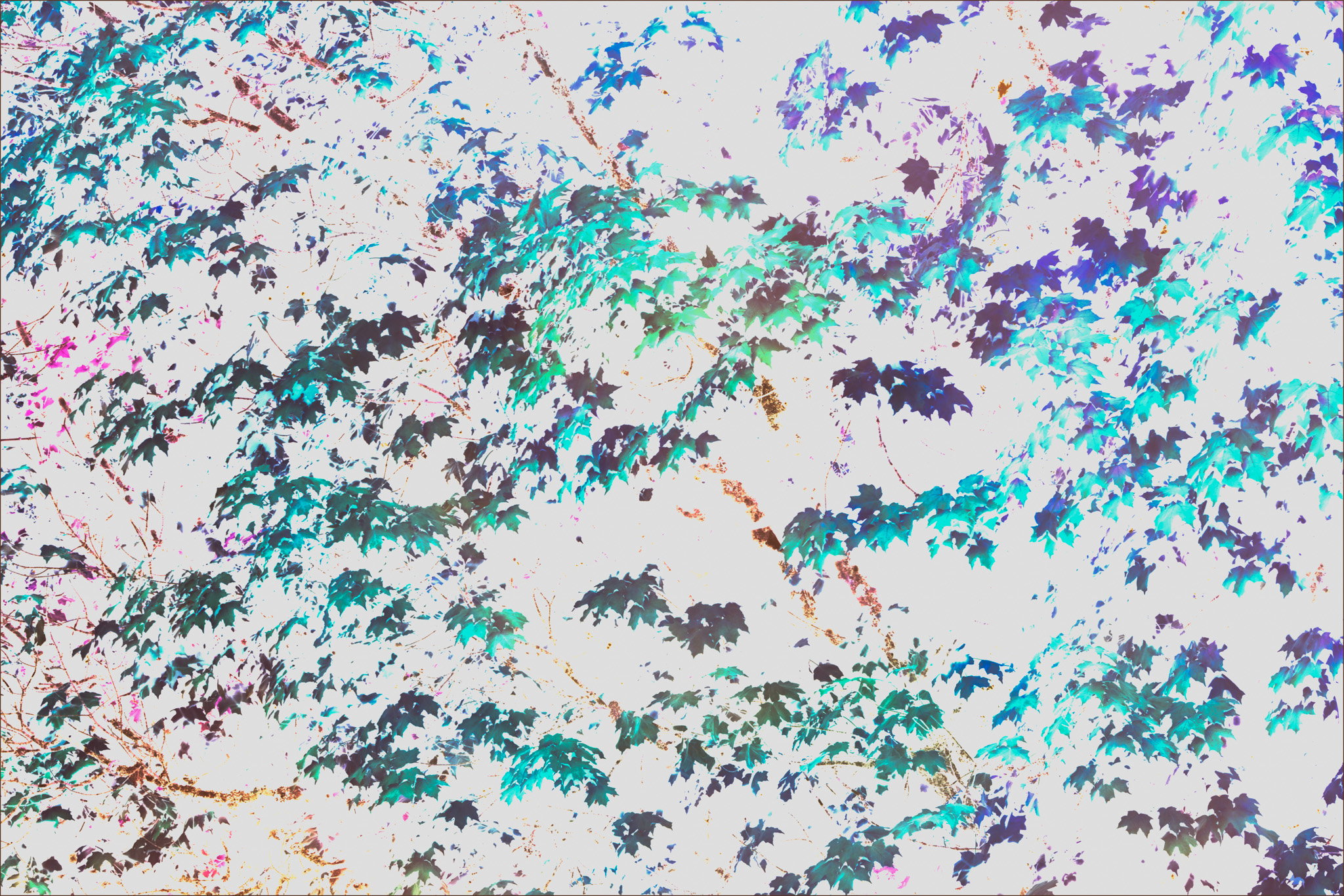
More playing around with fall colors and layer blending modes in PS. I’ve noticed that the subtract and divide blending modes can produce some interesting effects since they give color differences as the output. This one had kind of a swirled orange/yellow/green base layer and the typical red/yellow/orange maple leaves as the top layer. When I combined the two in the “divide” blending mode it produced these mostly blue and purple leaves on a white background (solid white until I toned it down). There were some holes in the leaf pattern around the edges, so I used the transform function to scale up the leaf layer to fill them.
Feedback Requested
I know the composition is pure chaos, but does chaos work at all in this case or does it need a bit more organization. Does it hold your attention past a casual glance?
Technical Details
Blur layer: Rotated while shutter open then further blurring in LR.
Camera: SONY ILCE-7RM5
Lens: FE 70-200mm F4 Macro G OSS II
Focal length: 200mm
Shutter speed: 1s
Aperture: f/22
ISO: 50
Leaf Layer:
[image]
