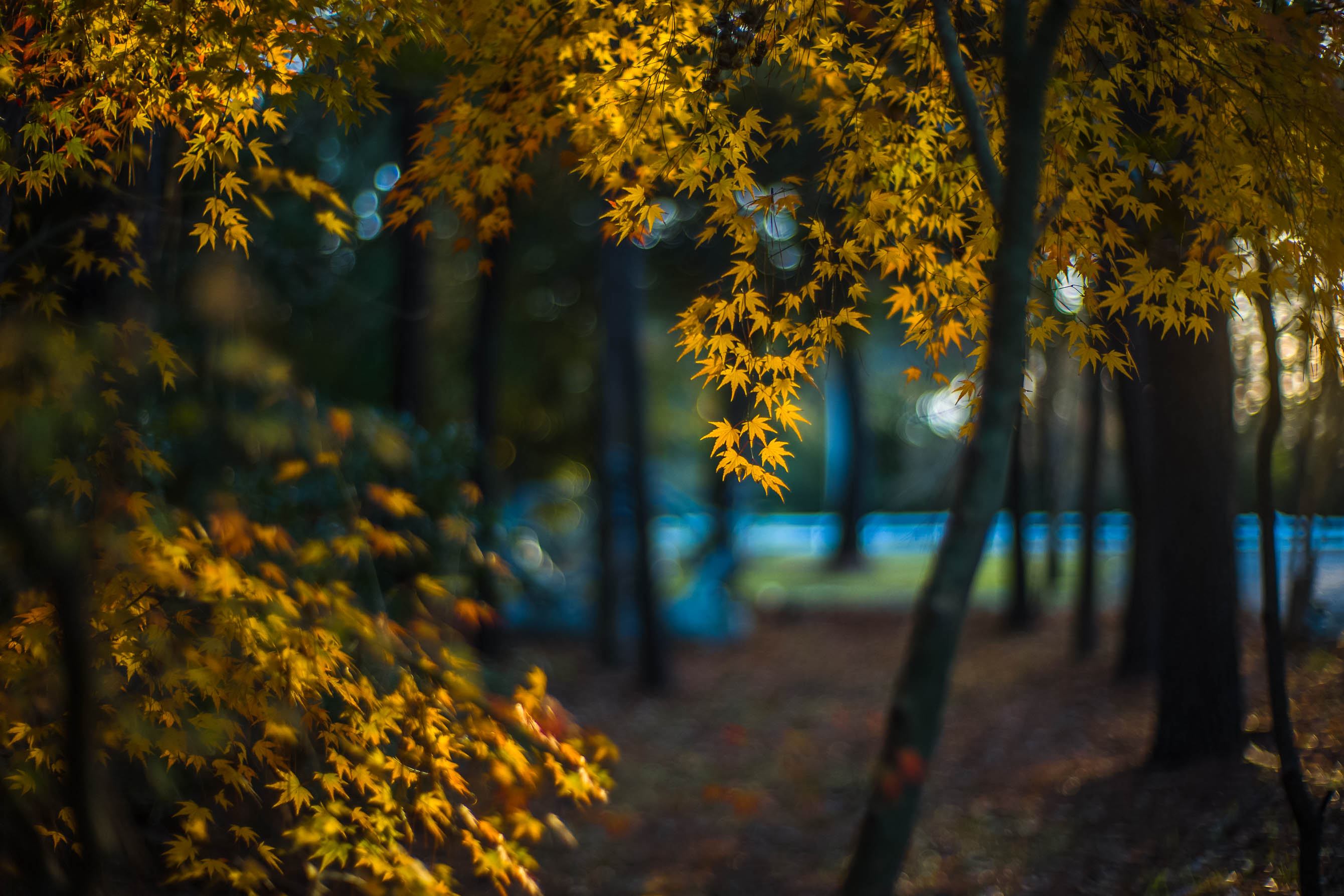
(If this is a composite, etc. please be honest with your techniques to help others learn)
If you would like your image to be eligible for a feature on the NPN Instagram (@NaturePhotoNet), add the tag ‘ig’ and leave your Instagram username below.
Welcome aboard Patty and an intriguing first post. I like the shallow DofF presentation. I am finding my mind really wants to linger at the in-focus leaves, but the intense and bright blues and the bright whites in the background yank my attention to them and hold it there. I might experiment with desaturating the blues and burning those bright areas.
I am looking forward to seeing more of your work and reading your thoughts on the work of others. Again, welcome.
Will try this Harley. Agree there is a perhaps too large a difference in light and dark. Also saw a very annoying irregular bright spot in the upper right I’d not seen before that must go. It is one of the first images I shot with this lens. This vintage Noctilux is a bit “quirky”, but therein lies its charm for me. It loves writing blue and green tones. Thank you for taking time to comment. Look forward to participating among so many fine photographers. Cheers.
Hi Patty! The bright yellow leaves are very appealing and the selected DOF works nicely here. I am first drawn to the focused ones, but also enjoy the soft ones, esepcially in the middle left. I agree with Harley about the bright blues and whites. I also find the strong horizontal line in the blues distracting. It reminds me of a road, and maybe it is. It draws my attention and thoughts away from the nice leaves. I would give composing without the line in the frame a try, maybe with spring greens right now?
The “white” above the green grass is a fence line. At this point, think I’d rather try retaking stopped down some. It’s a fine line I am still discovering with this lens as it will quickly become sharp by f2, causing some “light” magic to disappear. Thanks for your thoughts and ideas. Good to be here!
Welcome Patty. Awesome first post. Like the others the blue band going through the middle of the image is very intense and distracting. Maybe desaturate the blue channel a bit. You’ve captured some amazing light on the fall color leaves. Beautiful image Patty. Keep them coming.
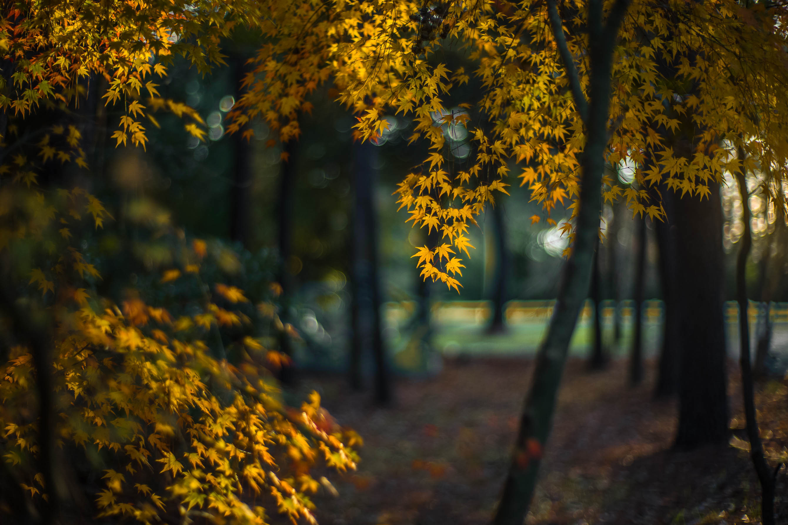
Hi Patty and welcome to NPN, thanks for sharing your image with us. I’m usually a sucker for backlit autumn leaves, so this image is right up my alley. I also like the overall softness, i think it works as a creative effect. Normally the combination of blue and yellow works pretty well together. But in this cast I’m lined up with the comments from the others about the bright saturated blue having too much visual weight (where backlit leaves are the real star of this show). You could try de-saturating and or burning down the blue, as others have already suggested. Another thought I had was to select the blue tones in Photoshop, and then apply the PS Warming filter at full opacity to just the blues. This rework shows the result of that change.
Whoa! So Ed. You are going to ‘make’ me learn PS. ;0) Amazing do over. Now I get it. A while before I could do it, though a goal. Can’t thank you enough.
Welcome to NPN! What a beautiful first post. The back lit maple leave are gorgeous - and to me, are attractive just like a sunrise or sunset - one can’t help but admire the light and colors.
I too appreciate the shallow dof and also the bokeh that is present in some of the highlights.
Have to jump on the bandwagon on the blues. While I almost always love the color combo of blue and gold, but agree with others it competes with the main subject, the leaves. Another thing, the strong blues just look “mechanical” - just another word for knowing it’s a fence, roadway or some hand of man. But ya know what? Ed’s rendition does a great job in mitigating that element.
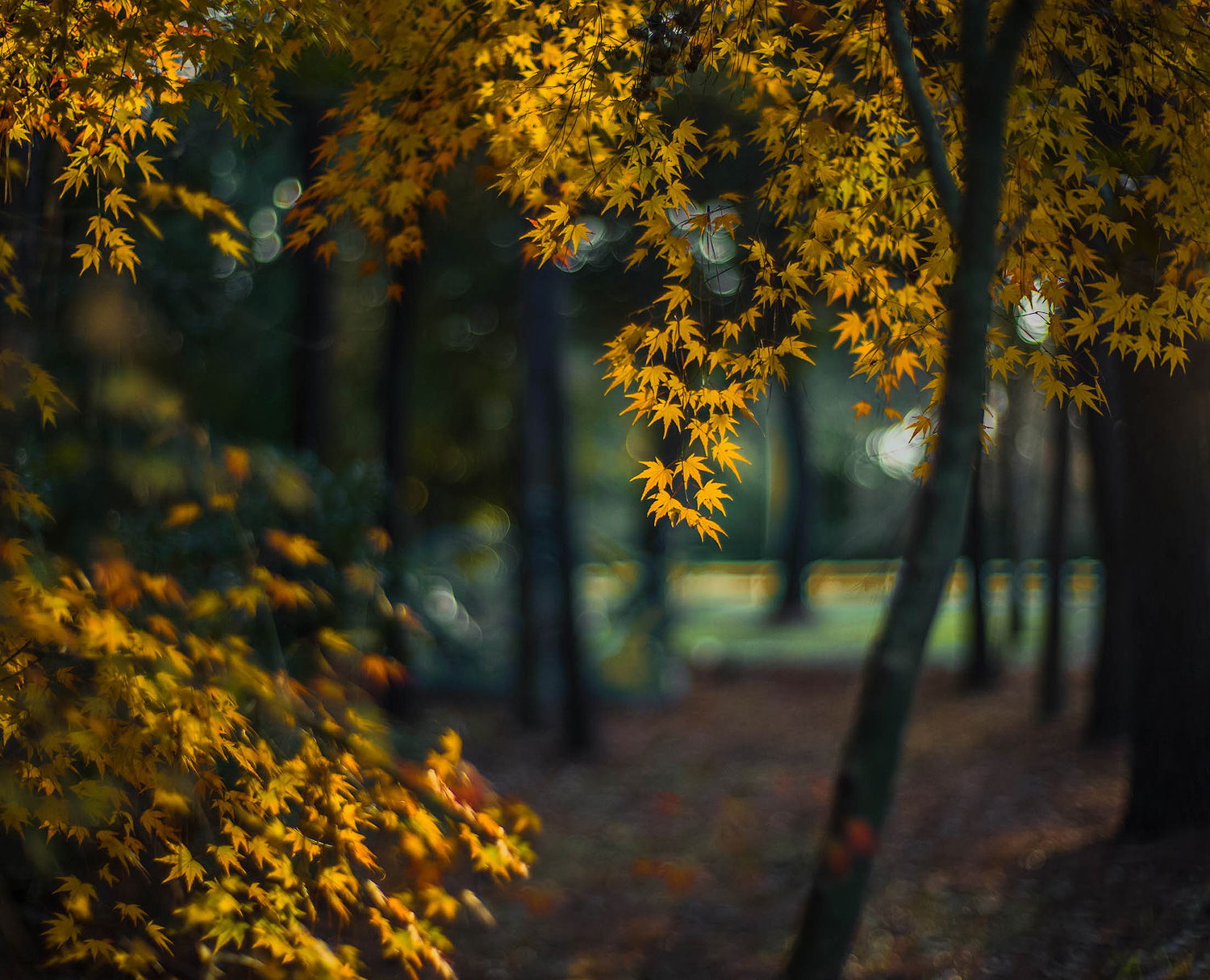
All I’ve done is further siimplify with a crop. At this point, and I hope all realize these suggestions are simply personal choices and not meant to be “corrections” My crop was to mostly eliminate the brighter highlights on the right (even though I like the bokeh) But the idea was to bring even more attention to the back lit leaves.
But all that, the light and shallow dof in your original is quite exceptional. Welcome aboard!