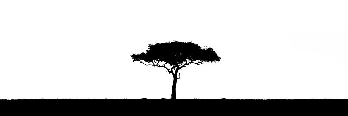
I went with somethign a bit more abstract than I normally do on this edit.
What artistic feedback would you like if any?
does the high contrast image work here? how’s the crop? should I fill in the spots in the tree? Any other comments?
Any pertinent technical details:
4921x1640
1/500 at f/5.6
312mm (100-400mm L)
ISO 200
7D Mark II
You may only download this image to demonstrate post-processing techniques.
This works very well as an abstract. The centering adds to that feel, too and works for me. I would not fill the spots, but not a big deal either way. Nice presentation.
Duncan, I really like this in B&W and agree with Harley that the spots in the tree are not an issue. I also enjoy the simplicity of the composition. My first reaction was there was too much space on either side of the tree and it could be cropped on both sides. But as I studied it longer I decided I like the wide view as presented. For me it emphasizes the vast open spaces and provides even more emphasis on the subject. Nicely done!
Duncan,
Very graphic and very effective. NO, on filling in the spots. In fact, I wish there were more open spaces giving this tree some extra character.
You know what comes to mind? A Great graphic design for a logo, business card, etc. Very cool.
Lon
Thanks for the comments, y’all!
Duncan, I love this image, it definitely works. I’m ambivalent about the spots in the trees. If it were mine I’d crop it just a little so the tree would be more off center.
Lone or dead trees are a definite favorite subject for me. Good choice of a pano format and presentation in b&w. My personal preference on composition would be to place the tree much further to the left. Very nice image!
Thanks for the feedback. I’ll try out positioning it to the left but I was truly going for a symmetrical image in parallel with the black and white to really show how two contrasting elements can balance each other.
