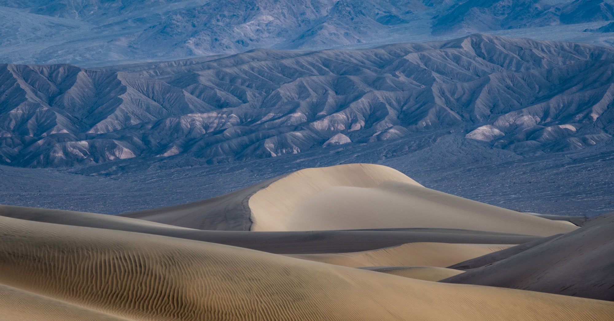
The colors look nice and subtle to me, and the contrast in both color and form of the near to far works well. I don’t notice it much in the smaller view, but in the larger view it looks like the background could use a little more contrast to bring out the nice shadow play on those ridges.
I have to say this is the first “new” take on the dunes I’ve seen in years, mostly due to your effective use of the background. Nice to see something so familiar in a new setting.
Alan, I think you have an outstanding composition here. The decision to include the two layers of mountains in the background makes this much more than “just another dune image”. And you have a nice arrangement of zig-zag dune triangles in the foreground that perfectly frame the center dune.
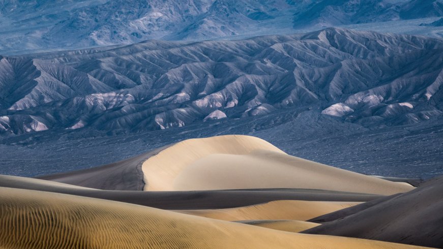
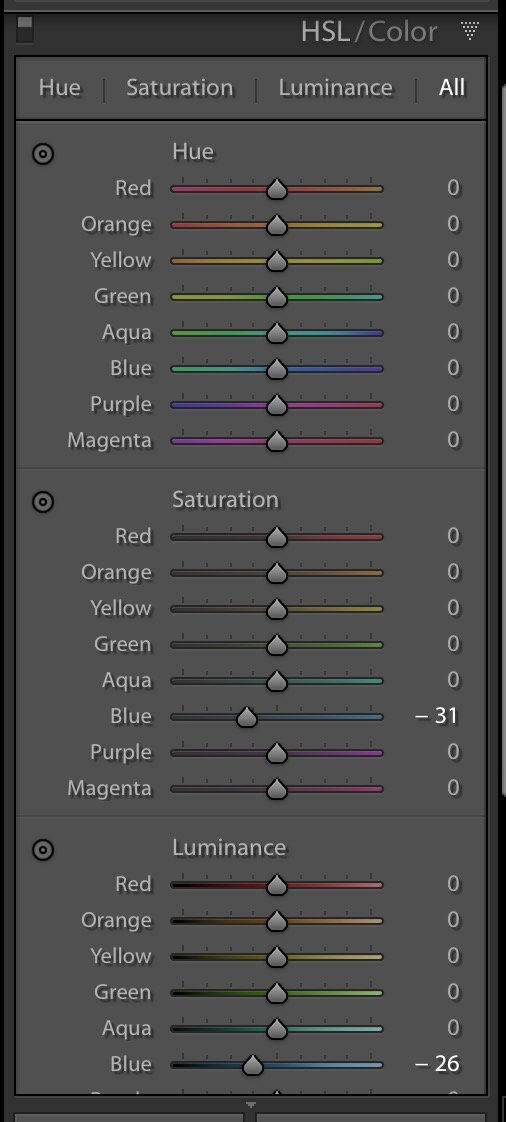
From a processing standpoint, I agree with @John_Williams that adding some mid-tone contrast would help, especially in the mountains. I think adding some vignetting in the corners would help draw your eye more to the central dune. This is a matter of personal taste, but I would consider warming this image up ever so slightly, but not so much to lose the coolness in the background mountains. Maybe apply more warming locally to the fore ground dunes. If you don’t mind, I took a stab making these changes myself.
Thank you for your comments and suggestions John. The background color/contrast was my biggest question. I looks like you @Ed_McGuirk have a similar suggestion and looking at Ed’s rework I also agree. Thanks for your thoughts.
I have to vote against the rework. To me your original does indeed feel like dawn with the first sun striking the dunes while the ridges behind await their turn. Increasing the midtone contrast back there mooshes the dunes into the background and greatly diminishes the sunrise effect on the dunes. The “contrast” between the foreground and background make the image for me, and that’s tempered in the wrong direction.
Hank, it’s interesting you made the “new take” comment. I appreciate that very much! As I stated in my posting this was first time to DV and I purposely did not have a lot of preconceived ideas of what I intended to shoot. It was a workshop and I kind of went with the flow. I do have plenty of traditional dune shots but this was one of favorites from the trip.
Thanks Alan. The difference between the two approaches is subtle, but important for my eye. As photographers we work so hard to catch “magic” light, and I hate to see anything that diminishes the effect.
The warm and cool tones work very nicely together for this DV scene, Alan. This has some wonderful layering as well as some beautiful early morning light. Hard to chose which version I like better because both are superb.
Ed, thanks for your comments and re-post suggestions. I definitely like the suggestion of the warmer tones in the dunes. I am going to revisit the contrast in the mountains and like Ed Lowe am a bit torn on my preference.
Nice little scene! I agree with @Hank_Pennington that it is nice to see the backdrop. Dunes make great images by themselves. But, having been in DV a few times, I appreciate the distant scenery!
Regarding the comp, those cascading layers are a great find and they would work nicely to pull the eye to the center dune if it were not for that bright line in the lower left corner is catching my attention.
I don’t know what the weather was like that day, but with the right side light, scenes like this can take on a lot more drama, texture and color punch.
The color feels subdued.
The texture is lower than expected because the shadows are too light and the highlights are a bit flat. Probably due to the weather.
I took the liberty of making some lightroom adjustments, see below.
Alan: One of my favorite places on the planet. This is excellent. I’ll not comment on the processing as the others have covered that well. I very much like the comp and the ratio of dunes to BG. Well seen and captured.>=))>
I would discourage you from changing the color of the near dunes, they really are more of a tan than an orange. If clouds in the east and the sun work together, they can give the whole scene a warmer (even magenta) glow, but not just part of the dunes.
The far dunes/hills form a nice backdrop to the sand dunes at this time of morning (or even earlier)! You might consider cropping down from the top and darkening the far hills a bit. 87fc5765c72d4a60cd0da1d8fed8fb77624b1f71-2|400x168
I would also disagree with adding contrast to the background, this takes away the atmospheric perspective that lets you know that the mountains are much farther away. It also changes that soft twilight glow. I may be biased, but I think the contrast and colors look great as is.
For a scene with what you might describe as subdued colors. I find myself enjoying the tones very much! The subject matter is always captivating when captured and composed well. As you have done here. The background compliments the dunes very nicely.