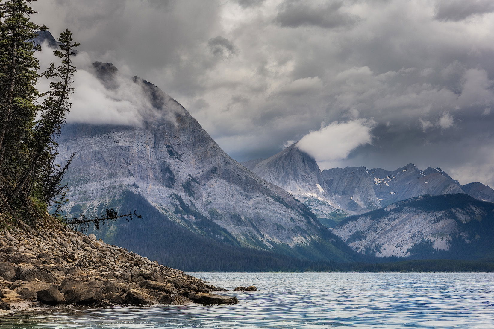
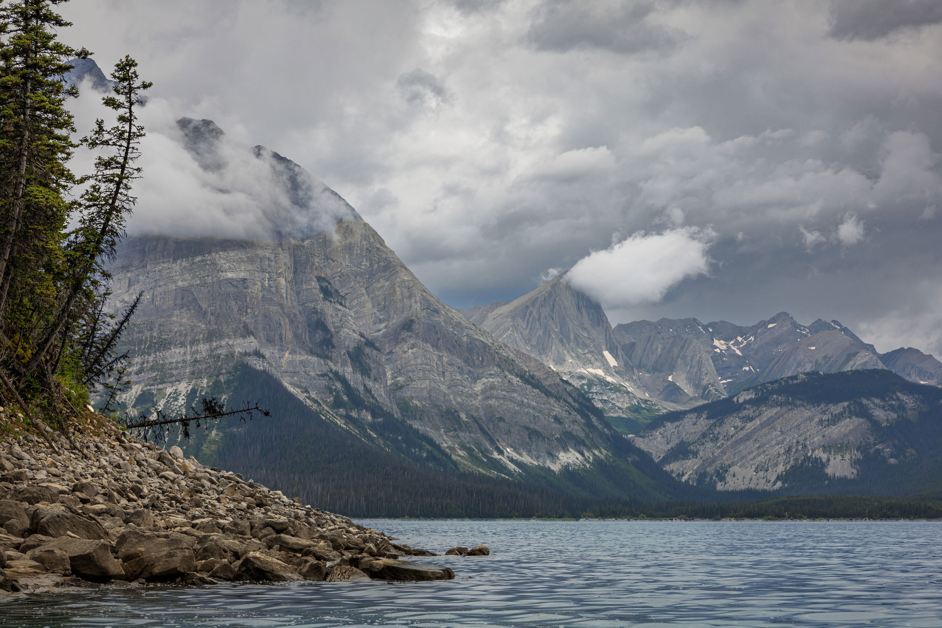
I captured this image last weekend while kayaking on a lake in the Canadian Rockies. The day had such a moody, atmospheric feel, and I really wanted to convey that in the photo. No matter how much I tweak it, though, I can’t quite get the mood to come through the way I’d hoped so I’m curious how others might approach it.
You may only download this file to demonstrate how you would process the image. The file is Copyright of the photographer, and you must delete the raw file when you are done. Please post a jpg of what you created, explain what you did, and why you did it.
Wow, what a spectacular place to kayak. Those clouds are so atmospheric (literally and figuratively).
I had the same idea as Jim for b&w, so I gave it a whirl.
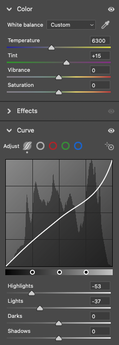
For me, moody means less contrast. The histogram for the raw file is very well distributed (good field technique!), so the first thing I thought of doing was to narrow it by bringing down the highlights. I didn’t touch the darks because they were dark enough already. Here’s what I did:
In ACR:
Adjust color (warm a bit) and bring down highlights.
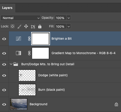
In PS:
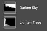
Burn/dodge in mountains to bring out a bit of detail.
Convert to +/-monochrome w/gradient map; warm darks at RGB/8-6-4, cool lights at RGB/239-240-253.
Curve to re-brighten it a bit.
Hi @Bonnie_Lampley , I finally have time tonight to sit in front of my computer and have a bit of “me” time and I’m sorry I wasn’t able to reply sooner. Overall it’s been a hectic and stressful last couple months here - our teenage nephew (from Europe) came to visit and stay with us for the summer so that he can go to school and learn English. I’ve only met him a couple times before and plus we don’t have any children of our own so going from no kids to all of the sudden having a teenager around has been very overwhelming for me.
Anyway, I wanted to say that I really like your take on the image and as soon as I’m done writing this I’m going to try to recreate your steps. The lower contrast black and white looks very appealing and kind of reminds me of some of Ansel Adams’s B&W work. My default approach to this would have been to process it as a high contrast image but I think like the way you did it much more.
Oh, no worries - sounds like you have your hands full!
It’s not something I routinely do, and actually it was an “accident” when I was working on your photo. I’d done a regular b&w conversion, then toned it with the gradient map (my favorite way to tone). Going back to “check my work” and turning layers on and off to see the changes (something I always do), I turned off the b&w but left on the gradient map. The results were more pleasing than the straight b&w so I figured, yay - one less step.
It is hard to not revert to our standard operating procedure. My usual preference is for a lower contrast look, and I always have to ask myself whether that fits with what I want to say about an image.
Well, I spent an hour or so reworking the image with your suggested edits @Bonnie_Lampley and it the end it didn’t look nearly as good as your version so I’m going to try tinkering with it a bit more tonight. I think I’m a bit rusty with my post-processing.
I don’t know that I’m adding much, but for me, the biggest challenge is that line of trees that is above the rocks, extending to the right along the water. I really want to see the detail there. Elsewhere, I played with detail and WB, trying to find a balance between all of the elements here.
Great shot, beautiful scene.
Thanks for taking a stab at this image, @Gary_Hook! I really like what you did. It looks very natural and, in all honesty, I like it much more than what I did. I think I’ll have to revisit the image and give it another go.
You’re very kind, @Tom_Nevesely. I tried to focus on a natural look, while addressing the things that I found most interesting. An xmp file is available upon request.