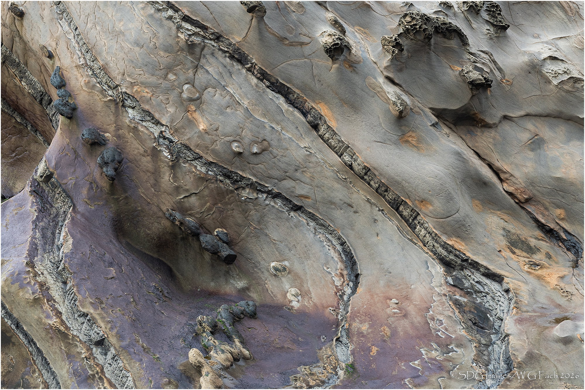
The photographer is looking for thoughtful feedback on the image as a whole, especially around the areas noted below.
Feedback Focus: Artistic / Expressive
About This Image
I’ve mentioned before that Anil Rao is one of my favorite photographers and have been inspired by some of his tafoni shots. This is a more subdued version of the area in Shore Acres SP in Oregon where I shot Emulating Anil. Most of us know Shore Acres for the incredible surf shows during winter storms but there are many more opportunities when the seas are calm.>=))>
Feedback Requested
The only significant adjustment I made on the original capture was a small contrast boost which improved the color saturation without going garish. How does this rendition strike you?
Technical Details
Sony A77II
Sony 70-400 G @ 250mm
ISO 200, 1/40 @ f8
With my first, quick, glance, I thought this was wood!
Excellent patterns and textures Bill. and your use of the diagonals is very appealing. That purple is fascinating too; I haven’t noticed that when I’ve been there.
With that said, I really need to get back there and ignore the surf. I played a little with the rocks on the shoreline, but agree with you there is so much more!
Bill this is a beautiful photo, I love the lines, color, and texture. It has an organic feel to it. The purplish color in the BLC really adds a rich tone to the image.
I’m glad you mentioned Anil Rao, I’m not familiar with his work, but after a quick look, I’ll check him out further.
Alice
Love this! The colors are subtle, yet rich. There is so much to enjoy and explore here; the diagonal lines really hold the entire composition together. In fact, I had a brief (brain lapse) thought about cropping to a square, taking off some of the right and emphasizing the color purple, but then I quickly realized the diagonals would be lost.. This is just beautifully seen and captured.
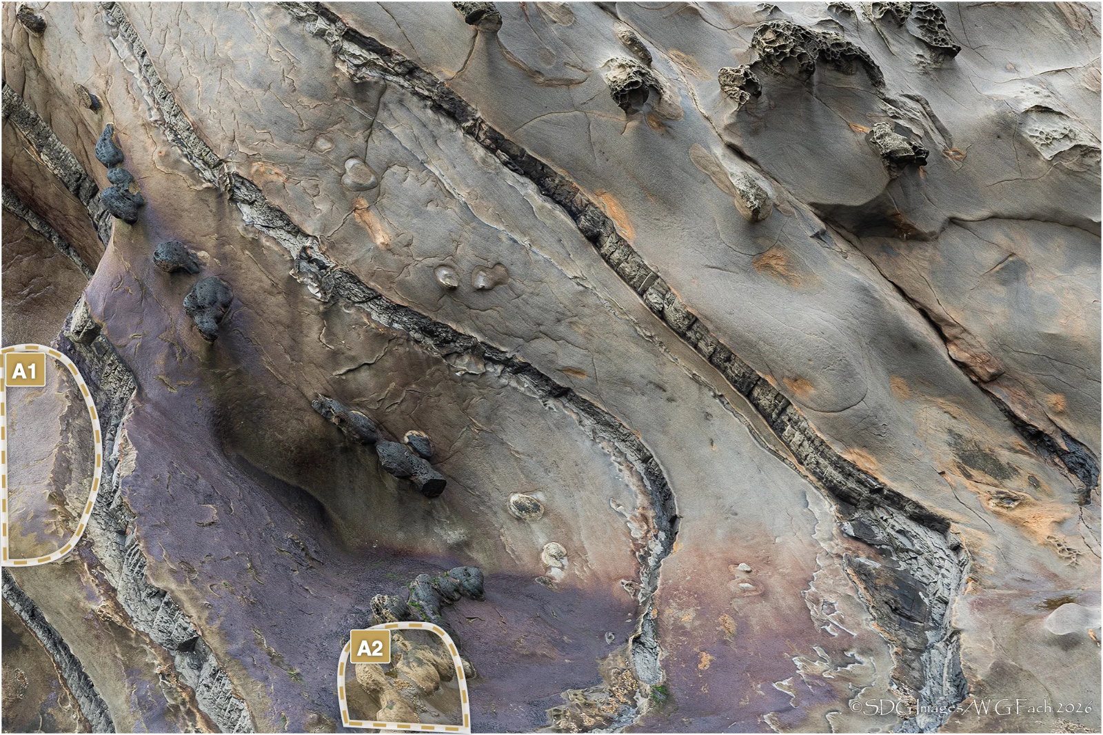
If I had to suggest anything, I would recommend burning/painting or whatever you choose - to darken the brighter, light purple patch on the left edge. It’s not too bright actually, but is bright enough to pull the eye. At least for me. And then perhaps some vignetting in the corners - but that’s subjective of course.
Bill, this is frame filling great. There are so many textures, shapes and colors to explore. The diagonal lines add well to the lower left, upper right eye movement, while the soft purple adds a good touch of color without changing the overall cool tones. I could see a bit of burning-in of the brightest purple bit touching the left edge.
Hi Bill,
This is lovely. I like the diagonal lines and the bits of orange and purple (great color combination). I can image a tish more micro contrast or “texture” in LR terms, and maybe a very subtle boost in saturation.
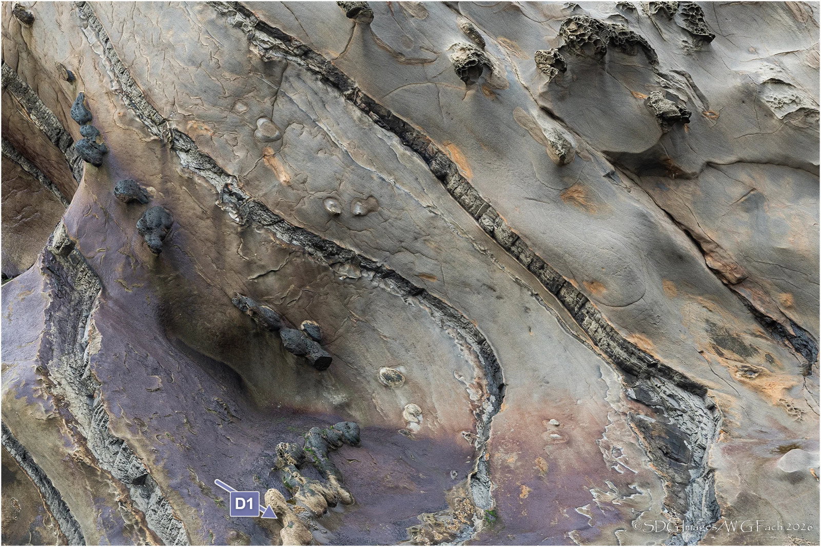
The only thing that distracts me is that the bit of bubbly material at the bottom edge. It keeps pulling my eye out of the more interesting parts of the frame. I don’t know whether that’s just me or whether you might find it useful to crop a tish off the bottom or “remove” some part of that tiny structure. I’ve pointed to it using the visual notes tools.
Of course, it’s lovely as is, and all part of this amazing natural formation, so please take my suggestions with a grain of salt. Wonderful subject. I can see getting lost in this for days.
ML
Another one I managed to miss but I’m glad I found it now because I think it is gorgeous! There are probably several macro subjects in there but this “wide angle” view works just fine. Congratulations on the EP – very well-deserved!
This caught my eye immediately. I especially love the diagonals in your composition, and the contrasating “waves” in the lower left. I’m glad you improved the color saturation, it seems just right even though I don’t see the original.
I don’t know how I missed this one, but it is gorgeous.
I met up with Anil several years ago at Sonora Pass. We had a great time and he is a gentleman. I saw him again in Lee Vining during a CANP meetup one Autumn. I really miss his being here, as I am sure others do as well.
If anyone recalls why he left NPN, please send me a PM.
This is the subject matter that Anil would often shoot on the San Mateo coast. Anil was and still is a perfectionist. When he was interested in photography he went all out and bought the finest cameras and printers. He went all out. I don’t know. To me the composition seems awkward. The area on the left struck me as being a bit too bright and draws the eye. The bottom ‘knobs’ pulls you out of the frame. Looks like A2 was addressed by Marilynn.