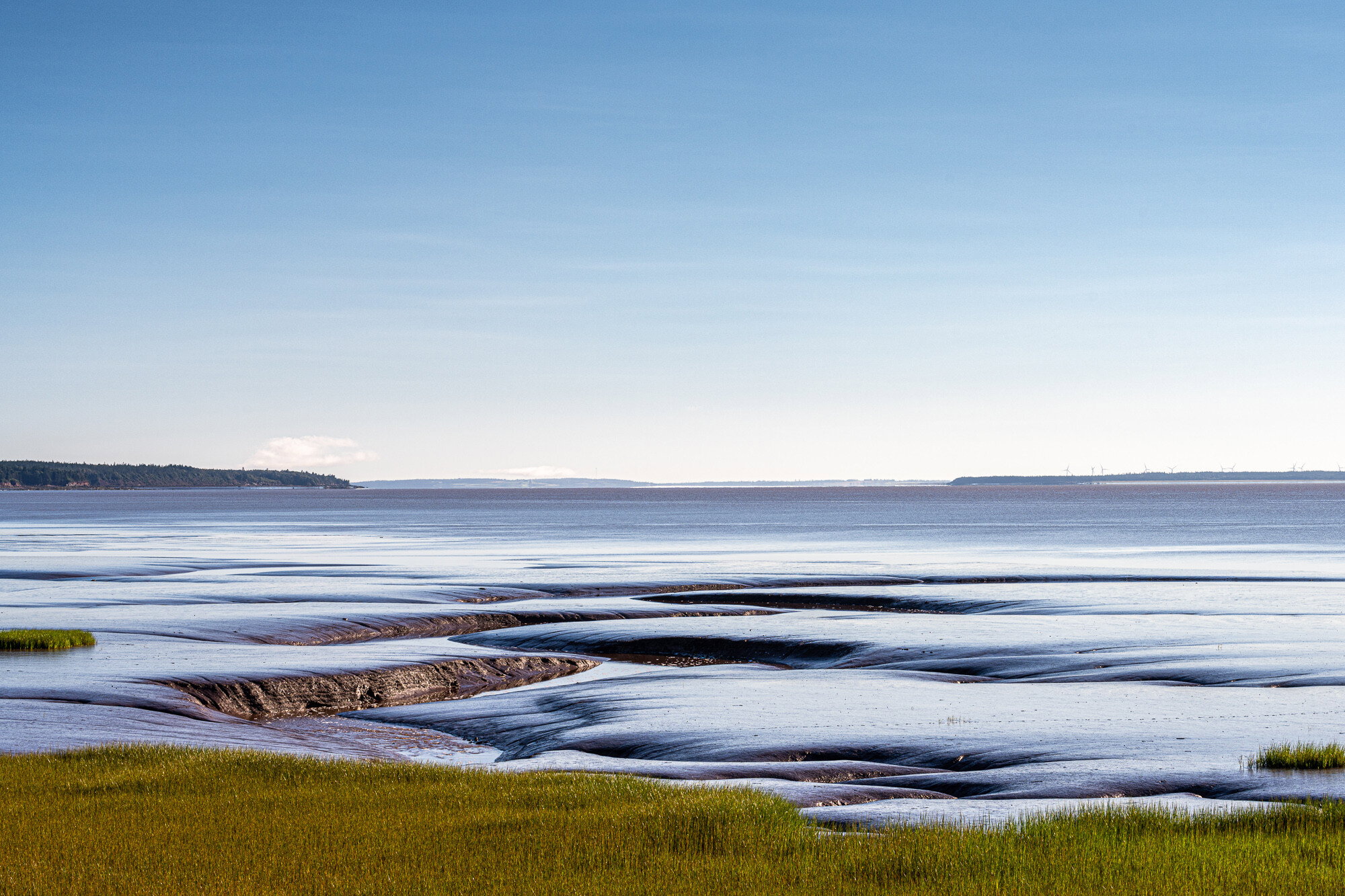
One of the elements of my local landscape to which I’m especially attracted are the mud-flats of the Cumberland Basin, part of the Bay of Fundy. The famously high tides of the Bay of Fundy cover and uncover the flats twice a day. Iron-rich, the mud is reddish in most light, but at dawn and dusk it reflects rich changing blue hues as well as the warm colours of sunrise and sunset. I also love the jagged fissures carved through the flats. My website includes several images of mud-flats, taken at two different locations.
In this photo, I sought to capture that rich blue, the pattern of deep fissures at this point, and the colour and texture contrasts with the foreground shore grass.
Specific Feedback Requested
Well, I’ve just joined the NPN, and this is my first posted image; it was capture just a few days ago. I would appreciate any honest feedback. (I’m used to posting to IG and FB where it’s mostly my former students and only a few photographers giving IG-and-FB-type appreciation. So it’s been difficult for me to gauge realistically how I’m doing!) My own opinion is that this is a strong image, well composed and with a calm stasis and bright light that I like. But what do other photographers see in it?
Technical Details
Nikon Z7 and Nikkor 70-200 f/4 @ 75 mm
1/125 sec at f/11, ISO 64
Processed in Lightroom
Welcome to NPN. I really like this image. It’s calming while the colors aren’t overpowering, but that could just be my monitor. I can faintly see a couple of clouds that you may try to brighten and maybe darken the sky a little. All in all, I think it’s well done and would look really good as a large print.
Welcome here, Gary. This looks good to me. There is a lot of sky but after looking at your website you seem to prefer seascapes that are almost minimalist. I like the oily look of the nearshore water or wet mudflats. I thought a slightly narrower aspect ratio would emphasize the broadness of the landscape. But I get the feeling that you wanted to emphasize the big sky. The flats themselves really don’t take up a big portion of the canvas. Thanks for sharing.
Hi, Gary! I like the color and texture of the image. The sky occupies the entire top half of the image, and gives a great sense of depth, but pulls my attention to the background and away from the wonderful smooth subject. Perhaps a 1x2 crop with the sky occupying the top third would help.
Hi Gary, welcome to NPN. I know you’ll get a lot out of this community. Great first image here. I really like the composition and the negative space offered by the sky. This is one of those times where a Polarizer would have ruined the feel of the image. The sky reflecting off the mud flats makes this image. Very cool.
Hi Gary. Welcome to NPN. I joined a couple of months ago and have enjoyed being a part of this community. I like your first post a lot. The grasses leading into the beautiful blue water is very calming and I especially enjoy the jagged fissures. When I first looked at this image, I too, thought that cropping out some of the sky would give more attention to the grasses and water, but now I’m not so sure I would. You might try cropping some sky out to see if you like it better and if you don’t keep it the way you have it. It’s your choice. Sometimes I learn by trying what folks suggest even if I kind of know I won’t like it. Looking forward to seeing more of your work.
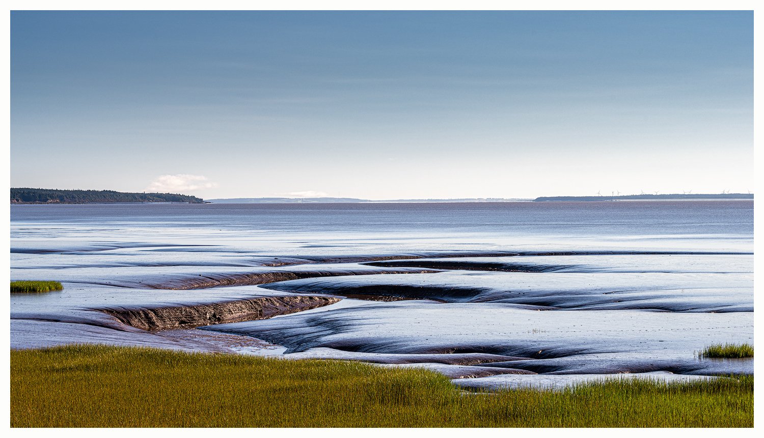
Hi Gary. Welcome to NPN. I enjoyed looking through your website, lots of very nice images. I really like the reflection shots you have. It looks like this image is the first that comes up on your home page. I like that version a bit better because it brings out more of the interesting texture of the foreground and crops out some of the sky.
Hello, Stephen. Thanks for taking the time to look at and comment on my first posted image. Your remarks and those of the others who responded have very much helped to make me look at the image critically again and to adjust it.
Welcome to NPN Gary!
I think the image would be a lot stronger if you removed some of the sky by cropping it out. That much sky almost never (almost) adds any visual interest to a photograph, in my opinion, unless you’re going for a very minimalistic scene, but in this case there’s a lot happening in the foreground so that’s not really the case. My 2 cents!
Hello, Matt. Yes, the consensus seems to be that I need to lose a bit of sky – and I’ve indeed come to agree with this. I’ve cropped the image to a 16:9 format, which I think works better. Thanks so much to you, and to the other members who’ve taken the time to look at my photo and offer suggestions for improvement! Gary
Hi, Cameron. Thanks for the feedback. I have cropped my image to remove a bit of the sky, and I think that does indeed improve it. Thanks especially for taking the trouble to visit my website! Gary
I first of all want to welcome you to NPN, Gary. I believe you’ll get honest and critical comments and feedback on your posted images and we all welcome you to provide feedback on other people work as well. I actually learn more by critiquing others work that by receiving comments and suggestions about my own work. It really forces to to think.
As almost everyone has already stated, I believe the sky occupies way to much of this scene. I enjoy negative space as much as anyone if it helps to define what the image is all about but this negative space doesn’t add to the feeling that the image is trying to express. The bottom of the image is pretty dynamic with lots of lines, geometry, and texture and of course the contrasting blues and greens. The composition was well made. I particularly find that the green nub on the left edge and the green nub on the right side were very placed in the scene. Same with the protruding land masses on the horizon. This was well executed for sure.
I love the crop that you did in your revision. I think that works really well. It looks well intentioned rather than just having sky fill a random aspect ratio. One thing I might consider doing is burning the land protrusion coming from the right edge of the frame or dodging the land protrusion coming from the left side of the frame to balance them out a little bit better. This is an extremely minor nit.
Love your website, Gary!
Hello, David. Thanks so much for your detailed and thoughtful response to the photo I posted; I’m glad you like the revision (Yep, too much sky!), and thanks for the suggestions about those bits of protruding land; I’ll take another look at them. And, of course, I appreciate your taking the extra time to visit my website; it doesn’t get loads of traffic.
Though I haven’t responded individually to all of the response messages posted here, I’ve been very impressed by how many people have taken the trouble to look at my photo and to consider how it might be improved. I thank you all! Gary
Welcome to NPN! I really enjoy this photo. I was immediately drawn to the patterns and lines created by the fault lines in the mud. It almost makes it look as though it is water folding in over itself. I agree that the 16:9 crop helps draw attention in to the foreground. Great shot!
Welcome to NPN. I really like your image and it reminds me of one I recently took in Alaska. I agree with the thought that the sky doesn’t add much to your image . Thus I would be inclined in significantly reducing the sky and focusing on the movement of the water which in my mind is the subject of the image. Great image!
A bit late to the party, but couldn’t go on without first welcoming you to NPN! Great to have you here. And what a fantastic first post.
I think this is wonderful and actually quite unique. The exposed wet mud gives an easy impression that the water is actually draining in to the depths of the unknown. I don’t know how to explain how I’m seeing this, but the impression goes way beyond just mud flats at low tide. This is very, very cool.
Your processing is outstanding. A very clean image, presented beautifully. My only suggestion has been mentioned. And to that point, I really like cropped version. I did think there was a bit too much sky - although the gradient blues are quite nice.
Welcome aboard! We look forward to more images and your participation in the forums and galleries! Don’t be shy!